The Beauty of Living Well
THE NARRATIVE OF HOME.
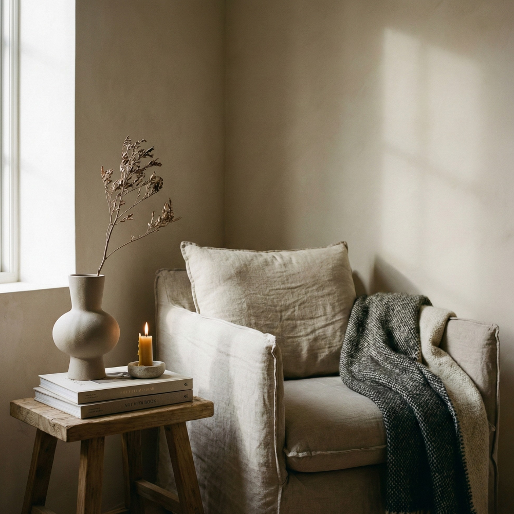
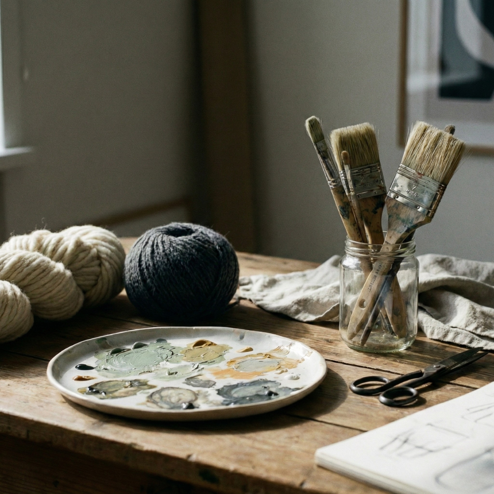
Building a life of substance through the details. This is an exploration of the specific tones, materials, and rituals that create a grounded home. Every choice is an act of curation, offering the tools to define a space with soul.
Sophisticated. Understated. Essential.
-
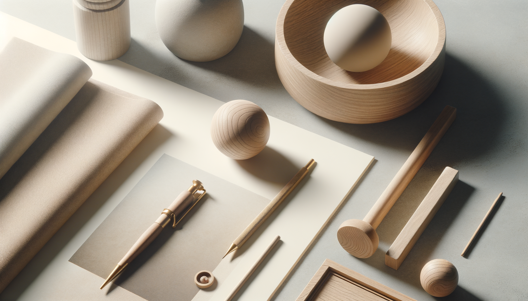
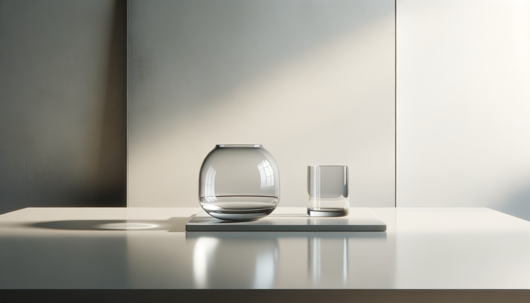
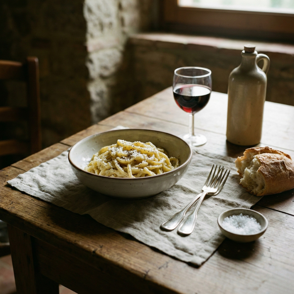
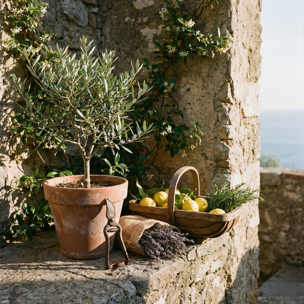
Luxury is found in the removal of the non-essential. The belief is simple: when you edit out the noise, you make room for the enduring. Every choice here is made to support a sense of calm and permanence.
-
A rigorous edit of the modern world. Only the materials, techniques, and systems that contribute to a grounded, soulful life are archived here.
-
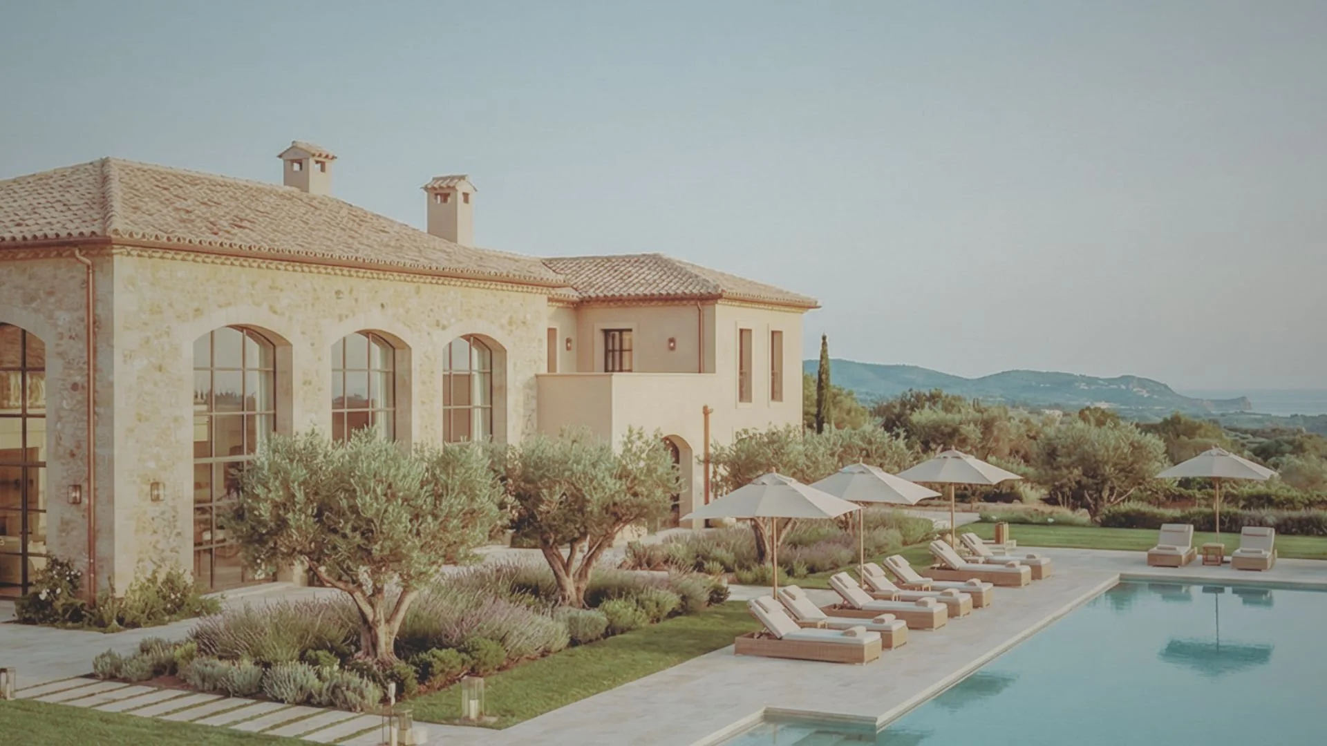
A perspective shaped by the pursuit of a simpler, higher standard. This hub is the result of years spent refining the intersection of design, craft, and a well-ordered life.

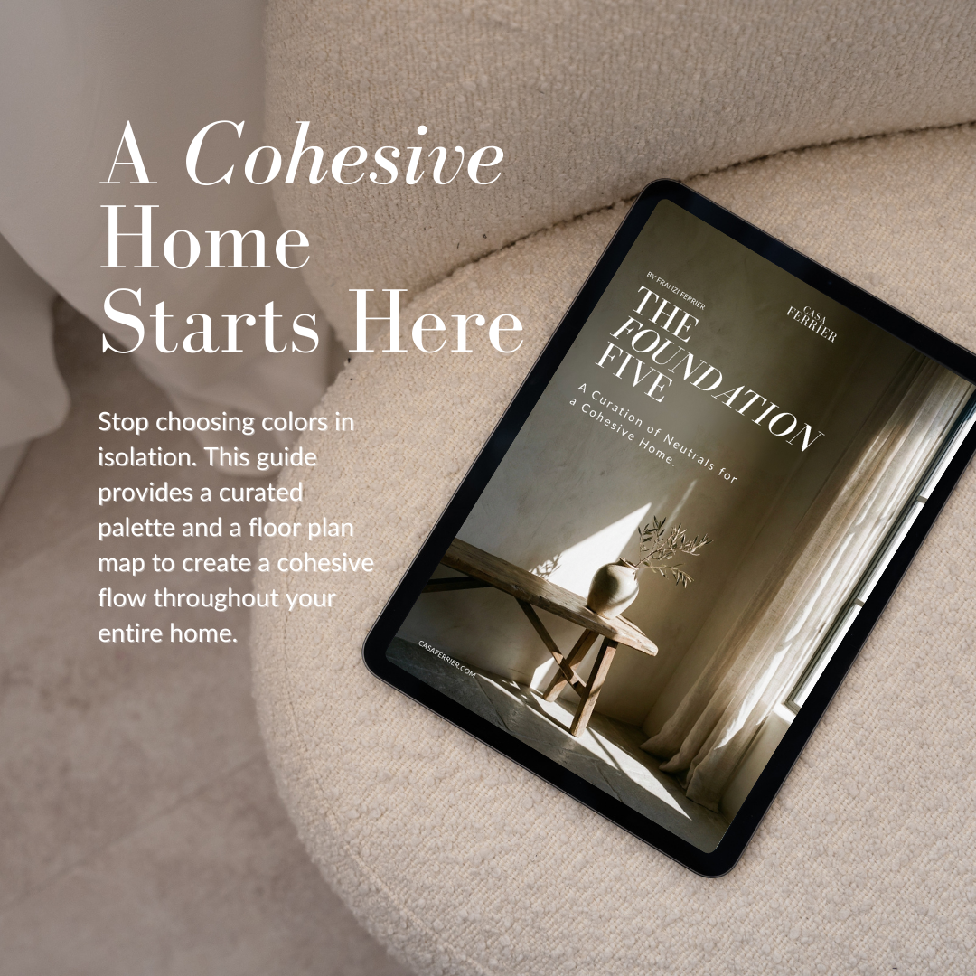
More About Franzi Ferrier
My creative philosophy centers on intentionality. At Casa Ferrier, I’ve sought to create an environment where quality is the only metric that matters. My goal is to move away from the noise of fast-moving trends, focusing instead on a curated collection of timeless essentials. To me, the beauty of our work lies in the dedication to unyielding standards and the pursuit of effortless elegance.

Stay a while - Join the Inner Circle
@casaferrier