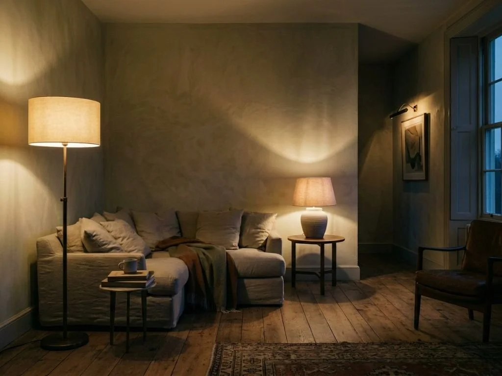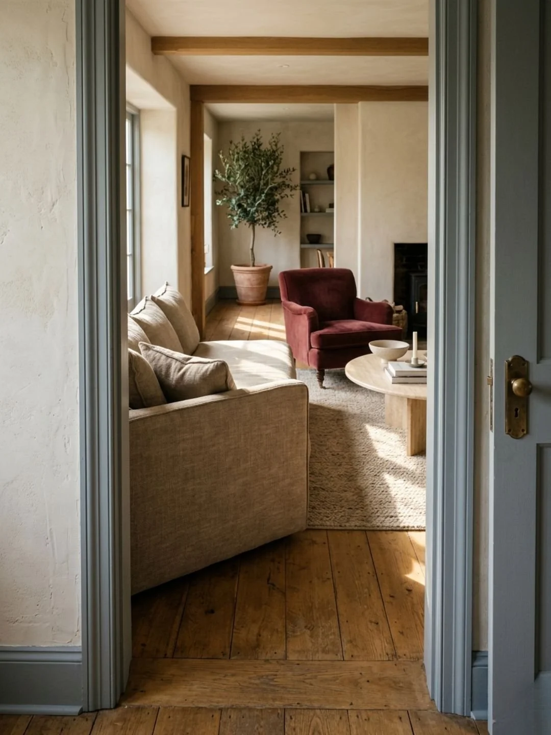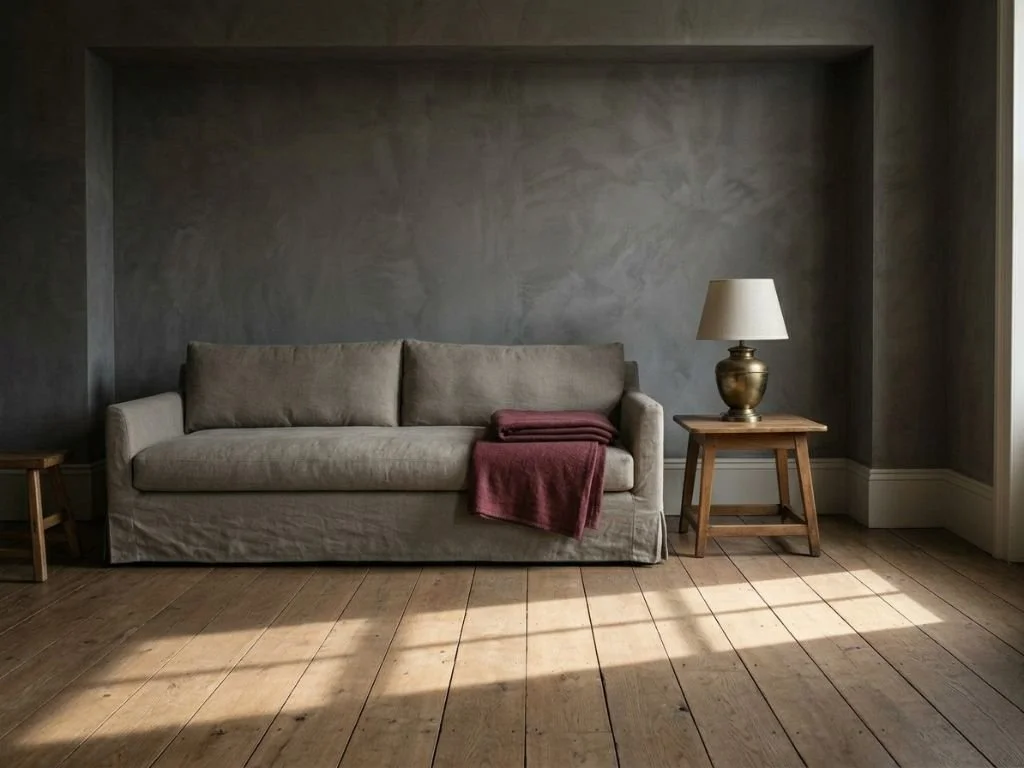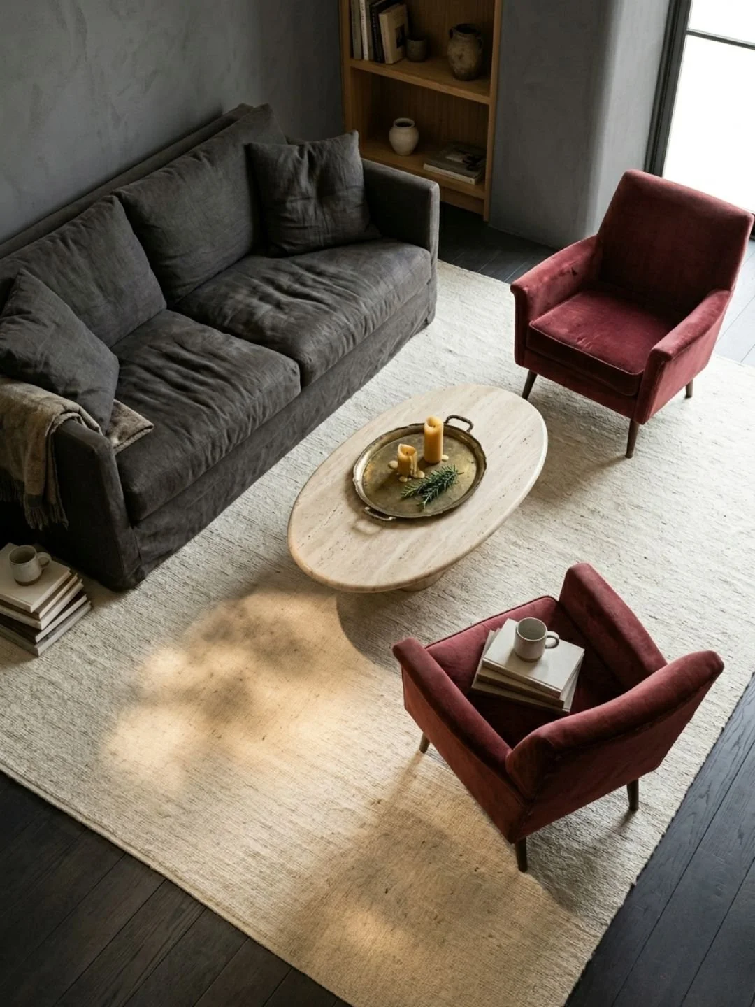
Light can dramatically transform how we perceive space – it’s one of the fundamental principles I’ve worked with throughout my 15 years in interior design. When I first started my consulting business, I made plenty of mistakes with color (that dark aubergine powder room still makes me cringe!). But those mistakes led me to dive deep into understanding exactly how color affects spatial perception.

Today, I’m sharing proven strategies I’ve developed while working with hundreds of clients in spaces ranging from tiny Manhattan studios to compact suburban homes. And no, it’s not just about painting everything white (though we’ll definitely talk about whites!).

Understanding color psychology in interior design is foundational for creating impactful spaces. The way colors affect your home’s mood can transform any room’s atmosphere. By mastering the interior design color wheel principles, you’ll learn to balance warm vs cool colors in interior effectively. Whether you’re seeking colors to make a room look bigger or creating perfect color flow between spaces, strategic color selection is key.

The Science Behind Colors and Spatial Perception

The relationship between color and spatial perception fascinated me so much that I spent years studying it. I remember standing in a client’s narrow hallway, realizing that the deep navy blue I’d chosen, while beautiful, was visually shrinking the space. That was my lightbulb moment – I needed to understand the science, not just follow trends.

Here’s what the research actually tells us: Light Reflectance Value (LRV) is a measurable characteristic that tells us how much light a color reflects back into a room, rated on a scale from 0 to 100. Pure white has an LRV of about 90-95, while pure black has an LRV of about 5. This isn’t just theoretical – LRV values directly impact how spacious a room feels.

When working with spatial perception, we’re dealing with both physics and psychology. Lighter colors reflect more light, creating more illumination throughout the space. This increased light reflection helps define the room’s dimensions more clearly to our eyes. I’ve seen this principle at work in countless projects – my clients often can’t believe the difference between a wall color with an LRV of 80 versus one with an LRV of 40.

Color temperature plays a crucial role too. While it’s commonly observed that lighter colors tend to make spaces feel more open, the temperature of the color (warm versus cool) affects how we perceive depth. In my practice, I regularly work with the principle that cooler tones tend to recede visually while warmer tones appear to advance – a principle that’s been documented in color theory and proven useful in countless projects.

Let me share a practical application: When working with a small room, I always start by analyzing the natural light sources and measuring the current light levels throughout the day. This isn’t just designer fussiness – it’s because the same paint color can appear dramatically different depending on the light it receives. For example a “perfect” gray can turn distinctly purple in a north-facing room!

The most important thing I’ve learned? Color choices should be systematic, not just aesthetic. I now approach each space with careful consideration of its light sources, orientation, and intended use. Sometimes I spend an entire consultation just studying how light moves through a room – it might seem excessive, but understanding these patterns is crucial for selecting colors that will genuinely enhance the sense of space.

Colors to Make A Room Look Bigger Home Office White

Pure Whites & High-LRV Colors (LRV 85+)

Let’s talk about the heavy hitters in the space-expanding world: pure whites and high-LRV colors. I keep detailed notes on every project I work on, and these colors consistently perform exceptionally well in smaller spaces. When I first started working with Benjamin Moore’s Chantilly Lace (OC-65), I was skeptical that different whites could make such a dramatic difference. Boy, was I wrong!

Chantilly Lace has an LRV of 90.04, making it one of the brightest whites available. What makes it special? It’s a pure white without any obvious undertones, which means it reflects light incredibly consistently throughout the day. I used it last month in a north-facing home office that previously felt like a cave, and now it feels like we added an extra window. Just remember – with such a pure white, good lighting is crucial. I learned this lesson when I used it in a basement room with insufficient lighting, and it felt a bit stark until we upgraded the light fixtures.

Behr’s Polar Bear (75) is another powerhouse, with an LRV of 87. What I love about this one is its barely-there warmth that makes spaces feel larger without feeling clinical. I often recommend this for small bathrooms or kitchens where you want that bright, clean feeling while maintaining a welcoming vibe. The slight warmth helps hide minor wall imperfections too – something I discovered while working on a century-old home with less-than-perfect plaster walls.

Sherwin-Williams Alabaster (SW 7008) is my go-to when clients want a softer approach to white. With an LRV of 82, it’s still firmly in the high-reflectance category while offering a gentler, more nuanced look. The creamy undertone makes it particularly effective in rooms that get strong afternoon light – it helps diffuse that harsh sunlight that can make purer whites feel overwhelming.

Here’s a pro tip I’ve developed after years of working with these high-LRV colors: always test them on at least two walls of the room you’re painting. I keep a collection of large paint swatches in my car because I’ve learned that these whites can read dramatically different even within the same space. The way Alabaster looks on a north wall versus a south wall can be surprising.

When working with any of these high-LRV options, pay special attention to your trim color. One of my favorite tricks is to use the same color on both walls and trim, but with different finishes – flat or matte on walls, and satin or semi-gloss on trim. This creates subtle depth without breaking up the space visually. Remember, these aren’t just paint colors – they’re tools for manipulating light. So if you’re planning on finding that perfect color for your home transformation project, consider getting a light meter. You don’t need one of the expensive ones for hundreds of dollars. For home projects, an affordable option for around 25 USD is more than enough.

Colors to Make A Room Look Bigger Space Transition

Soft Grays & Neutral Space Enhancers

After understanding high-LRV whites, I discovered that sometimes a softer, mid-tone approach actually works better for creating visual space. Sherwin-Williams Repose Gray (SW 7015) with its LRV of 58 is my perfect example of this principle. While it might seem counterintuitive to use a darker color to expand space, this warm light gray has a remarkable ability to create depth, especially in rooms that transition between different light exposures.

I once was working on a connected living-dining space that faced both east and west. Where pure whites felt too harsh and created glare during sunrise and sunset, Repose Gray maintained a consistent appearance throughout the day. Its warm undertones help create a visual flow that makes the space feel more expansive rather than chopped up.

Benjamin Moore Gray Cashmere (2138-60) has become my secret weapon for spaces that need a subtle color while still maintaining an open feel. With an LRV of 65, it hits in that sweet spot between too light and too saturated. What makes this color particularly effective is its chameleon-like quality – the soft green-gray undertone helps blur the boundaries between walls and creates a gentle recession effect.

For clients who aren’t ready to commit to a true gray but want something more complex than pure white, Benjamin Moore Swiss Coffee (OC-45) with its LRV of 83.93 offers the perfect transition point. I often use this in spaces that connect to rooms painted in higher-LRV whites, as it creates a subtle progression that draws the eye forward without creating harsh transitions.

Here’s an insight that took me a while to develop: these neutrals work best when you consider the room’s “color memory” – how the space reads when you first walk in versus how it feels after you’ve been in it for a few minutes. I now plan my neutral palettes by walking through the entire flow of a home, noting how each space transitions into the next. This approach transformed a recent project where we used Swiss Coffee in the entryway, transitioning to Gray Cashmere in the main living space, creating a subtle but effective spatial progression.

A common mistake I see (and learned to avoid) is choosing neutrals based solely on swatches. These colors are particularly susceptible to environmental influence. I now insist on testing large samples (at least 24″ x 24″) on every major wall, observing them during different times of day and under both natural and artificial light. This practice has saved me from what I call “gray gone wrong” syndrome – when a seemingly perfect neutral suddenly reads too blue or too brown in actual application.

Your lighting plan becomes crucial with these mid-tone neutrals. Unlike with high-LRV whites where you’re primarily working with light reflection, these colors are about creating subtle depth. I work with my clients to layer their lighting – combining ambient, task, and accent lighting to enhance the dimensional quality these colors can create. A perfectly placed wall sconce or up-light can transform how these neutrals enhance spatial perception.

Colors to Make A Room Look Bigger Skylight Blue Kitchen

Cool Tones That Create Depth

After mastering the neutral palette in my projects, I noticed that cool tones could create even more dramatic effects in spatial perception. Farrow & Ball’s Skylight (No. 205) became my gateway into understanding the power of cool tones. With an LRV of 57, it taught me that the right pale blue-gray can actually push walls back more effectively than a bright white in certain spaces.

The science behind this effect fascinated me – cool tones naturally recede in our vision. I first put this theory to the test in a galley kitchen where bright whites felt stark and grays felt heavy. Skylight transformed the space by creating an atmospheric depth that made the narrow room feel significantly more expansive. The key was its undertone – neither too blue (which can feel cold) nor too gray (which can feel flat).

Benjamin Moore’s Glass Slipper (1632) has become my go-to solution for rooms that need to feel both spacious and serene. Its LRV of 63 hits the sweet spot where it reflects enough light to keep spaces bright while providing enough pigment to create depth. I discovered its versatility while working on a project with mixed lighting conditions – it maintained its space-enhancing properties under both LED and natural light, something that’s surprisingly rare in blue-toned paints.

Sherwin-Williams Sea Salt (SW 6204) surprised me when I first started using it. Despite having the same LRV as Glass Slipper at 63, its green-gray undertones create a different type of spatial effect. I use it primarily in rooms where I want to blur the boundary between indoor and outdoor spaces. Recently, in a sunroom project, it made the walls seem to dissolve into the garden view beyond, effectively doubling the perceived space.

Working with cool tones requires a strategic approach to orientation. I’ve developed a method I call “light mapping” – tracking how natural light moves through a space throughout the day. North-facing rooms get different treatment than south-facing ones. For instance, in north-facing spaces, I might use Skylight to amplify what little natural light there is, while in south-facing rooms, Sea Salt helps soften intense direct sunlight while maintaining the spacious feel.

Temperature transitions are crucial when working with cool tones. In open floor plans, I create what I call “temperature bridges” – thoughtful progressions from warmer to cooler tones that guide the eye through the space. This technique proved invaluable in a recent project where we needed to connect a cool-toned living room to a warmer kitchen space without making either room feel disconnected or confined.

The biggest lesson I’ve learned with cool tones is that lighting is everything. Unlike with whites where you’re working primarily with reflection, or grays where you’re playing with neutrality, cool tones actively participate in creating atmosphere. I always recommend testing cool colors under every lighting scenario – morning sun, afternoon shadows, overcast days, and artificial evening light. A cool tone that expands space beautifully at noon might close it in at dusk if the lighting plan isn’t carefully considered.

Colors to Make A Room Look Bigger Blush Pink Home Office

Unexpected Space-Expanding Colors

Let me share something that challenged everything I thought I knew about space-expanding colors – soft pinks can actually make a room feel larger. I discovered this by accident when a client insisted on Benjamin Moore’s First Light (2102-70) for their small home office. With an LRV of 77.31, I expected it to perform well, but what happened next revolutionized my approach to space-expanding colors.

The room didn’t just feel bigger – it had this incredible luminosity that made the walls seem to float. First Light’s particular genius lies in how it responds to different times of day. Unlike the cool tones we discussed earlier, which can sometimes feel flat in evening light, this soft blush maintains its space-expanding properties consistently. I now use it specifically in rooms where I need to maintain a sense of spaciousness across wildly different lighting conditions.

Sherwin-Williams Intimate White (SW 6322) became my go-to alternative when I need a slightly warmer take on this effect. At LRV 76, it holds its own in the brightness department, but its specific undertone does something fascinating – it creates what I call a “luminous bubble” effect. The color seems to glow from within, especially during golden hour. This property makes it particularly effective in rooms with limited natural light, where traditional whites can feel harsh and cool tones might appear dull.

Here’s what makes these gentle pinks so effective: they combine the light-reflecting properties of whites with the depth-creating properties of color. Working with several historic home renovations taught me that these tones also beautifully mask the slight irregularities in older plaster walls – something that stark whites tend to highlight mercilessly.

Temperature plays a crucial role in how these colors perform. Unlike our cool tones that create depth through recession, these warm-but-light hues work by diffusing light in a way that softens shadows without flattening the space. I learned to leverage this effect in a recent project where we needed to make a narrow hallway feel more expansive. By using First Light on the walls and a slightly warmer white on the ceiling, we created a gentle color wash that made the space feel significantly wider.

Light fixtures need special consideration with these tones. I always recommend testing your lighting temperature before committing – I learned this lesson after installing cool LED strips in a First Light room, which temporarily killed its space-expanding magic until we switched to warm white LEDs. Now I keep a set of different temperature bulbs in my toolkit for testing how these colors will perform under various lighting scenarios.

The most surprising discovery I’ve made with these colors is their ability to create what I call “atmospheric progression.” In open floor plans, using these unexpected warm lights as transition colors between spaces can actually make the entire area feel larger than using a single neutral throughout. It’s like creating gentle waves of color that lead the eye forward without creating harsh boundaries.

Combining Your Space-Expanding Colors

Let me share a nerve-wracking but ultimately successful color combination project – blending three different space-expanding colors in a 180-square-foot open-concept studio apartment. We used Chantilly Lace (LRV 90.04) for the main living space, transitioned to Gray Cashmere (LRV 65) for the kitchen area, and incorporated First Light (LRV 77.31) in the sleeping nook. The result taught me invaluable lessons about combining these space-makers effectively.

The key to successful combinations lies in what I call the “15-point rule” – I try to keep LRV differences between adjacent colors within 15 points. Any greater contrast can create harsh visual breaks that actually make spaces feel smaller. This principle came from lots of trial and error, including one particularly humbling project where I ignored this rule and ended up with what looked like color blocks rather than a flowing space.

Here’s how I approach color combinations in compact spaces:

For areas under 200 square feet, I create what I call “color zones” rather than hard breaks between spaces. In a recent micro-apartment project, we used Sea Salt (LRV 63) as our base color, but instead of stopping abruptly at corners, we let it flow onto adjacent walls before transitioning to Alabaster (LRV 82) through a subtle gradation in the lighting. The effect made the space feel like it continued beyond its actual boundaries.

Transitions between colors require careful consideration of natural light patterns. In that same apartment, we positioned the color changes to align with natural light falls. The Sea Salt section caught morning light, while Alabaster maximized afternoon sun. This intentional placement helped each color perform at its peak effectiveness during different parts of the day.

One of my most effective discoveries has been using doorways and hallways as transition points. Rather than changing colors at corners (which can create a chopped-up feeling), I now use these natural breaks in architecture. A recent townhouse project proved this method’s success – we used Repose Gray (LRV 58) in the hallway as a sophisticated bridge between the First Light living room and the Skylight kitchen, creating flow rather than division.

Here’s my practical formula for combining these colors in small spaces:

  1. Use your highest LRV color (like Chantilly Lace) on the wall that receives the most natural light
  2. Transition to mid-range LRV colors (like Gray Cashmere) in areas where you want to create depth
  3. Save your unexpected colors (like First Light) for spaces where you want both expansion and warmth

The biggest mistake I see (and occasionally still make) is trying to combine too many space-expanding colors in one area. I’ve learned that three is usually the magic number for spaces under 400 square feet. Any more than that, and you risk creating a patchwork effect that defeats the purpose of space expansion.

For seamless transitions, I now use what I call “sight line testing” – standing at key points in the space and noting where my eye naturally travels. Color transitions should enhance, not interrupt, these natural sight lines. This technique helped me salvage a project where initial color blocking was making a small condo feel like a maze – we adjusted the color placement to follow natural sight lines, and suddenly the space felt twice as large.

Colors to Make A Room Look Bigger Living Room Light

Conclusion

After spending years transforming hundreds of small spaces, I can tell you with absolute certainty that color is your most powerful tool for creating visual space. The transformation I described in that 180-square-foot studio apartment isn’t unique – I’ve seen similar results in countless projects since then, from tiny urban apartments to compact suburban homes.

What makes these color strategies so effective is their foundation in both science and real-world application. Light Reflectance Values aren’t just numbers on a paint chip – they’re practical tools that can transform how we experience space. Whether you choose the pure brilliance of Chantilly Lace, the sophisticated depth of Repose Gray, or the unexpected luminosity of First Light, each color in this guide has proven its space-expanding capabilities in real homes with real challenges.

Remember: the most successful space-expanding color schemes aren’t about following rigid rules. They’re about understanding how light moves through your space, how colors interact with each other, and most importantly, how you want your space to feel. That micro-apartment project I mentioned? Its success came not just from the colors we chose, but from how we adapted their placement to work with the natural light and flow of the space.

I encourage you to test these colors in your own space, but do it thoughtfully. Get large samples, observe them during different times of day, and pay attention to how they make you feel in the space. Your room’s unique lighting conditions and your personal response to colors are just as important as any design principle.

The real magic happens when you stop thinking about these colors as just paint on walls and start seeing them as tools for sculpting space with light. Whether you’re dealing with a cramped city apartment or a cozy suburban room, these colors can help create the spacious, welcoming environment you’re looking for.

I’d love to hear about your experiences with these space-expanding colors. Which combinations worked in your space? What unexpected challenges did you encounter? Share your stories in the comments below – your experience might be exactly what another reader needs to transform their own space.

And remember – even the smallest spaces can feel expansive with the right color strategy. Trust me, I’ve seen it happen too many times to count.

When planning your space, remember that color choices affect both aesthetics and wellbeing. The best bedroom colors for sleep might differ from other rooms, but maintaining color flow between rooms ensures harmony throughout your home. From implementing color psychology interior design principles to understanding how different hues impact our daily lives, thoughtful color selection remains crucial for creating spaces that truly work.