7 Striking Castlecore Color Schemes: Rich, Dramatic Hues
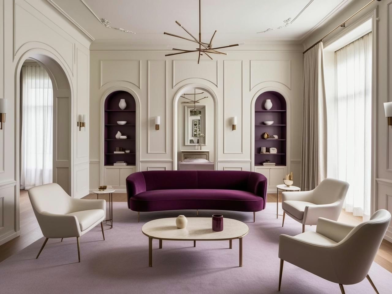
You know that feeling when you walk into a room and instantly feel transported to another time and place? That’s exactly what happened during my deep dive into Castlecore colors. What started as casual curiosity about moody, medieval-inspired hues turned into a fascinating exploration of how these rich colors can transform modern spaces.
Here’s the thing about Castlecore colors – they might sound intimidating at first (I mean, Gothic black? Deep burgundy?), but they’re actually incredibly versatile when you understand how to work with them. After countless paint swatches, unexpected color combinations, and yes, a few surprising discoveries, I’ve put together a guide to help you navigate these dramatic hues with confidence.
Think of this as your color map to creating spaces that feel both timeless and totally current. We’re talking about lush burgundies that look different every hour of the day, forest greens that somehow make everything look more expensive, and deep purples that play surprisingly well with modern furniture. Whether you’re ready to go all-in with dark, dramatic walls or just wanting to dip your toe into the Castlecore aesthetic with some rich accents, these color schemes will show you how to make it work.
Ready to explore how these moody hues can transform your space? Let’s dive into the world of Castlecore colors – no actual castle required (though a few gothic arches never hurt anybody).
Your Shortcut to Effortless Quiet Luxury Style
12 refined color palettes designed to bring luxury, sophistication and harmony into your home.
The Core Colors of Castlecore: Building the Foundation
There’s something fascinating about the way certain color combinations can instantly transport us to another time and place. While exploring different design aesthetics, I’ve found that Castlecore colors have this unique ability to create atmosphere without requiring a complete medieval renovation of your space.
Understanding the Primary Palette
After spending time analyzing countless historical references and contemporary interpretations, I’ve discovered that Castlecore’s foundation rests on five key colors:
- Burgundy brings that sense of old-world opulence without feeling stuffy. In various lighting conditions, it can shift from a deep wine to a rich ruby, making it incredibly versatile for different spaces. When testing burgundy in different rooms, I’ve noticed it tends to feel most natural in spaces that get moderate natural light – enough to show its depth but not so much that it washes out.
- Emerald green has proven to be surprisingly adaptable in modern spaces. Through various design experiments, I’ve found it works particularly well when you layer it in different textures. A matte emerald wall paint creates a completely different effect than emerald velvet upholstery, yet they complement each other beautifully.
- Deep purple might seem intimidating at first, but it’s actually one of the more flexible colors in the Castlecore palette. During different times of day, I’ve observed how it can read as either a sophisticated neutral or a bold statement color, depending on what you pair it with.
Creating Balance with Dark Tones
One interesting discovery from working with these rich hues is that they don’t always need to be used at full intensity. A useful approach I’ve developed is the 60-30-10 rule for Castlecore colors:
- Use your primary dark tone (like Gothic black or deep burgundy) for about 60% of the space
- Add a complementary rich color for 30%
- Reserve 10% for metallic accents or lighter shades
This balance helps prevent the space from feeling overwhelming while maintaining that moody Castlecore atmosphere. Through various lighting experiments, I’ve found that incorporating different sheens within the same color family can add depth without requiring additional colors.
The Role of Metallic Accents
In studying how light plays with different finishes, I’ve noticed that metallics serve a crucial purpose in Castlecore color schemes. Rather than using them just as decorative elements, they can actually help modulate the intensity of darker colors. Gold and brass accents, for instance, can catch and reflect light in ways that make dark walls feel less heavy, while antiqued silver can add sophistication without brightness.
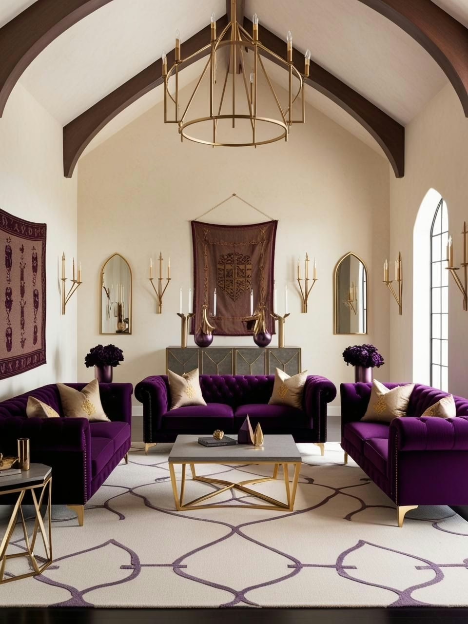
Castlecore Color Scheme #1: Deep Purple and Antique Gold
Let’s talk about one of the most intriguing color combinations in the Castlecore palette. While experimenting with different color pairings, deep purple and antique gold have consistently surprised me with their adaptability. You might think this combination would only work in sprawling Victorian mansions, but these colors can actually feel right at home in modern spaces too.
Finding the Right Purple
Here’s something interesting I’ve discovered through trial and error: not all deep purples are created equal. When sampling different shades, I’ve found that purples with a slight gray undertone tend to be more forgiving in various lighting conditions. They create that moody Castlecore vibe without feeling like you’re living in a medieval dungeon.
- The magic happens when you look for purples that have what paint experts call a “dirty” base – these are the ones mixed with a touch of gray or brown. They tend to change beautifully throughout the day, going from deep and dramatic in low light to surprisingly sophisticated in bright sunlight.
- Eggplant-toned purples have proven especially versatile. They maintain their richness without going too Gothic, making them perfect for spaces where you want drama without darkness.
Playing with Gold Accents
The real fun starts when you bring in the gold elements. Through various lighting experiments, I’ve noticed that different gold finishes can completely change how the purple reads in a space:
- Brushed brass creates a softer, more lived-in look that feels less formal than traditional polished gold
- Antiqued gold finishes actually help make the whole combination feel more contemporary – there’s something about their patina that bridges the gap between old and new
- When working with picture frames or hardware, mixing different gold tones actually adds depth, as long as they share similar undertones
Balancing with Lighter Elements
One of the most useful discoveries I’ve made while working with this combination is the importance of breathing room. Adding cream or off-white elements isn’t just about brightening the space – it’s about giving your eyes somewhere to rest:
- Cream-colored textiles, especially in natural materials like linen or wool, help ground the more dramatic elements
- White trim or molding can actually make purple walls feel more intentional and less overwhelming
- Light-colored artwork or mirrors with gold frames create perfect focal points that tie everything together
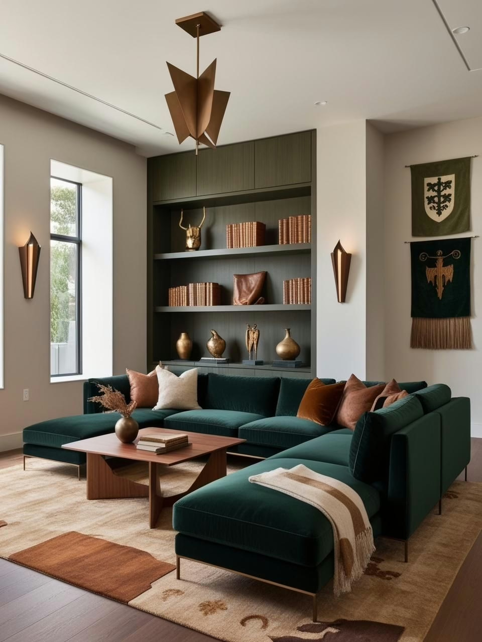
Castlecore Color Scheme #2: Forest Green and Warm Brown
You know those color combinations that just feel right, even if you can’t explain why? Forest green and warm brown are exactly that in the Castlecore palette. After experimenting with countless green shades (and yes, there was that one time with a green that looked more “fresh spring” than “mysterious forest”), I’ve discovered some fascinating things about this earthy duo.
The Secret Life of Forest Green
Let’s talk about what makes forest green such a chameleon in interior spaces. Through various lighting tests, I’ve found it’s all about the undertones:
- Forest greens with a black undertone create that moody, library-worthy vibe we’re after. But here’s the fun part – they also play surprisingly well with modern furniture
- The magic really happens when you layer different forest green textures together. Matte walls with glossy trim in the same shade? That’s the kind of subtle drama that makes people stop and stare (in a good way)
- Pro tip from countless paint sampling sessions: forest green looks completely different on a north-facing wall versus a south-facing one. Always, always test your greens in every type of light your space gets
Bringing in the Browns
The warm brown elements are where things get really interesting. Through various experiments with wood tones and leather pieces, I’ve noticed:
- Mid-tone to dark woods create this incredible depth when paired with forest green – there’s something about how they echo each other’s richness without competing
- Leather in cognac or tobacco shades adds this gorgeous warmth that keeps the green from feeling too cool or formal
- When you mix in brass or copper accents, the whole combination suddenly feels like it belongs in a centuries-old library (even if you’re working with completely contemporary pieces)
Creating the Study Vibe
One of my favorite discoveries about this color scheme is how it can make any space feel like a cozy study, regardless of size:
- The key is in the layering – start with your forest green base, add wooden elements at different heights, then sprinkle in those metallic accents
- Textural variation is your friend here – think smooth leather against rough wood against glossy metal
- Light plays a huge role – I’ve found that warm-toned light bulbs make this combination feel especially inviting in the evening hours
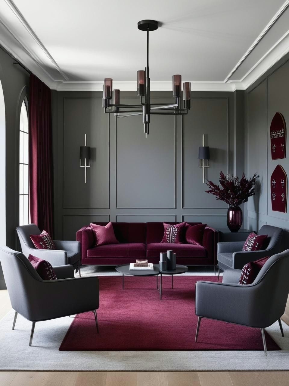
Castlecore Color Scheme #3: Burgundy and Charcoal Gray
You’d think burgundy and charcoal would be one of those no-brainer combinations, right? But here’s the thing – after countless color experiments, I’ve discovered these two have quite the personality when they get together. Think of them as that power couple at the party who somehow make everyone else look better too.
The Burgundy Balance
Let’s chat about burgundy for a second. While testing different shades, I stumbled upon something pretty interesting:
- Burgundies with a brown undertone (rather than purple) tend to play much nicer with charcoal. It’s like they’re speaking the same language, creating this incredibly sophisticated vibe without trying too hard
- In natural daylight, these warmer burgundies have this fantastic way of warming up even the coolest charcoal gray. Who knew? It’s like they bring out the best in each other
- I’ve found that flat and eggshell finishes in burgundy create this amazing depth – almost like velvet on your walls. Though fair warning: don’t go full gloss unless you’re ready for some serious drama (learned that one through trial and error!)
Working with Charcoal
Here’s where things get really fun. Charcoal isn’t just gray’s moodier cousin – it’s actually incredibly versatile:
- Different textures of charcoal (think smooth paint versus nubby wool) create this subtle layered effect that adds so much depth to a room
- When you use charcoal as trim with burgundy walls, something magical happens – the burgundy actually appears richer, while the charcoal acts like a sophisticated frame
- One surprising discovery: charcoal furniture against burgundy walls creates this beautiful tension that makes both colors look more expensive (even when they’re not!)
Creating Intimacy with Texture
The real secret sauce with this combo isn’t just about the colors – it’s about how you use them:
- Mixing in different textures is like adding seasoning to a perfect dish. Velvet, leather, wool – they all bring something special to the party
- I’ve found that metallic accents in either warm brass or cool silver work equally well here – it’s all about how you distribute them
- Pattern mixing becomes surprisingly easy with this combo. It’s like these colors were made for vintage-inspired prints and geometric patterns
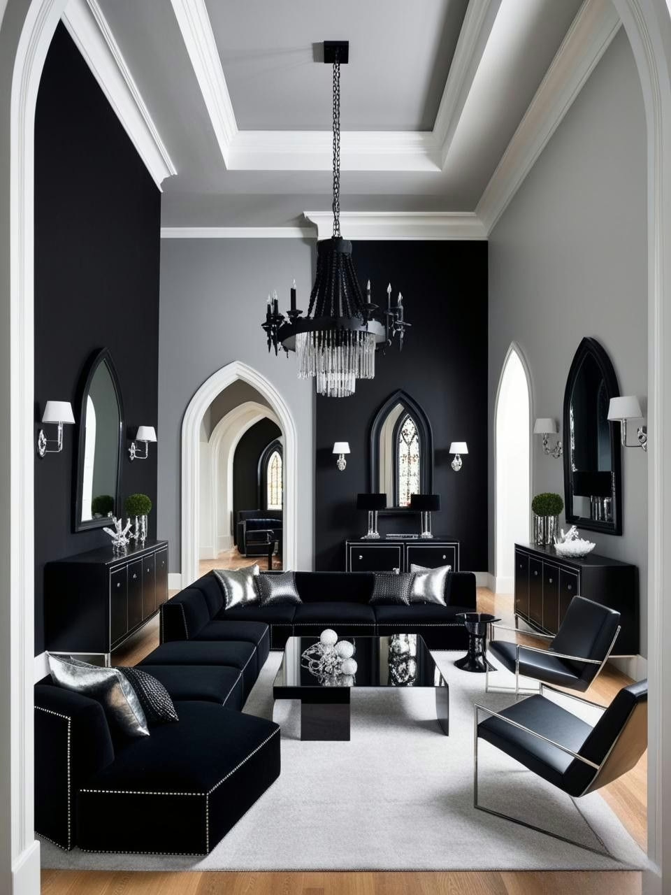
Castlecore Color Scheme #4: Gothic Black and Silver
Let’s talk about the power couple of the Castlecore world – Gothic black and silver. You know that feeling when you see a combination that’s somehow both classic and edgy? That’s these two. And here’s a fun little truth bomb: Gothic black isn’t actually as scary as it sounds (trust me, I’ve gone down the paint swatch rabbit hole more times than I can count).
The Truth About Gothic Black
Here’s something that blew my mind during all my color experiments – Gothic black isn’t just… well, black:
- The best Gothic blacks actually have a tiny hint of warmth to them. Think of them like really good coffee – there are subtle undertones that make all the difference
- Paint one wall Gothic black, and suddenly you’re looking at fifty different shades throughout the day. Who knew black could be such a show-off?
- The finish makes a huge difference – I’ve found that matte black creates this velvety depth that’s absolutely dreamy, while a slight sheen can make smaller spaces feel more expansive
Silver: The Ultimate Wingman
Now, let’s chat about silver, because this is where things get really interesting:
- Different silver finishes are like different personalities at a party – some are super polished and formal, others are more laid-back and vintage. And guess what? They all get along surprisingly well
- Through trial and error (and maybe a few questionable purchases), I’ve discovered that mixing brushed and polished silver actually creates this gorgeous layered effect
- The real game-changer? Antiqued silver. It’s like that friend who somehow makes everyone in the room feel more comfortable – it softens the edge of Gothic black while maintaining the drama
Small Spaces, Big Impact
Here’s my favorite discovery about this combo – it absolutely sings in smaller spaces:
- Powder rooms and entryways become these jewel-box moments that make people do a double-take (in the best way possible)
- Adding texture through wallpaper or subtle patterns gives the black walls this amazing dimensional effect – like wearing a really well-tailored black suit
- The key is balance – I’ve found that about 70% black to 30% silver is the sweet spot. Any more silver and you’re veering into disco ball territory (been there, learned that lesson!)
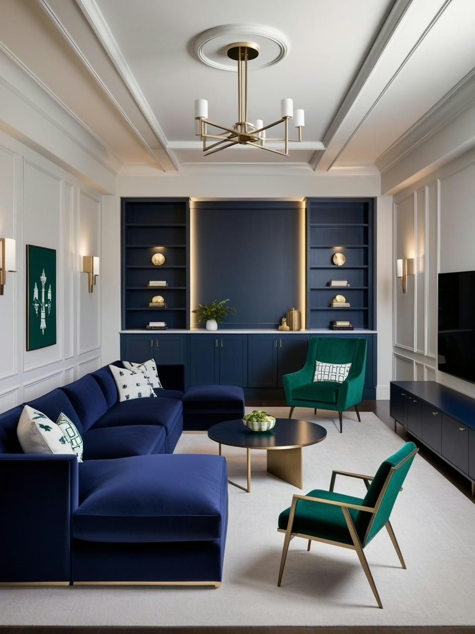
Castlecore Color Scheme #5: Navy Blue and Emerald Green
Remember how everyone used to say blue and green should never be seen? Well, after diving deep into color theory and countless experiments, I can tell you that’s one “rule” that definitely needs updating. Navy and emerald together? Pure magic – especially in a Castlecore context.
The Navy Blue Revelation
Here’s something fascinating about navy that I discovered through all my color testing adventures:
- Navy isn’t just a dark blue – it’s actually this amazing chameleon that can read either warm or cool depending on what you pair it with. Put it next to emerald green, and suddenly both colors come alive
- The real game-changer? Learning that navy walls don’t make a room feel smaller (I know, I was skeptical too!). Instead, they create this incredible depth that makes everything else in the room pop
- Different light sources completely transform navy. Natural daylight brings out its softer side, while evening lamp light makes it feel cozy and intimate
Emerald’s Supporting Role
Let’s talk about emerald green, because this is where things get really interesting:
- Unlike some other greens that can go a bit “jungle” on you, emerald has this inherent sophistication that perfectly matches navy’s vibe. Think of them as two old friends who bring out the best in each other
- Through some trial and error (okay, maybe a lot of error), I’ve found that emerald works best in fabrics and accent pieces when you’re working with navy walls
- The secret? Emerald doesn’t have to be super saturated to work. Sometimes a slightly muted version creates even more intrigue – who knew?
The Gold Factor
Adding gold to this mix isn’t just an option – it’s like the perfect seasoning that brings everything together:
- Warm metallic accents create these beautiful light points that dance between the navy and emerald. Think of them as little spotlights that highlight how well these colors play together
- I’ve found that mixing different gold finishes actually works better than keeping everything matching (and honestly, it’s way more interesting)
- Even small touches – a picture frame here, a lamp there – can tie the whole look together
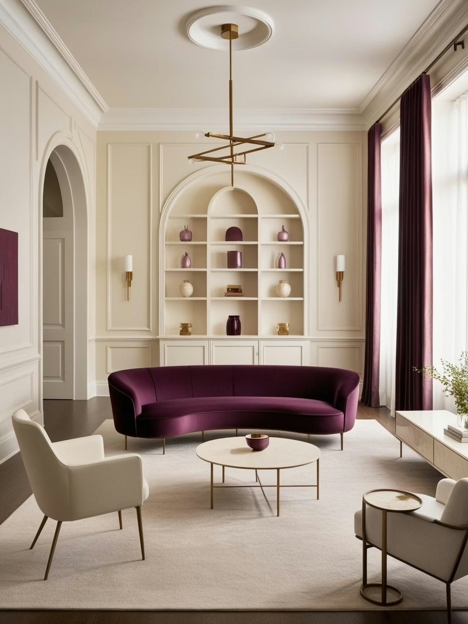
Castlecore Color Scheme #6: Plum and Ivory
Let’s chat about plum and ivory – a combination that kept popping up in my color experiments until I couldn’t ignore it anymore. You know how sometimes you discover a color pairing that just feels like it was meant to be? That’s this duo, especially when you’re aiming for that Castlecore vibe without going full dungeon-mode.
The Plum Surprise
Can we talk about plum for a minute? Because this color has some tricks up its sleeve:
- During my lighting experiments, I discovered that plum has this amazing ability to shape-shift throughout the day. Morning light brings out its warmer side, while evening light reveals these gorgeous deep undertones that feel incredibly sophisticated
- Here’s something unexpected – plum actually plays really well with existing wood tones. Those reddish-brown undertones create this subtle connection that makes everything feel intentional
- The biggest revelation? Plum doesn’t always need to be dark and moody. I’ve found some lighter versions that create the same rich feeling while keeping things airy
Ivory’s Secret Powers
Let’s clear something up about ivory – it’s not just “off-white”:
- Through various paint trials (and yes, maybe a few questionable choices), I’ve learned that ivory brings this incredible warmth that bright white just can’t match. It’s like the difference between harsh office lighting and the perfect table lamp
- When you use ivory for trim or wainscoting against plum walls, something magical happens. The contrast is strong enough to create drama but soft enough to feel timeless
- Mixing different ivory textures creates this subtle layered effect that adds so much depth without trying too hard
Pattern Play
Now here’s where things get really fun:
- Vintage floral patterns that incorporate both plum and ivory? They’re like the perfect mediator between these two colors. I’ve found they work especially well in smaller doses – think throw pillows or an accent chair
- Geometric patterns in ivory against plum walls create this modern edge that keeps the whole look from feeling too traditional. It’s all about balance
- Even simple stripes or dots can make a huge impact when you play with scale and placement
Your Shortcut to Effortless Luxury Resort Modern Style
12 refined color palettes designed to bring luxury, sophistication and harmony into your home.

Castlecore Color Scheme #7: Mustard Yellow and Rust Red
You know what’s funny about color combinations? Sometimes the ones that sound the most intimidating on paper end up being the most welcoming in real life. That’s exactly what happened during my experiments with mustard yellow and rust red – a pairing that initially made me raise an eyebrow but quickly became one of my favorite Castlecore discoveries.
The Mustard Mystery
Let me tell you something about mustard yellow that completely changed my perspective:
- After testing what felt like every shade of yellow under the sun, I discovered that mustard has this incredible warmth that somehow manages to feel both bold and cozy at the same time. It’s like that friend who’s confident but never overwhelming
- The real breakthrough came when I realized that mustard walls don’t actually make a space feel smaller – they create this amazing golden-hour glow that lasts all day long
- Here’s a fun discovery: mustard actually looks different on each wall of a room, creating this subtle movement that keeps things interesting without being chaotic
Rust Red’s Warm Welcome
Now, let’s talk about rust red because this color is full of surprises:
- Through various lighting experiments, I found that rust red has this chameleon-like quality – it can lean more orange in bright light and more brown in shadows, creating this amazing depth
- When paired with mustard, it creates this incredibly rich palette that feels like autumn in a medieval castle (but in a totally livable way)
- The key is finding rust reds that have a bit of brown in their base. Pure orange-reds can go a bit “pumpkin spice” – not exactly the Castlecore vibe we’re after
The Dark Wood Factor
Here’s where things get really interesting:
- Dark wood tones act like an anchor for these warm colors, keeping them from floating off into sunset territory. Think of it as the bass note in your color symphony
- I’ve found that mixing different wood finishes actually works better than trying to match everything perfectly – it adds this lovely lived-in quality that feels very authentic
- Even small touches of dark wood – picture frames, furniture legs, a side table – can help ground the whole look
Unlock Designer-Perfect Colors in Minutes
Browse my curated collection of interior color palettes—tailored for today’s most loved design styles.
How to Layer Castlecore Colors Effectively
Let’s talk about one of the most exciting parts of working with Castlecore colors – layering them together. After countless experiments (and yes, a few combinations that made me question my life choices), I’ve discovered that successful layering is less about rigid rules and more about understanding how colors interact with each other.
The Gradient Game
You know that satisfying feeling when colors flow naturally from one to another? Here’s what I’ve learned about creating that effect:
- Starting with your darkest shade and gradually moving lighter creates this beautiful visual journey. Think of it like going from deep burgundy to blush – each step tells part of the story
- The magic happens in the transitions. I’ve found that having at least three tones within each color family gives you enough variation to create real depth
- Here’s a fun discovery: when you work with gradients in the same color family, it’s almost impossible to mess up. The colors naturally want to play nice together
Texture: The Secret Weapon
Let’s chat about what really brings Castlecore colors to life – texture:
- Velvet has this amazing way of making colors look richer and deeper. But here’s the thing – you don’t need to velvet-bomb your entire space. Even small touches, like a pillow or ottoman, can create that luxe feeling
- Mixing materials isn’t just okay – it’s essential. Through trial and error, I’ve found that combining velvet, leather, and woven fabrics creates this incredible depth that makes every color look more expensive
- The real game-changer? Metallic textures. They’re like little spotlights that make every other texture in the room look better
The Neutral Factor
Here’s something that took me way too long to figure out:
- Neutrals in a Castlecore palette aren’t just space fillers – they’re more like the pause between sentences. They give your eyes somewhere to rest
- The key is using rich neutrals – think warm grays, deep taupes, and subtle metallics. They add to the story instead of just sitting there
- I’ve discovered that using neutrals strategically (like around windows or as trim) can actually make your bolder Castlecore colors look even more intentional
Ready to start your own Castlecore color adventure? Remember, the best part about experimenting with these rich, moody hues is that there’s no single “right” way to do it. The magic happens when you find the combinations that speak to you.
Curated Wall Art for Elegant Homes
Bring softness, texture, and intention into your home with digital wall art inspired by wabi-sabi, abstract forms, and muted watercolors. Every piece is crafted to create stillness and beauty—whether you’re styling a gallery wall or a minimalist nook.
Bring Your Castlecore Dreams to Life
You know what’s amazing about color? It’s probably the most powerful tool we have for transforming a space, and yet it’s also one of the most approachable. After diving deep into these Castlecore combinations, experimenting with different pairings, and seeing how they play out in various lighting conditions, I’ve come to appreciate just how versatile these rich, moody hues can be.
Here’s what I love most about working with Castlecore colors – they’re incredibly forgiving when you understand their basic principles. Whether you’re drawn to the drama of Gothic black and silver or the warmth of mustard and rust, these colors have a way of making spaces feel intentional and curated without trying too hard.
Remember, creating your perfect Castlecore palette isn’t about following strict rules or copying exact color codes. It’s about understanding how these colors interact, playing with different textures, and most importantly, trusting your instincts. Start small if you want – maybe with some velvet pillows in deep plum or a forest green accent wall. Watch how the colors change throughout the day. Notice how they make you feel in the space.
The best part? These colors have staying power. Unlike some trends that feel dated after a season, Castlecore colors have this timeless quality about them. They’re rich, they’re sophisticated, and they have this amazing ability to make both modern and vintage pieces look completely at home.
So go ahead – grab some paint samples, play with different textures, and start experimenting. Your perfect Castlecore color story is out there waiting to be discovered. And remember, sometimes the combinations that seem the most daring on paper end up being the ones that feel the most like home.
Ready to start your Castlecore color journey? Paint that wall, hang that tapestry, or simply add a few moody accessories. The castle of your dreams might be just a color swatch away.