Mastering Japandi Color Palettes: From Prison Chic to Perfect Zen

Listen, can we have a honest chat about Japandi color palettes? Because I need to tell you about the time I created what I thought was the perfect zen color scheme, only to have my client’s teenager walk in and ask if we were “going for prison chic.” Ouch! But you know what? That moment – and the mild panic attack that followed – taught me more about Japandi colors than all my years of Pinterest research combined.
Here’s the thing about creating the perfect Japandi color palette: everyone thinks it’s about finding the most sophisticated beige and calling it a day. (Spoiler alert: it’s not!) After countless client projects, multiple color disasters, and yes, that one time I had to repaint an entire living room at my own expense (we don’t talk about that one), I’ve finally cracked the code on how to create Japandi color palettes that feel both zen and alive.
What I’m about to share isn’t just theory or something I copied from a design book – these are real lessons learned from real spaces, real mistakes, and real victories. Whether you’re staring at your walls wondering if “greige” is actually a color or you’re ready to dive deep into the world of intentional neutrals, I’ve got you covered. Let’s turn your space into that serene sanctuary you’ve been dreaming of, without ending up in what I now lovingly call “50 shades of beige” territory!
Quick Tip: I included Color Codes throughout this article so you can easily create your own vision board using software like Canva and start visualizing your next Japandi Interior project.
Your Shortcut to Effortless Japandi Style
12 refined color palettes & implementation strategies designed to bring warmth, texture, and harmony into your home.
Cracking the Japandi Color Code
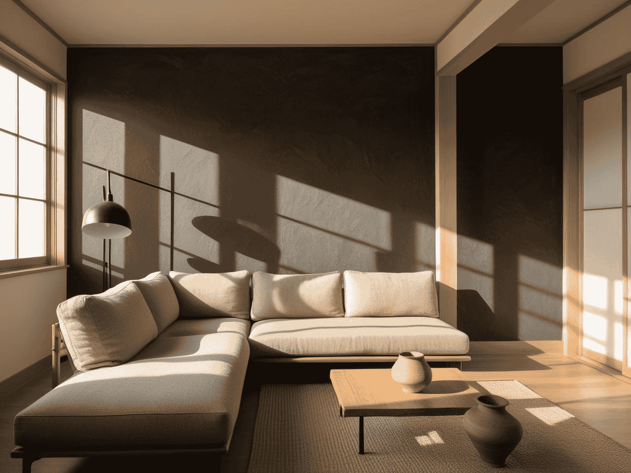
Let me tell you about my biggest Japandi color revelation – it happened in the most embarrassing way possible. Picture this: I’m standing in a client’s living room, confidently explaining why the “sophisticated greige” I chose was the perfect foundation for their Japandi dream space. Only problem? As the sun started setting, that supposedly perfect neutral turned into what can only be described as “sad oatmeal.” Total rookie move!
The Truth About Japandi Neutrals
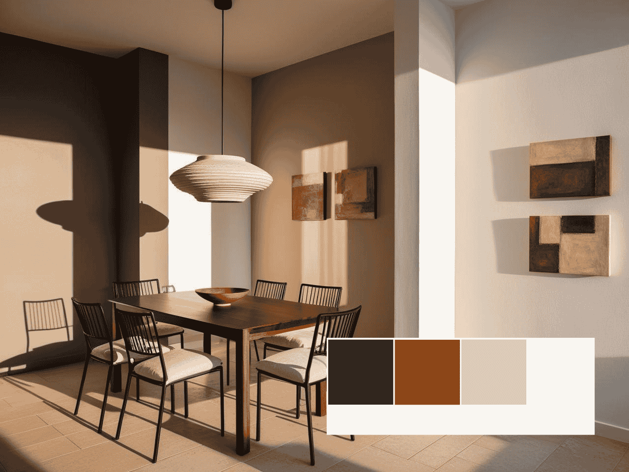
You know how everyone thinks Japandi is all about finding that perfect shade of beige? Well, plot twist: traditional Japanese design actually embraces deep, moody neutrals. Here’s my tried-and-true Japandi neutral palette:
- Deep Charcoal: #2A2A2A (like sumi-e ink paintings)
- Rich Cedar Brown: #8B4513 (inspired by aged Japanese temples)
- Warm Stone: #D3CEC7 (your perfect mid-tone neutral)
- Soft Rice Paper White: #F5F2EB (because stark white is too harsh)
I once had a client who was so nervous about using the deep charcoal that she made me paint a tiny test patch first. Two days later? She asked me to do the entire living room. Sometimes you just have to trust the process!
The Art of Color Theory Fusion
Here’s the game-changing realization that transformed my whole approach: Japanese and Scandinavian color theories are like two sides of the same coin. Japanese “shibui” meets Scandinavian “hygge” in this perfect balance:
- Base Layer: #2A2A2A (deep charcoal) or #D3CEC7 (warm stone)
- Secondary Tones: #F5F2EB (soft white) and #8B4513 (cedar)
- Accents: #B87333 (aged copper) or #8A9A5B (soft sage)
Pro tip: Layer these colors like you’re building a cozy Nordic sweater – start with your darkest shade and work your way up to the lightest.
The 60-30-10 Rule, Reimagined
Remember that “sad oatmeal” disaster I mentioned? It taught me to throw out the old rules and create new ones. Here’s my Japandi-specific 60-30-10 breakdown:
60% Main Color:
- Traditional Choice: #D3CEC7 (warm stone)
- Bold Choice: #2A2A2A (deep charcoal)
- Safe-but-not-boring Choice: #C2B8A3 (warm greige)
30% Secondary Color:
- Light Option: #F5F2EB (rice paper white)
- Mid Option: #A69F97 (fog grey)
- Dark Option: #4A4A4A (soft charcoal)
10% Accent:
- Natural: #8A9A5B (sage green)
- Warm: #B87333 (aged copper)
- Subtle: #D4C4B7 (pale eucalyptus)
One client nearly cried (happy tears!) when we flipped the standard ratios and used deep charcoal (#2A2A2A) as our 60%. The space went from “nice but boring” to “oh my gosh, how did you do that?” in one paint job.
Testing Your Colors Like a Pro
Here’s a sanity-saving tip I learned after that unfortunate oatmeal incident: Test your colors like you’re conducting a scientific experiment. Create large swatches (I’m talking at least 2×2 feet) and observe them:
- Morning light: Colors appear cooler and more forgiving
- Midday sun: True tones emerge
- Sunset: Warm undertones intensify
- Artificial light: The real test of your palette
The most successful Japandi spaces I’ve created all started with this rigorous testing process. Trust me, your future self will thank you for not skipping this step!
Want to know my secret weapon for testing colors? I take photos of my test swatches at different times of day and convert them to black and white. If the contrast looks good in grayscale, you’re golden in color. Game changer!

Building Your Perfect Base Palette
Okay, confession time: I once spent three hours convincing a client that white is white is white, and we should just pick one already. Plot twist? I was totally wrong! After that client politely (bless her) pointed out how different each white looked in her space, I dove deep into understanding base palettes. Let’s just say I learned some things that completely changed my Japandi game.
The White Wall Wisdom
Remember how I said I was wrong about white being just white? Well, grab your coffee because this is where it gets juicy. In Japandi design, your white choice sets the entire tone of your space. Here’s my current go-to white palette (learned through many, many sample pots):
- Pure Rice Paper: #F7F4ED (the perfect warm white that doesn’t go yellow)
- Soft Bamboo: #F0EBE3 (slightly warmer, amazing in north-facing rooms)
- Moonlit Snow: #F2F1EC (the coolest white I’ll use in Japandi spaces)
- Cloud Shadow: #E8E6E1 (my secret weapon for south-facing rooms)
Fun fact: I once used the wrong white (pure white – rookie mistake!) in a client’s meditation room, and it felt like being in a hospital. We switched to Rice Paper, and suddenly everyone was fighting over who got to use the space first!
The Dark Side of Neutrals
Here’s something that blew my mind: darker neutrals can actually make a space feel calmer than lighter ones. I know, right? Here’s my tried-and-true dark neutral palette:
- Aged Cedar: #3C2A21 (the perfect brown-black)
- Temple Stone: #4A4A4A (a rich charcoal that never feels heavy)
- Mountain Shadow: #535353 (the most versatile dark neutral I’ve found)
- Deep Earth: #2C2C2C (for when you want to get really bold)
Pro tip: I always tell my clients to think of dark neutrals like coffee – you can always add a little “cream” (lighter tones) to soften them, but starting too light is harder to fix!
The Art of Layering Tones
Let me tell you about the time I created what I thought was the perfect tonal palette, only to realize it looked completely flat. The missing ingredient? Depth variation! Here’s my foolproof layering formula:
Base Layer (60%):
- Light Option: #F7F4ED (Rice Paper)
- Dark Option: #4A4A4A (Temple Stone)
Middle Layer (30%):
- Light Spaces: #E8E6E1 (Cloud Shadow)
- Dark Spaces: #535353 (Mountain Shadow)
Detail Layer (10%):
- Light Accent: #F0EBE3 (Soft Bamboo)
- Dark Accent: #2C2C2C (Deep Earth)
Undertone Magic
Y’all, let’s talk about the day I discovered undertones could make or break a Japandi palette. I had this client who couldn’t figure out why her “perfect” neutral room felt off. Turns out, we were mixing warm and cool undertones like they were having a party! Here’s how to get it right:
Warm Base Options:
- #F0EBE3 (Soft Bamboo – slightly yellow undertone)
- #3C2A21 (Aged Cedar – red undertone)
Cool Base Options:
- #F2F1EC (Moonlit Snow – blue undertone)
- #4A4A4A (Temple Stone – blue undertone)
Pro tip that saved my behind multiple times: Never mix more than two undertone families in your base palette. I learned this after creating what I lovingly call “the rainbow neutral disaster of 2023” (spoiler alert: it was neither neutral nor Japandi).
The biggest game-changer in creating your perfect base? Understanding that Japandi isn’t about picking the safest option – it’s about creating intentional harmony. Sometimes that means going darker than you think, sometimes lighter, but always, always testing your colors in your actual space. Because trust me, what looks perfect on Instagram might look totally different in your living room at 4 PM on a cloudy Tuesday!
Unlock Designer-Perfect Colors in Minutes
Browse my curated collection of interior color palettes—tailored for today’s most loved design styles.

Adding Character Without Compromising Zen
Oh dear, let me tell you about the time I thought “adding character” to a Japandi space meant throwing in every earth tone I could find. Picture this: I had created what I thought was the most sophisticated neutral base (spoiler: it was giving “cardboard box chic”), and my solution was to add – wait for it – SEVEN different shades of brown. My client very politely asked if we were going for “zen office supply store.” Ouch! But you know what? That moment taught me everything about adding character the right way.
The Secret Sauce of Color Accents
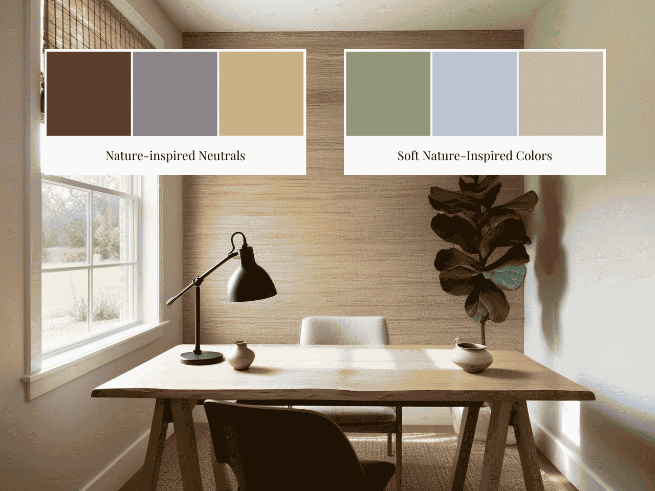
Here’s the thing about adding color to a Japandi space – it’s like seasoning a really good dish. Too much and you’ve ruined it, too little and why even bother? After my “fifty shades of brown” disaster, I developed this foolproof accent color palette:
Nature-Inspired Neutrals:
- Forest Floor Brown: #5C4033 (like aged pine needles)
- Stone Path Grey: #8B8589 (the perfect “is it grey or is it brown?”)
- Dried Grass: #C2B280 (adds warmth without screaming “look at me!”)
Soft Nature-Inspired Colors:
- Moss Touch: #8F9779 (my client favorite for 2023)
- Overcast Sky: #B8C5D6 (adds depth without breaking the zen)
- Morning Mist: #C4B7A6 (the most versatile accent ever)
Pro tip: Never use more than three accent colors in one space. I learned this after what I now lovingly call “The Rainbow Zen Incident of 2022” (trust me, it was neither zen nor pretty).
Texture as Your Color BFF
Y’all, can we talk about the day I discovered that texture could do the heavy lifting for color? Total game-changer! Here’s my texture-color combo guide:
Rough Textures (pair with):
- #E8E6E1 (Cloud White)
- #4A4A4A (Temple Stone)
- #8F9779 (Moss Touch)
Smooth Textures (pair with):
- #2C2C2C (Deep Earth)
- #C4B7A6 (Morning Mist)
- #B8C5D6 (Overcast Sky)
The “Almost Made a Mistake” Checklist
Listen, I’ve made every possible Japandi accent mistake so you don’t have to. Here’s what I call my “Is This Actually Going to Work?” checklist:
Red Flags:
- More than three accent colors in one view? Back away slowly
- Bright colors that don’t exist in nature? Probably not Japandi
- High contrast patterns? Save them for another project
Green Lights:
- Colors you’d find on a misty mountain morning
- Tones that look slightly faded or weathered
- Hues that make you want to take a deep breath
One client was so nervous about adding any color that her space looked like a gorgeous but slightly sad cloud. We added the tiniest touch of Moss Touch (#8F9779) through a textured throw and some dried grasses, and suddenly the whole room came alive. Sometimes it really is the smallest changes that make the biggest impact!
The Art of Natural Transitions
Remember my “fifty shades of brown” moment? Well, here’s what I learned about creating natural color transitions that actually work:
Base to Accent Formula:
- Start with your main neutral (let’s say Cloud White #E8E6E1)
- Add a mid-tone bridge color (Morning Mist #C4B7A6)
- Bring in your accent (Moss Touch #8F9779)
The secret? Each color should look like it could have naturally faded into the next. No jarring transitions, just smooth, zen-like flow.
Pro tip that saved my reputation more than once: Take a photo of your space in black and white. If any color jumps out at you in grayscale, it’s probably too bold for true Japandi style.
And here’s my favorite trick for when you’re not sure: Step back, squint your eyes, and look at your space. Everything should feel like it’s gently whispering rather than shouting for attention. Because at the end of the day, Japandi character is about creating a space that feels both interesting and peaceful – like a perfectly curated Japanese garden, where every element has its place but nothing screams for attention.

Seasonal Color Transitions in Japandi Style
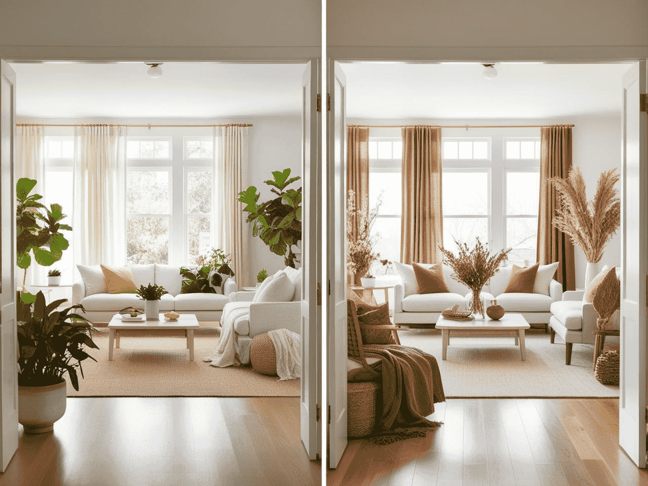
Okay, storytime! Last year, I had this client who was convinced she needed to completely redecorate every season to keep her Japandi vibe fresh. Her wallet (and partner) were not thrilled with this plan! After what I like to call “The Great Seasonal Intervention,” we figured out how to create a Japandi palette that could smoothly transition through the seasons without breaking the bank or causing relationship drama. Let me spill all the tea!
The Flexible Foundation Formula
First things first – your base colors need to be like that perfect white t-shirt that works all year round. Here’s my ride-or-die seasonal transition palette:
Year-Round Base Colors:
- Cloud Foundation: #F7F4ED (the perfect chameleon white)
- Grounding Stone: #4A4A4A (my favorite “goes with everything” charcoal)
- Neutral Bridge: #C4B7A6 (the seasonal transition superstar)
Fun fact: Pure white (#FFFFFF) as a year-round base will most likely make your winter space feel like “living inside a snowglobe that got too bright”.
Seasonal Accent Magic
Y’all, let me tell you about the time I cracked the seasonal accent code. It happened by accident when I was too lazy to change out all my client’s accessories (don’t judge) and discovered some colors actually work for multiple seasons!
🌼 Spring/Summer Accents:
- Fresh Bamboo: #91AA9D (spring to summer transition MVP)
- Morning Fog: #B8C5D6 (works from March through August)
- Sandy Beige: #C2B280 (summer neutral that doesn’t scream “beach house”)
🍁 Fall/Winter Accents:
- Moss Stone: #8F9779 (carries you from late summer through fall)
- Aged Cedar: #3C2A21 (perfect for adding winter warmth)
- Deep Earth: #2C2C2C (the winter accent that never fails)
Pro tip: Keep your main accent pieces in these colors, and you’ll only need to swap out a few small items to completely change the vibe!
The Textile Transition Trick
Remember that client who wanted to redecorate every season? Here’s how we saved her budget and her relationship – the textile swap strategy:
Summer Setup:
- Main: #F7F4ED (Cloud Foundation)
- Accent: #91AA9D (Fresh Bamboo)
- Texture: Raw linen and light cotton
Winter Warmth:
- Main: Same #F7F4ED (see? versatile!)
- Accent: #3C2A21 (Aged Cedar)
- Texture: Bouclé and heavy weave cotton
The secret? The colors stayed chill while the textures did all the heavy lifting!
The “Don’t Panic” Seasonal Switch
Here’s my emergency checklist for when clients text me in a panic about their space feeling “too summery” in winter or “too cozy” in summer:
Quick Fixes That Actually Work:
- Swap light textiles for deeper tones
- Change your botanicals (bright green to dried elements)
- Adjust your accent lighting (bright to warm)
Total budget? Usually under $200. Total impact? Looks like you hired a designer (which, I mean, you should, but that’s besides the point! 😉)
Remember my client who wanted to redecorate every season? We ended up creating what I call a “seasonal shift box” – a carefully curated collection of small decor items in our seasonal accent colors that she can swap out in about 30 minutes flat. Total game-changer! Her partner actually hugged me at our last meeting (and I’m pretty sure I saw their wallet doing a happy dance too).
The biggest lesson I’ve learned about seasonal transitions? It’s not about reinventing your space every three months – it’s about creating a flexible foundation that can handle a few strategic tweaks. Because let’s be real, nobody has time (or money) to completely redecorate four times a year. And honestly? The best Japandi spaces are the ones that feel intentional and lived-in, not like they’re trying too hard to chase every seasonal trend.
Curated Wall Art for Elegant Homes
Bring softness, texture, and intention into your home with digital wall art inspired by wabi-sabi, abstract forms, and muted watercolors. Every piece is crafted to create stillness and beauty—whether you’re styling a gallery wall or a minimalist nook.
The Bottom Line: Your Japandi Color Journey Starts Now
Remember that teenager who called my design “prison chic”? Well, six months later, I ran into her at a local coffee shop. Know what she said? “My room still feels like a hug every time I walk in.” And honestly? That’s exactly what a well-executed Japandi color palette should do – it should feel like your space is giving you a calm, confident hug.
Here’s what I really want you to take away from all this: Creating your perfect Japandi color palette isn’t about following rigid rules or copying someone else’s “perfect” neutral space. It’s about finding that sweet spot where tranquility meets personality, where calm meets character, and where YOUR version of zen comes to life.
Start small if you’re feeling nervous (maybe don’t do what I did and paint an entire open-concept space in an untested color!). Test your colors, trust your gut, and remember – even design professionals sometimes end up with “sad oatmeal” walls. The difference is, we learn from it, laugh about it, and then create something even better.
Ready to start your Japandi color journey? Grab those paint samples, pull out your favorite throw pillows, and let’s create something beautiful together. And hey, if you hit any bumps along the way? Just remember: even prison chic can be fixed with the right color palette! 😉
Want more cozy design inspiration? Drop a comment below with your biggest Japandi color questions or share your own color journey stories. Because trust me, we’ve all been there, and the best design discussions happen when we keep it real!