
Designing Your Own Knit: When a Hobby Becomes a Creative Practice
On the moment following someone else's pattern stops feeling like enough.
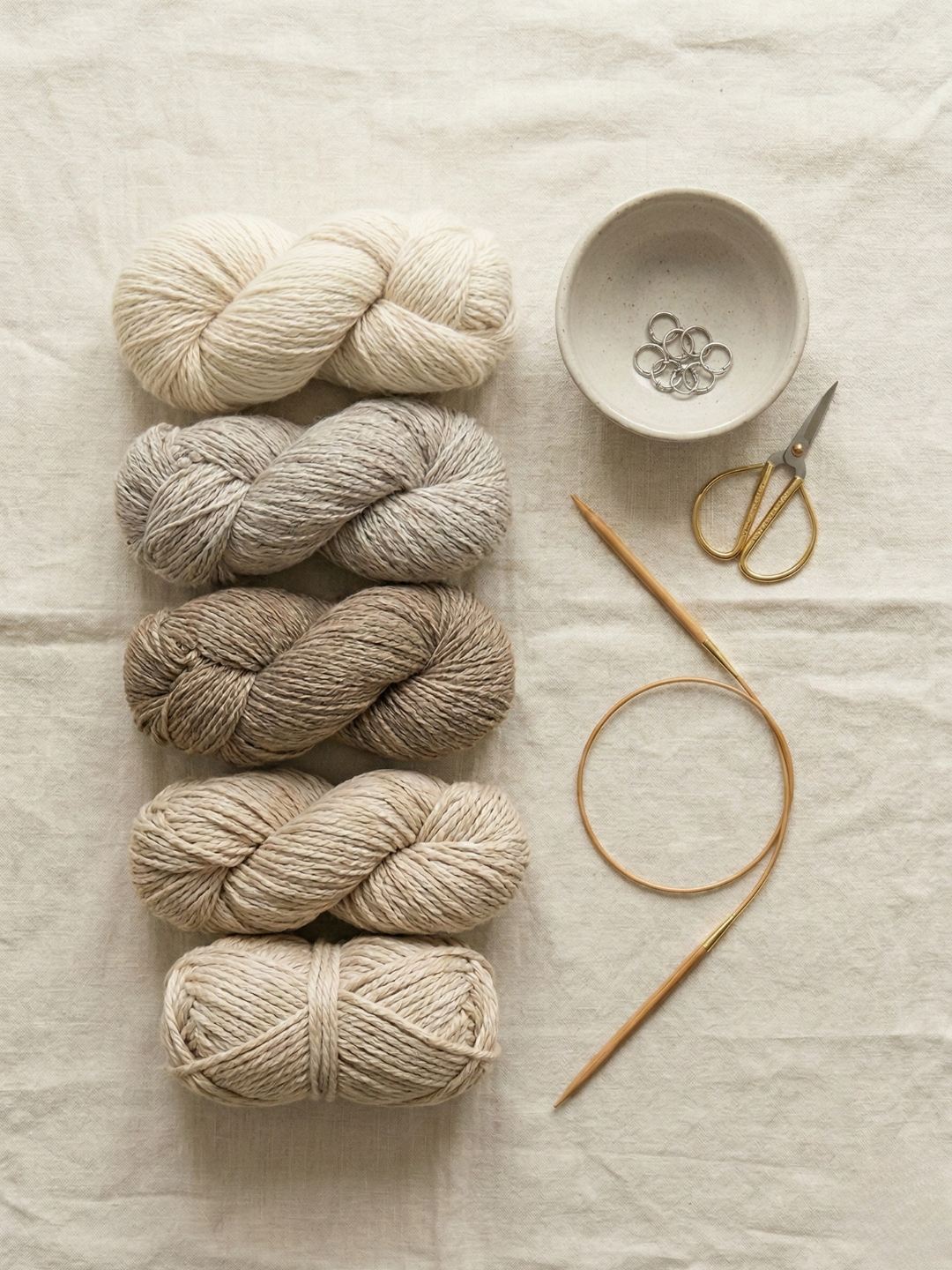
Why I Only Knit With Natural Fibers
How knitting with natural fibers changed the way I think about getting dressed.

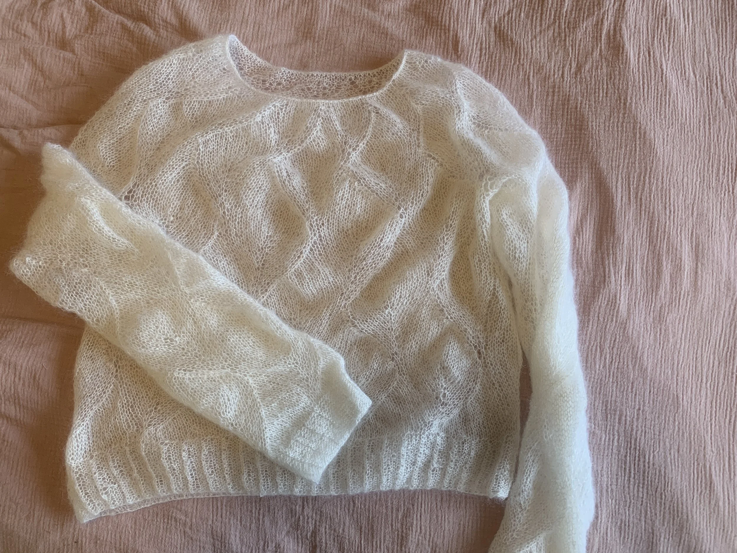
Starting With a Pattern That Was Too Hard
Why I started my first ever knitting project with a pattern that was way too hard.
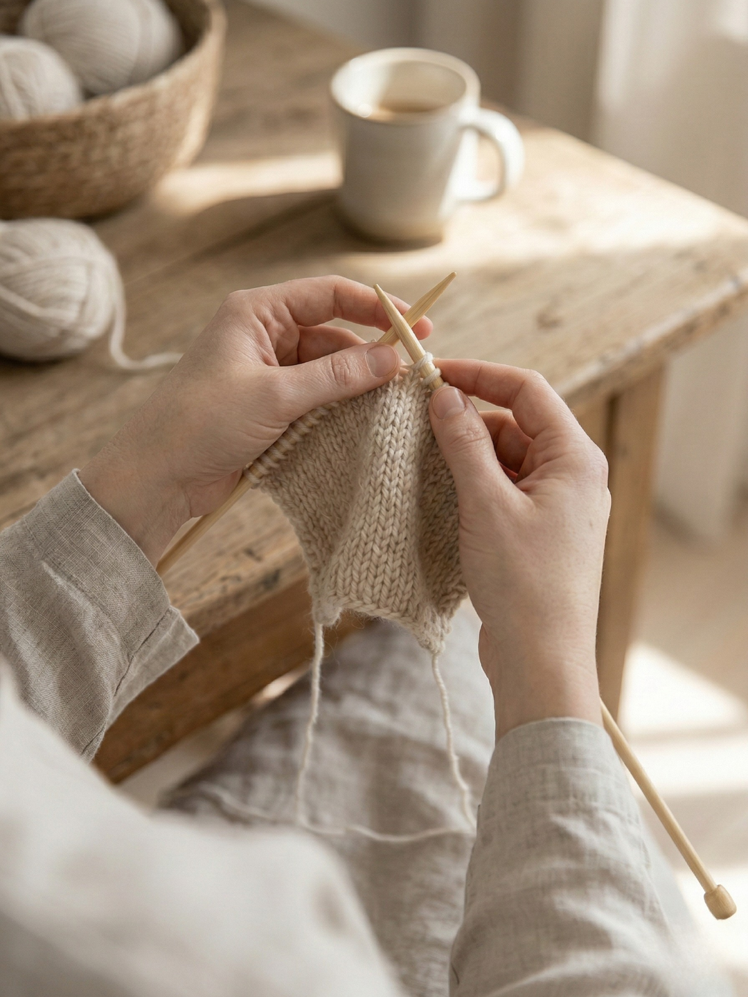
Knitting as Rest: How Making Something Saved Me From Doing Everything
On being someone who can't sit still, and what finally made rest feel possible.
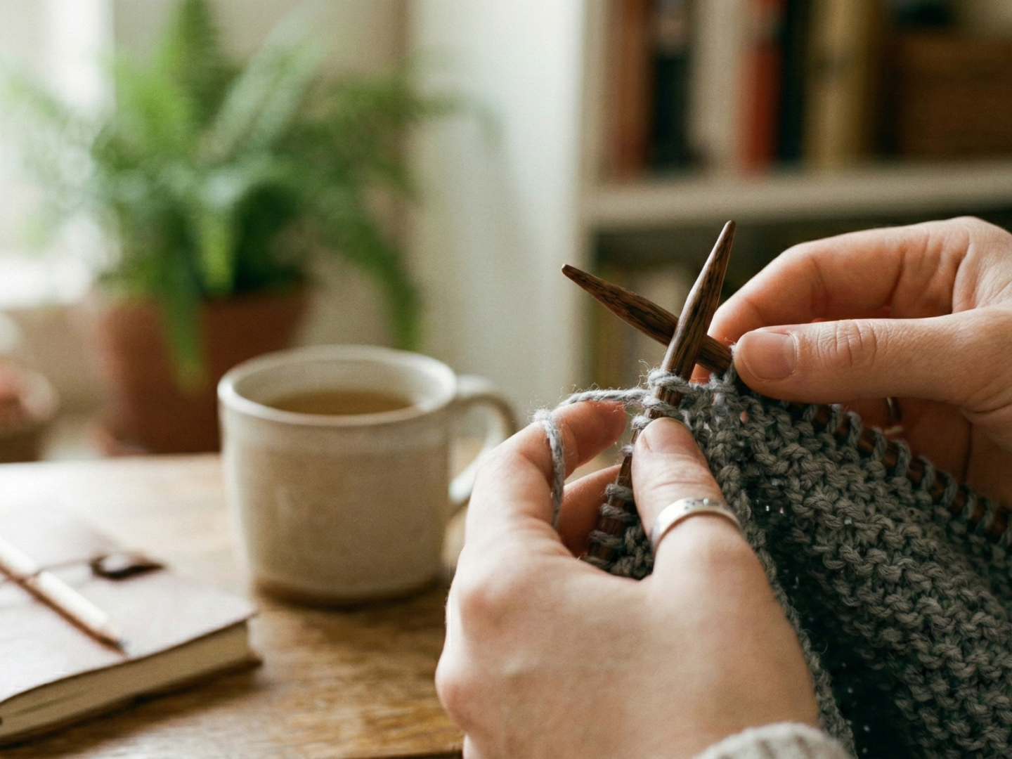
Why I Started Knitting (And Why I'll Never Stop)
How picking up knitting needles during burnout turned into the most important creative practice of my life.
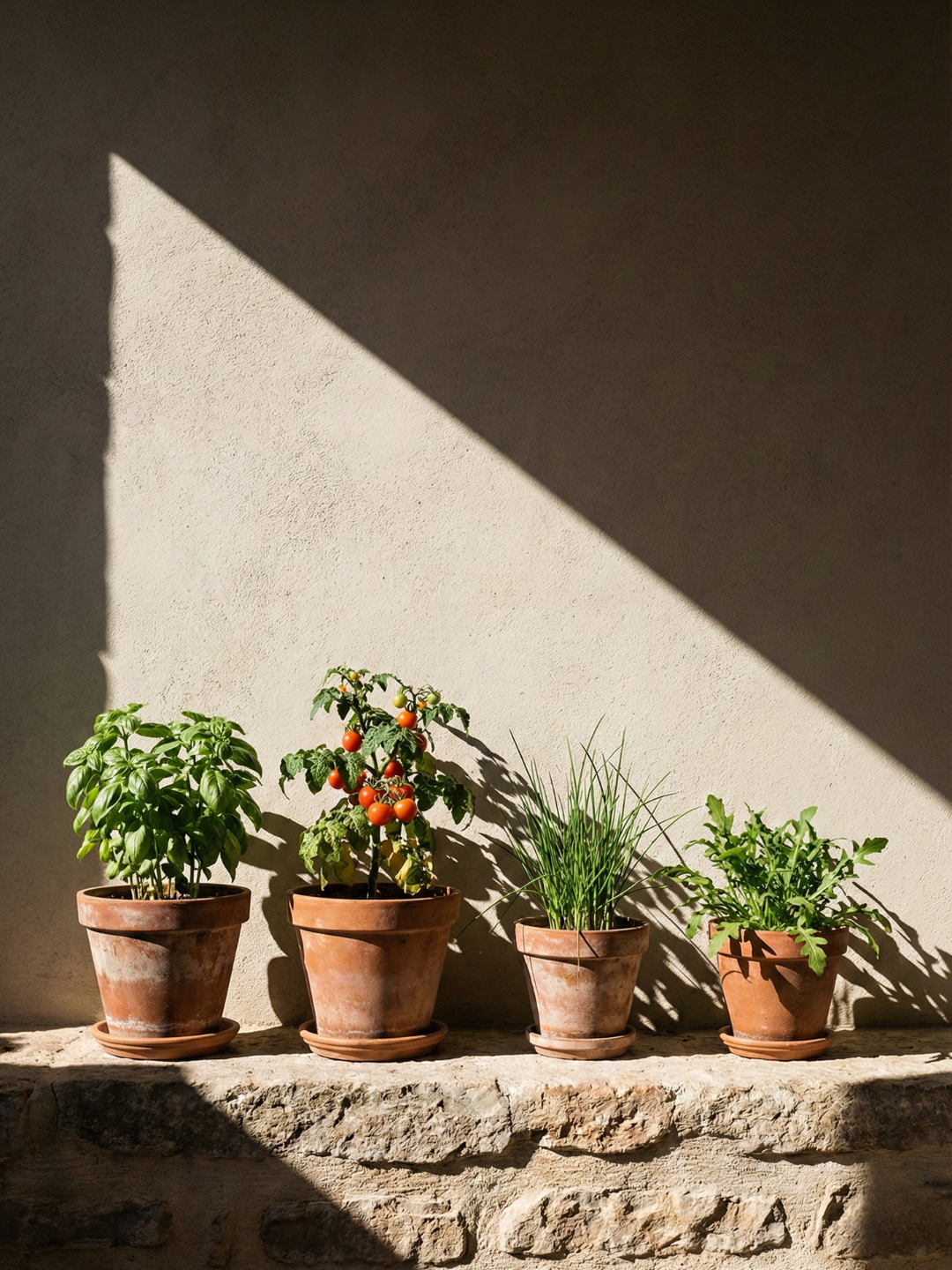
Starting Small with your Veggie Garden
My experience with avoiding the "overwhelm" of a massive garden and focusing on the first few pots.

The Value of the Home Harvest
My perspective on the difference between supermarket produce and the food I grow myself.

My Move to the Garden
The personal reasons I chose to start growing my own food and what it has added to my life.
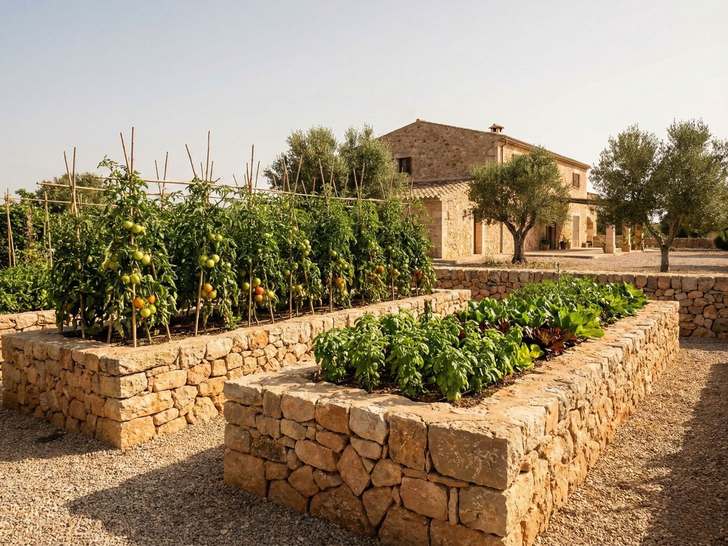
Why I Started Growing My Own Food
The reasons I started growing my own vegetables and how I got started.
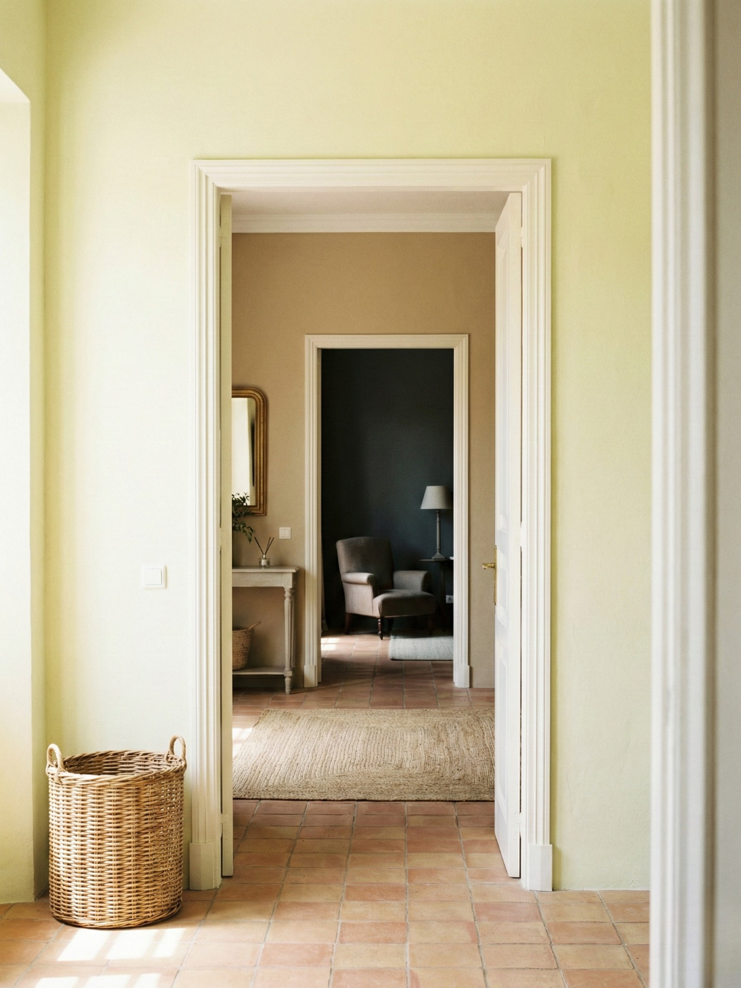
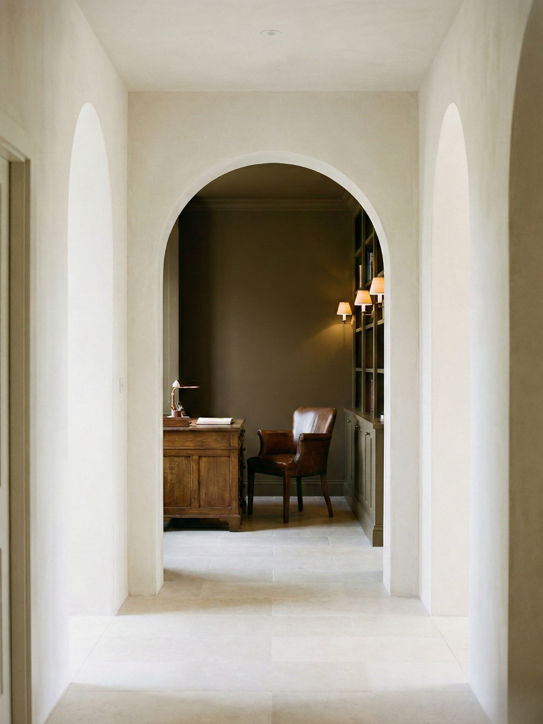
Transitioning Between Spaces: Color Flow
My experience with maintaining a narrative as you move from "Light" to "Dark" rooms.

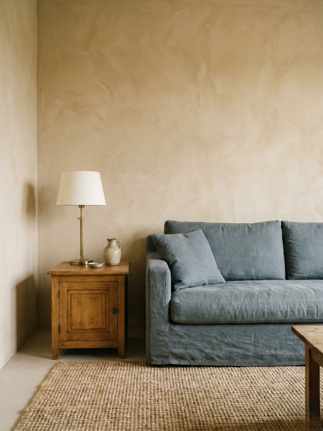
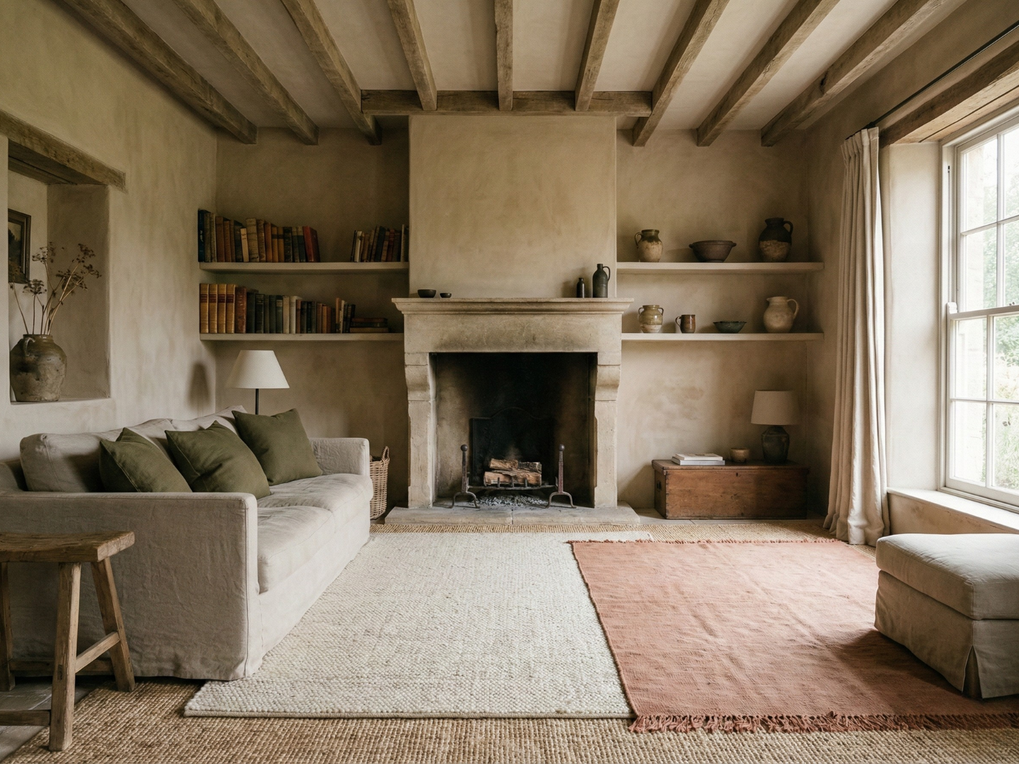
Color as an Architectural Tool in Your Home
Using pigment to highlight or hide structural features of a room.
The Psychology of a Resolved Home Paint Palette
A technical look at why mixing temperatures often fails and how I fix it.
Balancing Warm and Cool Undertones in Your Home
A technical look at why mixing temperatures often fails and how I fix it.
My Approach to the Baseline Tone for a Home
How I select the primary color that anchors every other room.
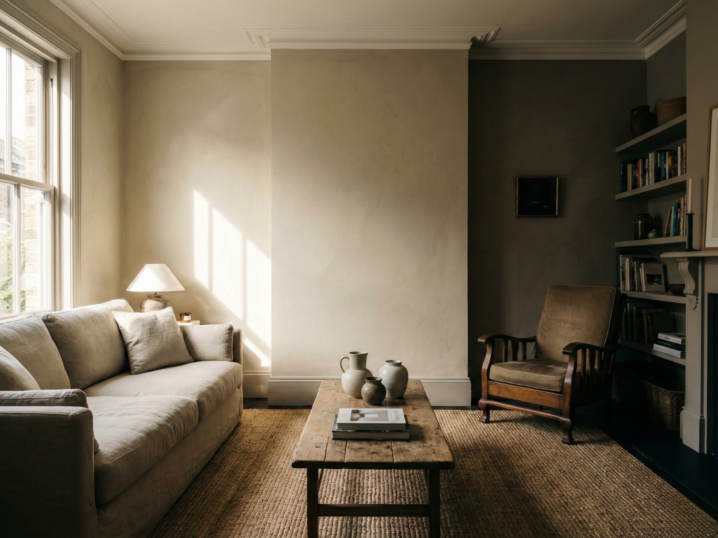
The Logic of a Unified Home Color Palette
The strategy of creating a cohesive color story throughout a home.
Defining Your Personal Hosting Rituals
A guide to establishing consistent traditions that ground your events.
Hosting as a Creative Expression
My experience with using an evening as a canvas for taste and personal style
The Aesthetics of Social Connection
A logical look at how interior style influences the way people interact.

Balancing Intentionality with Ease in Hosting
How I avoid the "over-hosted" feeling by focusing on invisible preparation
My Approach to the "Resolved" Evening
Defining what success looks like when curation meets hospitality