
The Guest Journey: A Narrative Approach
Designing a hosted evening through the eyes of the guest, from the first invitation to the departure.

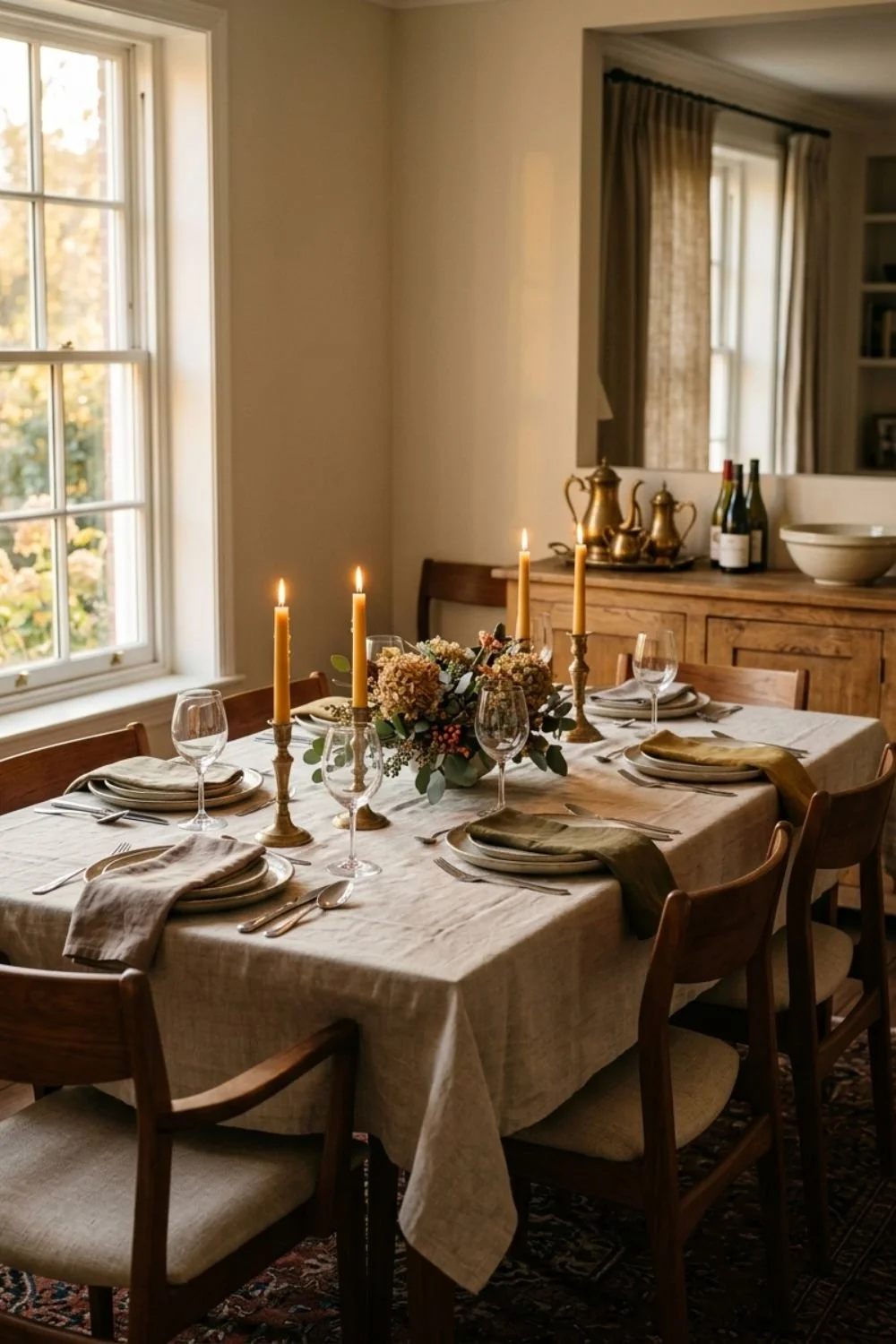
The Psychology of the Welcome in Hosting
Why the first five minutes dictate the energy of the entire night in hosting.

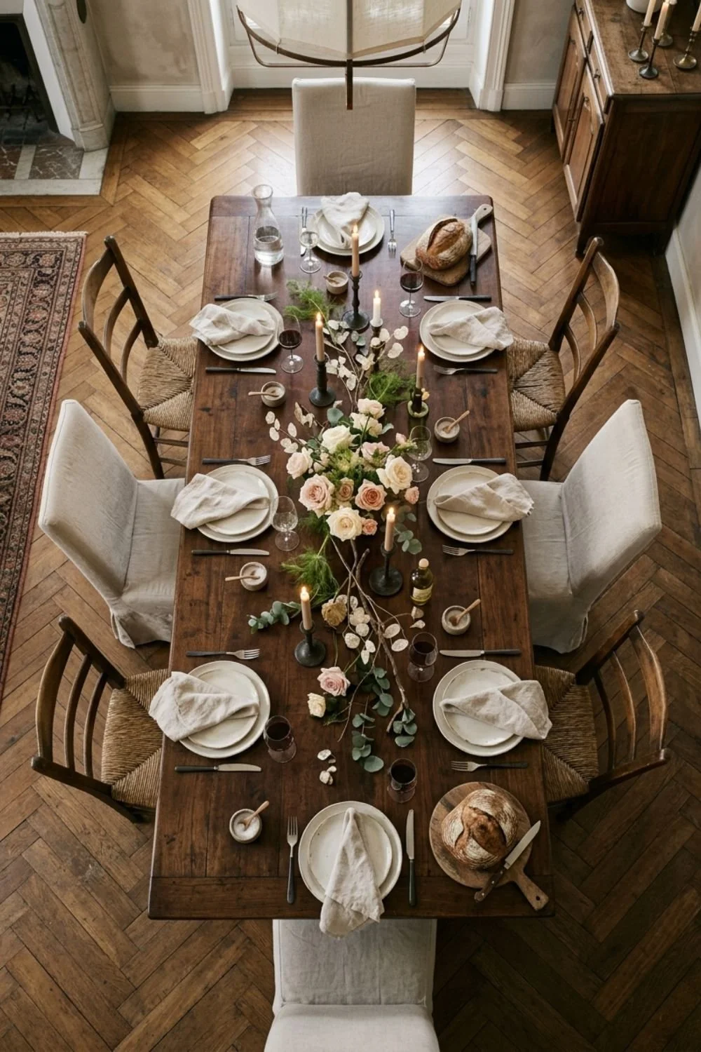
The Social Geometry of the Guest List
My hosting approach to curating a group that creates a balanced and interesting room.
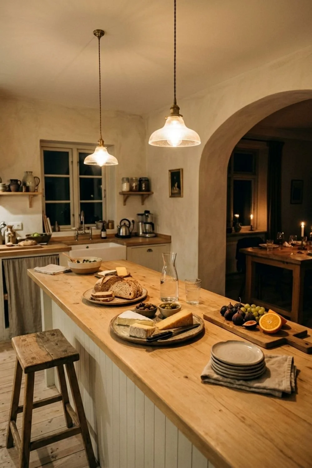
Designing for Comfort and Discovery in Hosting
How I use the layout of a home to encourage guests to move and explore.

Managing the Energy and Pace in hosting
A technical guide to reading the room and knowing when to shift the mood in hosting.
Hosting: The Art of the Graceful Conclusion
My experience with ending an evening without it feeling abrupt or forced in hosting.
Bridging Different Design Eras in Your Home
A logical look at pairing historical furniture with contemporary lines in interior design.
Harmonizing Styles Through a Unified Color Story in Your Home
How a disciplined palette acts as the bridge between furniture of different periods in interior design.
The 80/20 Rule for Aesthetic Balance in Home Design
My approach to establishing a dominant style while allowing for a 20% "experimental" mix in home styling.
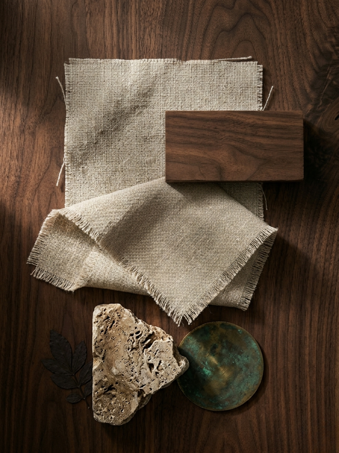
Materiality as a Connecting Thread in Home Styling
Using repeating textures like specific woods or metals to ground a diverse room.
Navigating Visual Tension and Contrast in Home Styling
Managing the friction between "Rough" and "Refined" styles to create interest in interior styling.
The Strategy of Mixing Interior Styles
How to combine disparate design languages into a single, cohesive narrative.
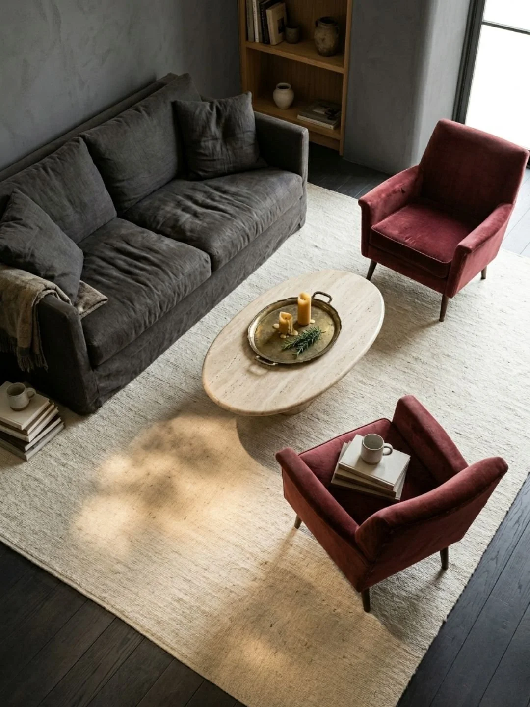
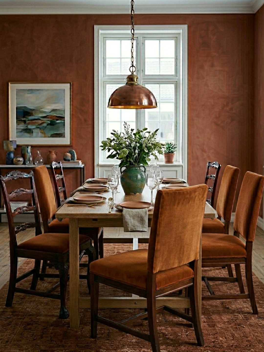
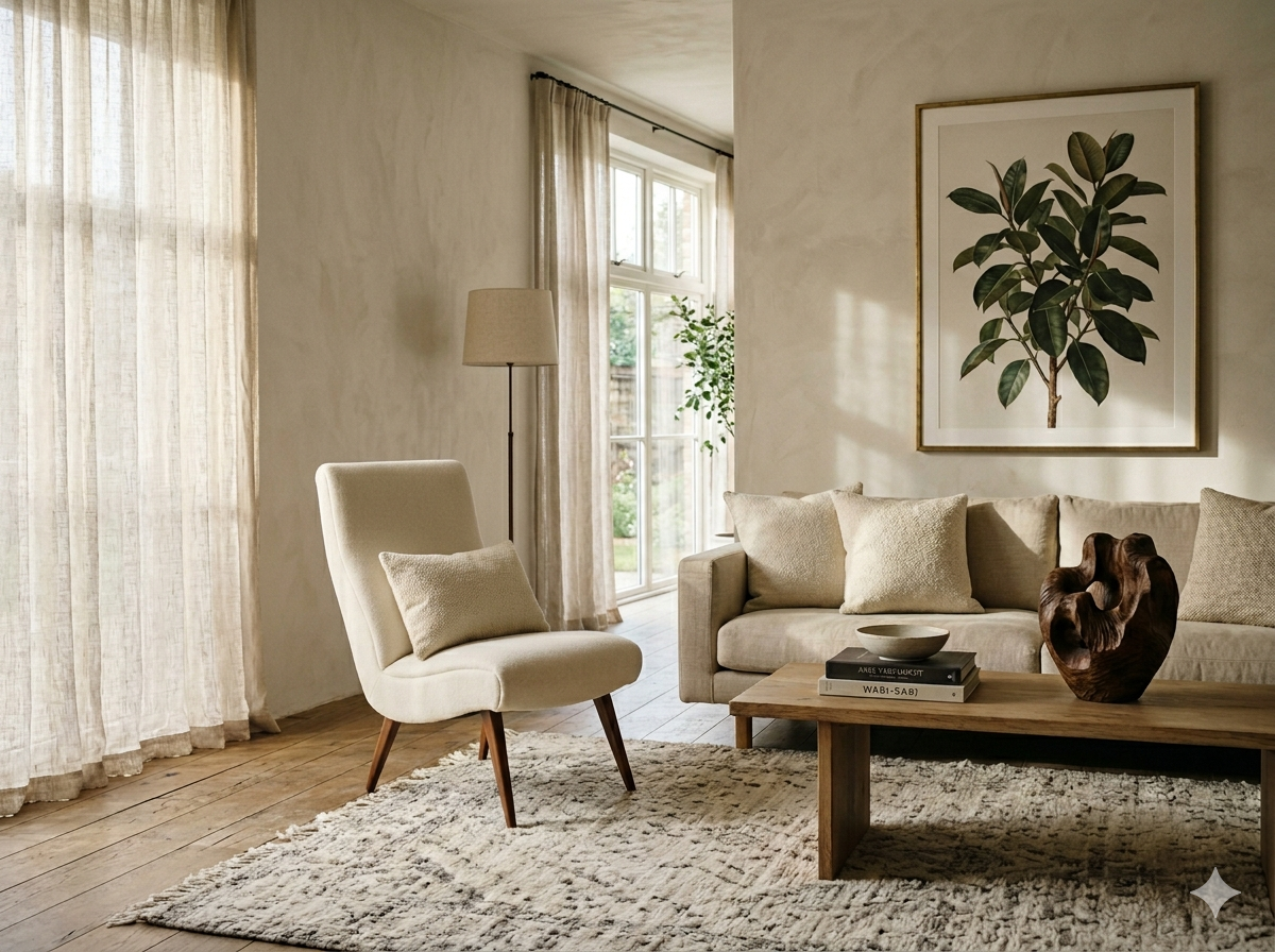
The Geometry of Social Seating in Home Styling
Seating arrangements aren't about capacity. They're about geometry, and why distance, angle, and a natural center determine whether a room invites conversation.
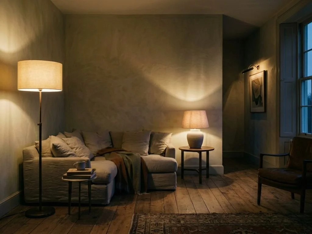
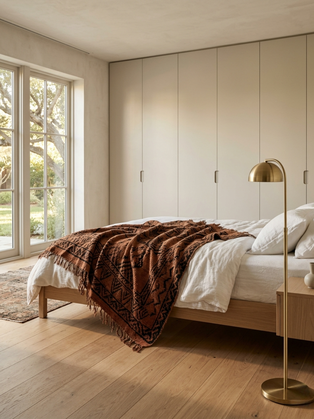
Using Light to Define Atmosphere in Your Home
Why lighting a room for function leaves it flat, and how layered light, contrast, and deliberate shadow turn a space from adequately lit into alive.
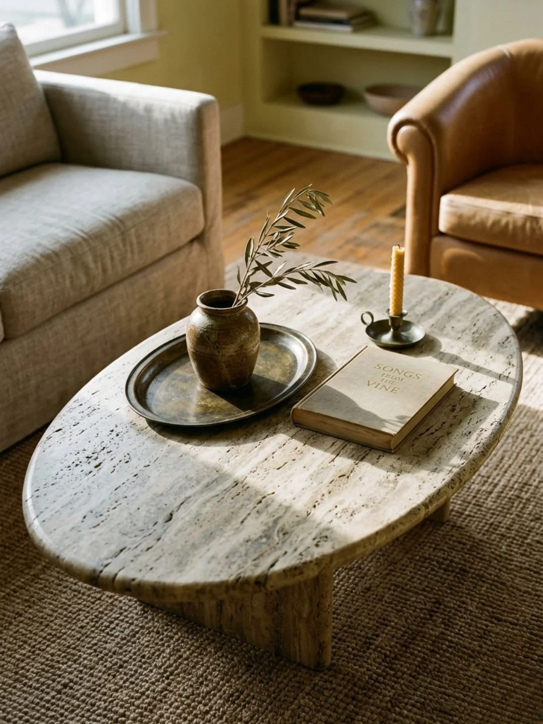
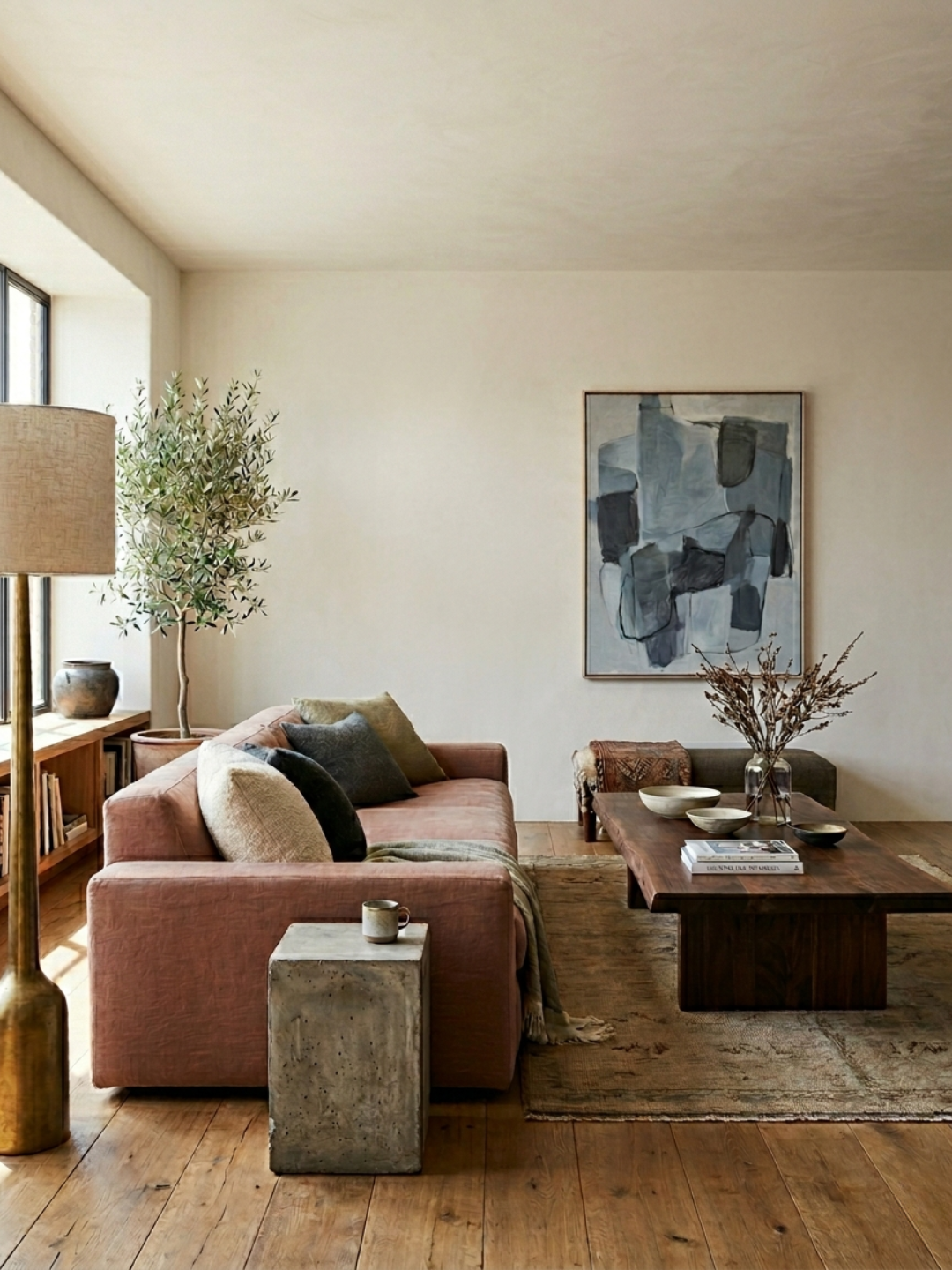
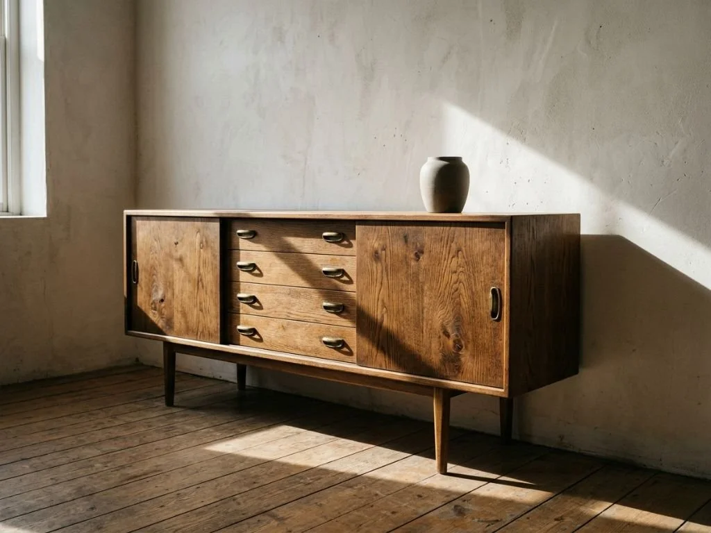
Selecting the Primary Anchor Piece for a Room
Every well-designed room has one piece doing the expressive work. Why hierarchy, not minimalism, makes a space coherent, and how to choose the right anchor.
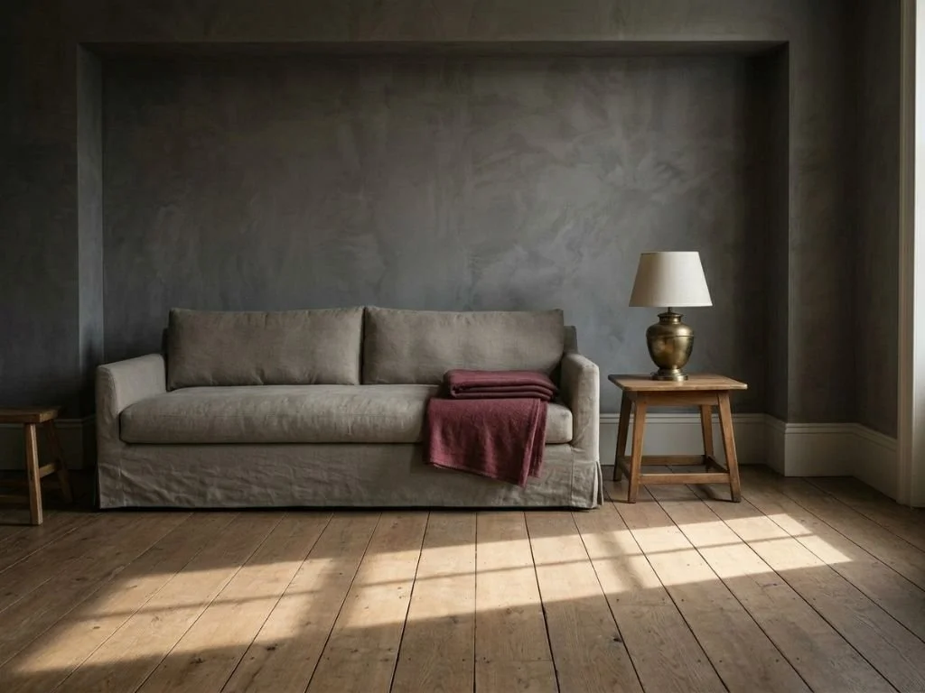
Mastering Balance in Room Layout
Balance isn't symmetry. Why visual weight, height variation, and negative space matter more than matching, and how to redistribute a room until it resolves.
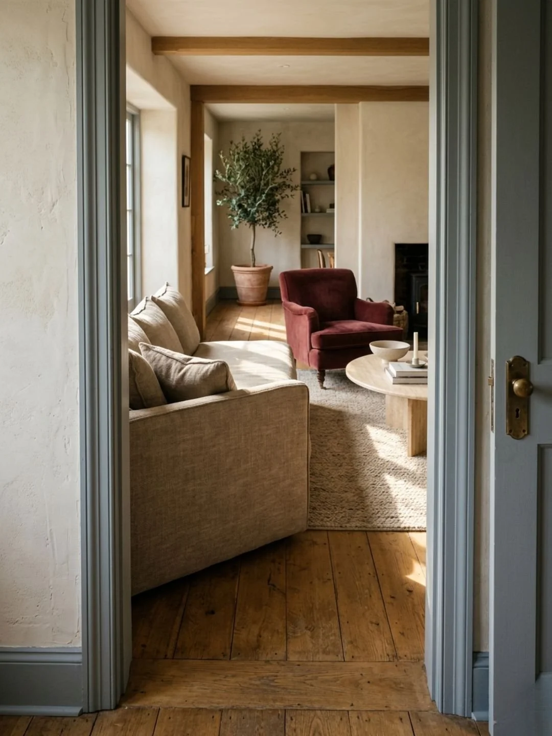
Designing for Flow and Movement in Your Home
Furniture that ignores how you actually move through a room makes the space feel awkward. How to map natural pathways before you arrange a single piece.
The Essentials of Spatial Composition and Light
Why carefully chosen furniture in the wrong arrangement still falls flat, and the spatial principles that finally make a room resolve.
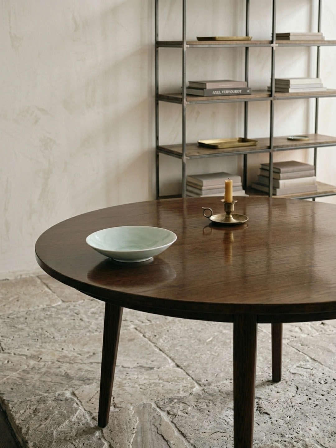
Sourcing for Longevity in Interior Design
How to vet the quality of materials before purchasing.
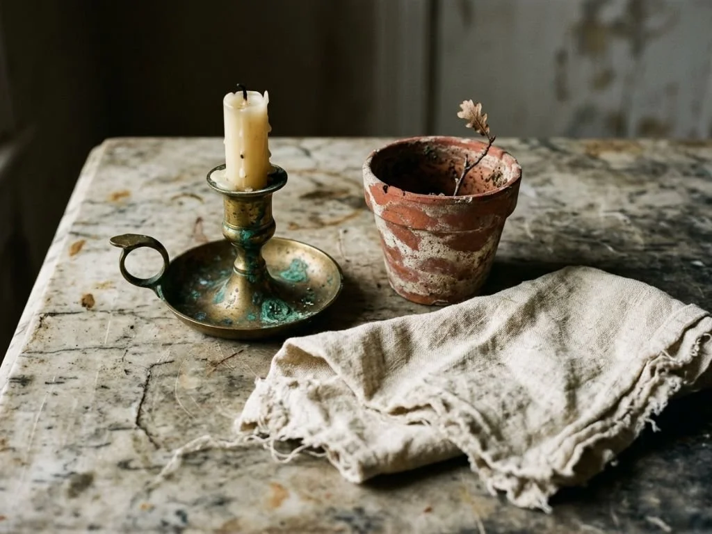
The Role of Patina in Home Décor
Why aged finishes and "living" materials (like unlacquered brass) add depth that new items can't.