Color Psychology: How to Create Color Flow Between Rooms
Did you know that 78% of home buyers make their decision within the first 10 seconds of entering a home? That’s why creating a seamless color flow between rooms isn’t just about aesthetics – it’s about crafting an experience! I’ve spent years helping homeowners transform disconnected spaces into harmonious havens, and I’m excited to share my proven strategies with you. Whether you’re tackling a complete home makeover or just refreshing your space, mastering color flow will give your home that professional, put-together feel you’ve been dreaming of.
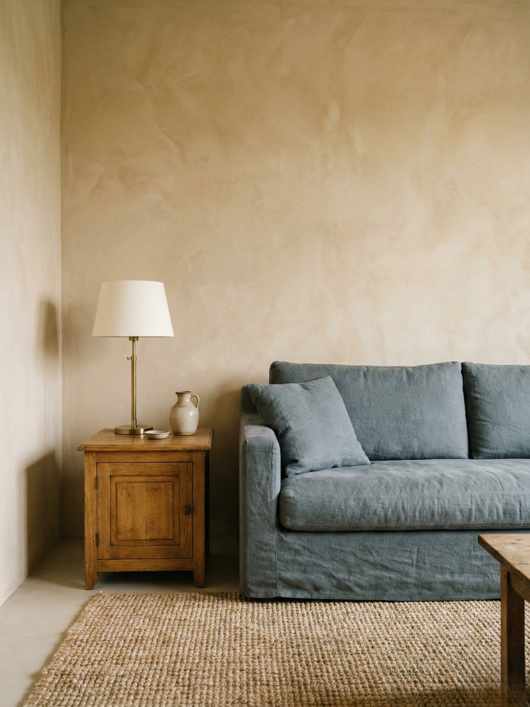
Understanding color psychology in interior design is foundational for creating impactful spaces. The way colors affect your home’s mood can transform any room’s atmosphere. By mastering the interior design color wheel principles, you’ll learn to balance warm vs cool colors in interior effectively. Whether you’re seeking colors to make a room look bigger or creating perfect color flow between spaces, strategic color selection is key.
Understanding Color Flow Fundamentals
Let me tell you about one of my learning experiences – it was back when I was helping my sister with her first home. Boy, did we mess up! We picked this gorgeous deep blue for her living room without considering how it would look next to her sunny yellow kitchen. Talk about a jarring transition! That experience taught me that understanding color theory isn’t just some fancy designer talk – it’s super practical stuff.
Here’s what I’ve learned about color flow over the years: it all starts with understanding undertones. You know how sometimes a white paint looks perfect in the store but then looks totally different in your home? That’s because every color has hidden undertones that can either make or break your color flow. I always tell my clients to look at their paint samples during different times of the day – morning, afternoon, and evening. It’s amazing how different a color can look when the sun hits it just right.
Let’s talk about the 60-30-10 rule, which honestly saved my behind more times than I can count. Think of it like a recipe: 60% of your space should be your dominant color (usually walls), 30% for your secondary color (like furniture or cabinets), and 10% for those fun accent pieces. When you’re working with color flow between rooms, this rule becomes your best friend because it helps you maintain balance while still giving each room its own personality.
One thing that really trips people up is lighting. I remember working on this gorgeous Victorian home where we used the exact same paint color in two connecting rooms, but they looked completely different! The north-facing room looked cool and almost bluish, while the south-facing room had this warm, golden glow. That’s when I learned about Light Reflectance Values (LRV) – it’s basically a measure of how much light a color reflects. Higher LRV means more light bounce, which can really affect how colors transition between spaces.
When it comes to color schemes, I’ve found that analogous colors (ones that sit next to each other on the color wheel) are usually the safest bet for creating smooth transitions. But here’s a pro tip I learned the hard way: don’t just rely on the color wheel – look at the undertones! I once had this client who wanted to use three different greens in connecting rooms. Sounds safe, right? Well, one had a blue undertone, one had a yellow undertone, and one had a gray undertone. It was like they were fighting with each other!
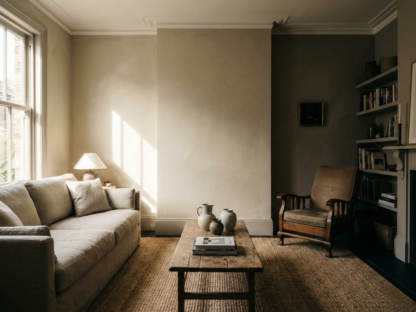
Something that’s often overlooked is the psychological impact of color transitions. You want your color flow to guide people through your home naturally, not shock them at every doorway. I learned this principle while working on a spa project – we used subtle color shifts to create this amazing sense of calm as you moved through the space. The key was using colors with similar intensity levels, even when we changed the actual hues.
And let’s talk about texture for a minute, because it plays a huge role in how we perceive color. I made the rookie mistake once of using the same color but different paint finishes in connecting rooms – flat in one room and eggshell in another. Even though it was technically the same color, the difference in how the light reflected made them look totally different! Now I always consider the finish as part of my color flow strategy.
Planning Your Whole-Home Color Strategy
Let me share something that changed my whole approach to color planning. Years ago, I was working on this beautiful craftsman home, and I kept getting overwhelmed by trying to pick colors room by room. Then it hit me – I needed to step back and look at the whole house as one canvas! That’s when I started using what I call the “helicopter view” approach to color planning.
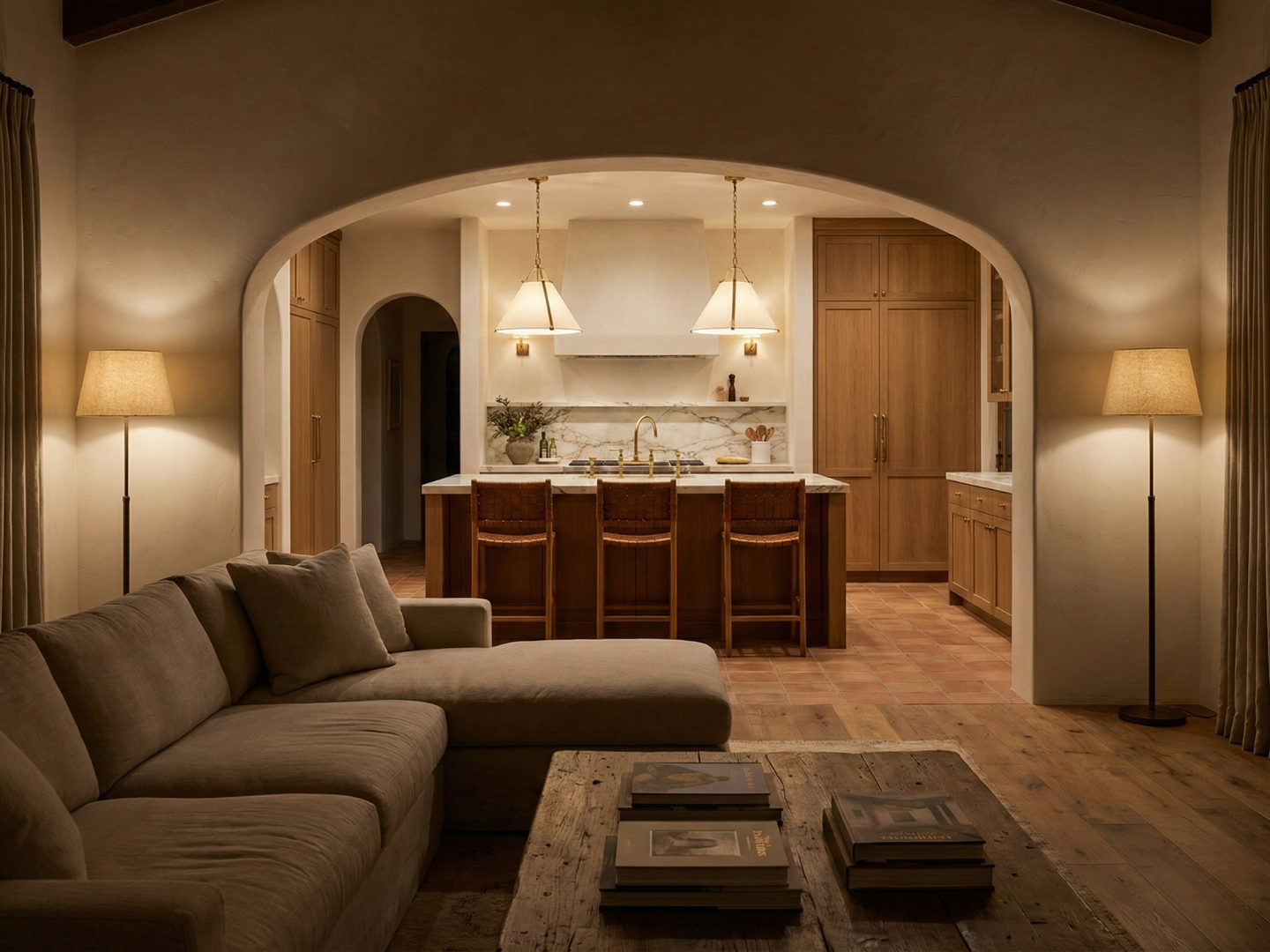
First thing I do now is create a color map, and trust me, it’s not as fancy as it sounds. I literally draw a rough floor plan and mark all the spots where one room is visible from another. This was a game-changer for one of my clients who had this tricky open floor plan where you could see five different spaces from the front door! We used this map to make sure each color transition made sense from every angle.
Here’s a pro tip about choosing anchor colors that took me way too long to figure out: start with your largest or most important room first. I had this client who was dead set on starting with their powder room color (it was this gorgeous deep emerald), but trying to build a whole-house color scheme around a tiny room was like trying to accessorize an outfit around your socks! Instead, we picked a beautiful warm greige for their open-concept living area and used that as our anchor color.
Speaking of anchor colors, let’s talk about the “can’t change” elements in your home. You know, those things like granite countertops or hardwood floors that aren’t going anywhere. When I helped my friend pick all these cool-toned grays for her walls, we were completely forgetting about her warm oak floors. The result? The floors looked orange in comparison! Now I always tell people to pull their paint colors from their fixed elements first.
When it comes to building a cohesive color palette, I’ve developed what I call the “string of pearls” technique. Imagine each room color as a pearl on a string – they don’t have to match exactly, but they should complement each other in a way that makes sense. For example, in a recent project, we started with a soft warm gray in the entryway, moved to a greige in the living room, then to a warmer taupe in the dining room. Each color had just enough of the previous color’s undertone to create this beautiful flow.
One mistake I see people make all the time (and yes, I’ve done it too!) is forgetting about sight lines. I once had this client who chose a bold red for their dining room without considering that you could see it from their serene, spa-like master bedroom. Talk about a mood killer! Now I always walk through the entire house and stand in doorways, making notes about which colors will be visible from where.
Here’s something that might surprise you – your home’s architecture can actually guide your color choices. I worked on this colonial-style home where we used deeper colors in the formal spaces at the front of the house, then gradually lightened the palette as we moved toward the more casual family spaces in the back. The color transition perfectly matched the transition in formality, and it felt so natural you barely noticed it happening.
And don’t forget about lighting when planning your color strategy! Natural light is like a mood ring for paint colors – it changes everything. I remember this one project where we had to adjust our entire color scheme because we didn’t account for how the afternoon sun would blast through these gorgeous west-facing windows. Now I always visit homes at different times of day before finalizing any color decisions.
Professional Techniques for Room-to-Room Transitions
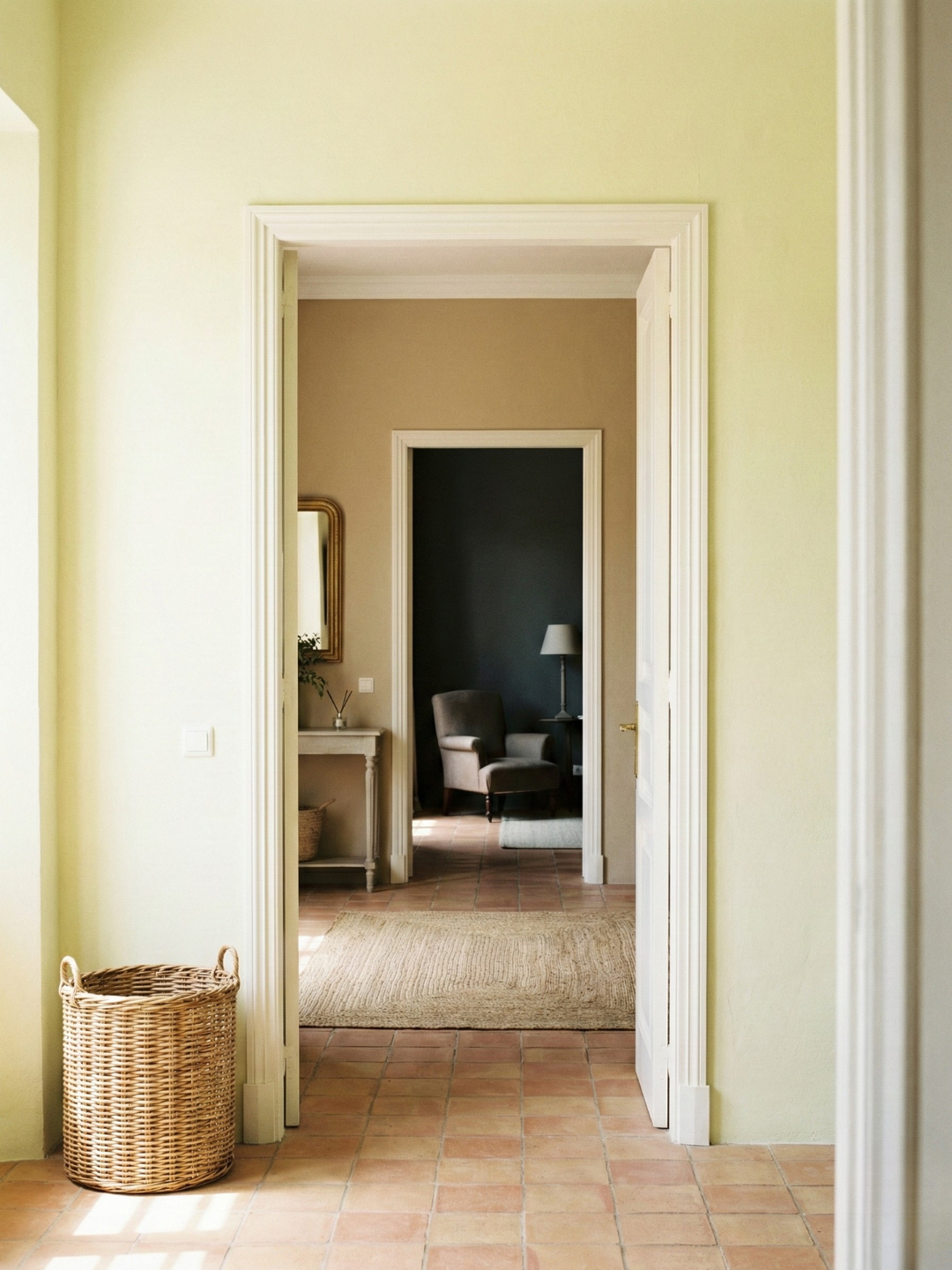
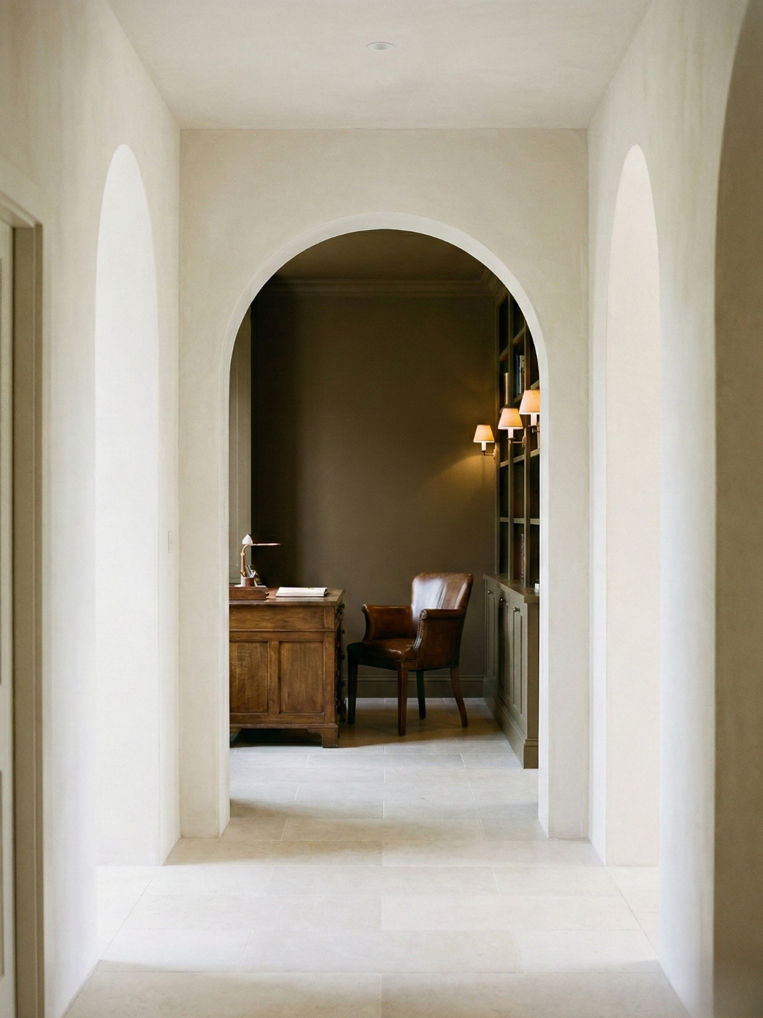
Let’s talk about neutral transition spaces, because they’re like the secret sauce of good color flow. I learned this trick from a massive mistake in my own home. I’d painted all my rooms these beautiful colors but completely ignored the hallway connecting them. It became this weird no-man’s-land that made everything else look disjointed. Now I always use what I call “buffer zones” – neutral spaces that help ease the eye from one color to the next.
Here’s a game-changing tip about paint finishes that nobody talks about enough. I was working on this gorgeous Victorian renovation when I discovered that using different finishes in connected spaces can actually help with color flow. We used eggshell on the walls in the main spaces, but switched to a pearl finish in the transition areas. The slight difference in how they reflected light actually helped define the spaces without creating harsh breaks.
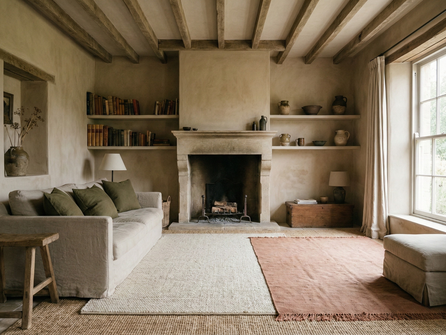
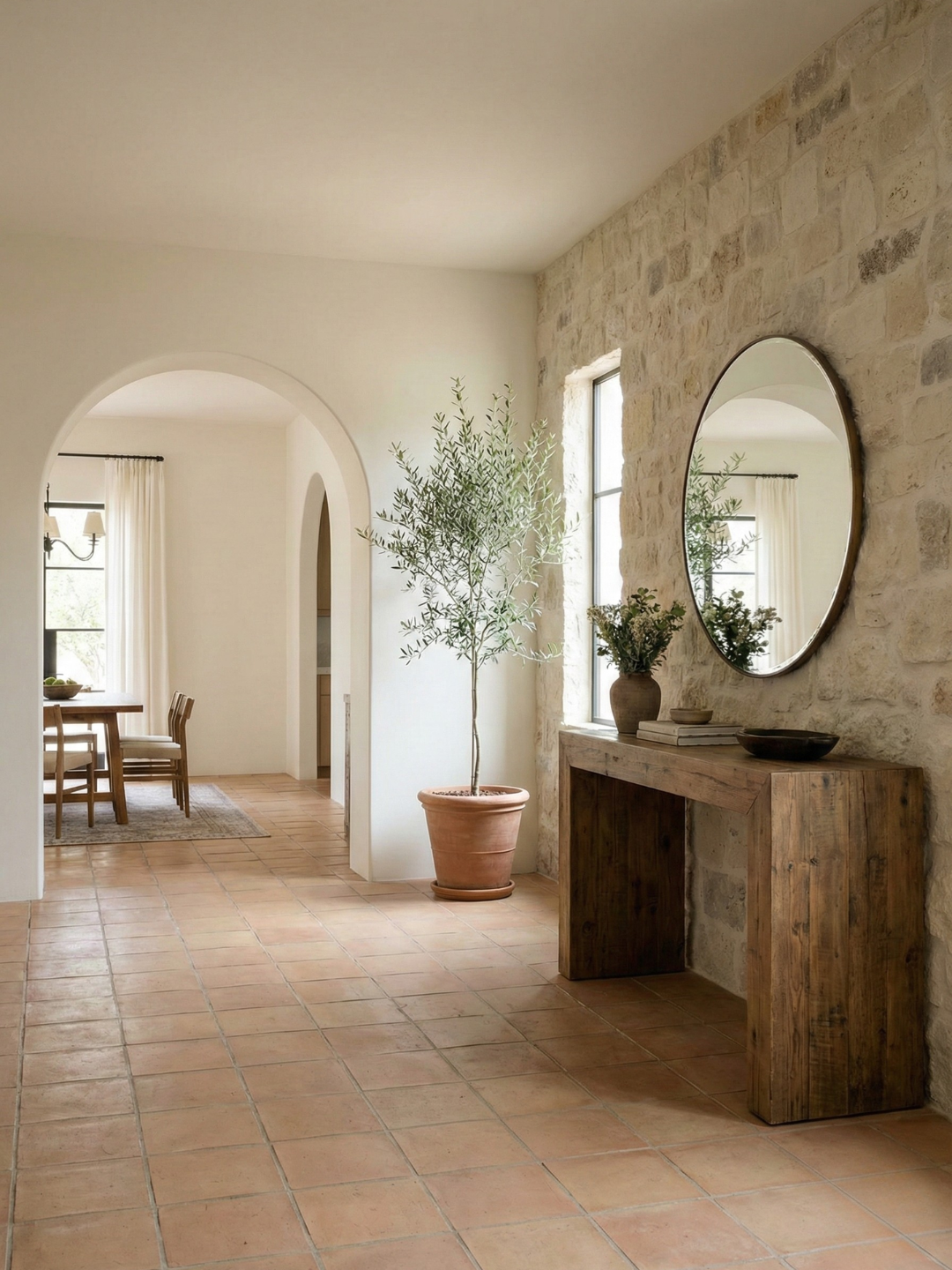
The biggest lesson I’ve learned about transitions came from a renovation disaster. I had clients who fell in love with this gorgeous deep navy for their dining room, but completely overlooked their terra cotta tiles that ran throughout the first floor. The contrast was brutal! Now my first step is always to map out what I call the ‘constant elements’ – those permanent features like flooring, stone fireplaces, or exposed beams that aren’t going anywhere. These become your color story anchors, and every other design choice needs to harmonize with them.
Common Color Flow Challenges and Solutions
Oh boy, let me tell you about the time I had to fix the most awkward transition ever! This client had a split-level home with this weird half-wall that was visible from both the upper and lower levels. It was like solving a puzzle where all the pieces kept changing shape depending on where you stood!
Here’s something I’ve discovered about dealing with tricky transitions: sometimes you have to embrace the awkward. I had this project where two rooms met at this strange angle, and no matter what we did, it looked forced. So instead of fighting it, we turned that corner into a feature with a bold accent color. Everyone now thinks it was intentionally designed that way!
North versus south-facing rooms used to be my nemesis until I cracked the code. Here’s the deal: north-facing rooms tend to bring out cool undertones, while south-facing rooms emphasize warm ones. I realized this when I used the same “perfect gray” in both rooms and ended up with what looked like two completely different colors! Now I adjust the warmth of my paint colors based on which direction the room faces.
And let’s talk about trendy colors because this is where people often get stuck. I had a client who was absolutely in love with this year’s “it” color but worried about committing to it. Here’s what we did: we used it as an accent in a way that could be easily changed later, then built our whole-house color scheme around more timeless shades. The trendy color got to shine without dominating the whole space.
Implementing Your Color Flow Plan
Alright, here’s where the rubber meets the road – actually getting these colors on your walls! The number one tip about implementation is that proper preparation is everything. I once skipped the sample testing phase (big mistake!) and ended up repainting an entire open-concept space because the color looked completely different once it was up.
Let me share my “time of day” testing method. Get yourself some large sample boards – I’m talking at least 2×2 feet – and paint them with your chosen colors. Then, move these boards around different spots in your rooms throughout the day. Trust me, that perfect greige might look amazing at noon but turn into a muddy mess by sunset!
One trick that’s saved me countless times is what I call the “transition test.” Before committing to any colors, tape your sample boards together at the points where they’ll meet in your home. Then stand back about 10 feet – this is how you’ll actually see the colors in real life. I can’t tell you how many “perfect” combinations failed this test!
Here’s something most people don’t think about: your ceiling color can make or break your color flow. I learned this when working on a home with varying ceiling heights. Using the same white throughout actually made the transitions more jarring! Now I adjust the ceiling white’s undertones to complement the wall colors in each space.
When it comes to actually painting, always, always paint connected spaces at the same time if you can. I remember this one project where we painted rooms months apart, and even though we used the same paint from the same store, slight variations in the batches made the transition look off. It’s like baking – you want all your ingredients mixed in the same bowl!
And let’s talk about lighting for a minute. Do yourself a favor and upgrade your light bulbs before making any final color decisions. I once had everything perfectly planned out, only to have it all thrown off when my client installed these super-bright LEDs that made everything look completely different. Now I always check what type of lighting will be used and adjust my color selections accordingly.
Remember, creating perfect color flow is like conducting an orchestra – every element needs to play its part just right. But don’t let that intimidate you! Take it one step at a time, test everything thoroughly, and don’t be afraid to adjust as you go along. After all, some of my best solutions came from fixing my mistakes!
Conclusion
Creating beautiful color flow between rooms doesn’t have to be overwhelming! By following these professional guidelines and taking a systematic approach, you can transform your home into a cohesive, welcoming space that flows naturally from room to room. Remember, the key is to start with a solid plan and build your color story gradually.
When planning your space, remember that color choices affect both aesthetics and wellbeing. The best bedroom colors for sleep might differ from other rooms, but maintaining color flow between rooms ensures harmony throughout your home. From implementing color psychology interior design principles to understanding how different hues impact our daily lives, thoughtful color selection remains crucial for creating spaces that truly work.