How to Use Warm Colors in Interior to Create Cozy Living Spaces

You know that feeling when you walk into a space and instantly feel like you want to stay forever? Like that neighborhood coffee shop where you always end up ordering a second latte just to linger a little longer? Chances are, warm colors are working their magic behind the scenes.
Let me tell you about a recent design revelation that changed everything I thought I knew about warm colors. A client’s “quick paint refresh” turned into something pretty amazing. We swapped their cool grey living room for the softest shade of terracotta, and suddenly this space that used to clear out faster than a dentist’s waiting room became the family’s favorite hangout spot. Their teenagers even started doing homework there instead of hiding in their bedrooms!
Here’s the thing about warm colors that most people get wrong: they think it’s all about bold oranges and dramatic reds. But creating a truly cozy space with warm colors is more like making the perfect cup of coffee – it’s all about the right ingredients in the right amounts. Too much and it’s overwhelming; too little and you miss the magic entirely.
Ready to discover how to use warm colors to create spaces that feel like a perpetual golden hour? Let’s dive into everything you need to know about working with warm colors – from choosing the perfect palette to the practical tips that’ll help you avoid the dreaded “pumpkin spice explosion” effect. (Yes, that’s a real term I had to coin after a particularly enthusiastic autumn decorating session!)
Think of this guide as your warm color compass – we’ll explore everything from tiny rental-friendly tweaks to full-room transformations, all while keeping it cozy, sophisticated, and totally you. Because at the end of the day, the best warm color schemes aren’t just about following rules – they’re about creating spaces that make everyone want to linger just a little bit longer.
Your Shortcut to Effortless Organic Modern Style
12 refined color palettes designed to bring warmth, texture, and harmony into your home.
Understanding Warm Colors in Interior Design
True story: A client once asked me to paint their entire open-concept space terracotta because they wanted it to feel like “basking in a Tuscan sunset.” Let’s just say the end result felt more like living inside a clay pot! But you know what? That project taught me some of the most valuable lessons about working with warm colors that I’m excited to share with you today.
The Warm Color Basics (What I Wish Every Client Knew):
- Think of warm colors as coffee for your space – they energize everything!
- Each warm color has its own personality
- Yes, they can make a room feel literally warmer (science is cool!)
- They’re the ultimate conversation starters in gathering spaces
Here’s something that blows my clients’ minds every time: A dining room makeover I did last month went from “awkward formal space” to “can’t get people to leave” with just one rich burgundy accent wall. The family now spends hours around that table instead of their usual eat-and-run routine. That’s the magic of warm colors!
Warm Color Psychology Quick Guide:
✨ Reds = Watch your dinner party conversations get livelier
✨ Yellows = Perfect for spaces where you need creative energy
✨ Oranges = The confidence-boosting color (hello, home office!)
✨ Terracottas = The friend who gets along with everyone at the party
Let’s talk about the biggest plot twist in warm colors – they’re total chameleons. You know that perfect peachy paint chip you fell in love with at the store? Well, it might turn into a completely different color in your space. Trust me, I’ve seen it happen more times than I can count!
Light Testing Tips (Save This One!):
🌞 Morning light: When warm colors are at their softest
🌅 Afternoon light: Peak warm color intensity
💡 Artificial light: The true test of your color choice
🌙 Evening light: When undertones really show themselves

Creating a Warm Colors Interior Strategy
True story: A gorgeous burnt orange leather sofa once inspired an entire room design, but there was just one tiny detail we overlooked – the client’s amazing collection of cool-toned art. Classic design plot twist! That experience completely changed how I approach warm color strategies, and today I’m sharing all the juicy details so you can skip the learning curve.
Your Warm Color Success Roadmap:
Start with what you’ve got:
- Take inventory of your favorite pieces (yes, even that quirky side table!)
- Look at your art collection with fresh eyes
- Don’t forget about those family pieces
- Check your storage – sometimes the perfect warm color inspiration is hiding in a box
So here’s the thing about the famous 60-30-10 rule – it’s like a recipe that you can totally tweak to your taste. One client had this incredible amber-toned vintage rug tucked away in their guest room, and it became the inspiration for their entire living space. We used it to crack the perfect warm color code:
The 60-30-10 Breakdown That Actually Works:
- 60% = Your main warm neutral (the one you’ll live with every day)
- Think creamy whites that feel like a warm hug
- Soft taupes that play nice with everything
- Pale terracottas that whisper rather than shout
- 30% = Your secondary warm color (this is where the magic happens)
- Rich cognac tones that age like fine wine
- Warm golds that catch the light just right
- Gentle rusts that add instant sophistication
- 10% = Your bold accent (the conversation starter)
- Spicy orange moments that make you smile
- Rich burgundy touches that draw you in
- Deep amber pops that feel like little surprises
Room Function Quick Guide (Because Each Space Deserves Its Own Warm Color Story):
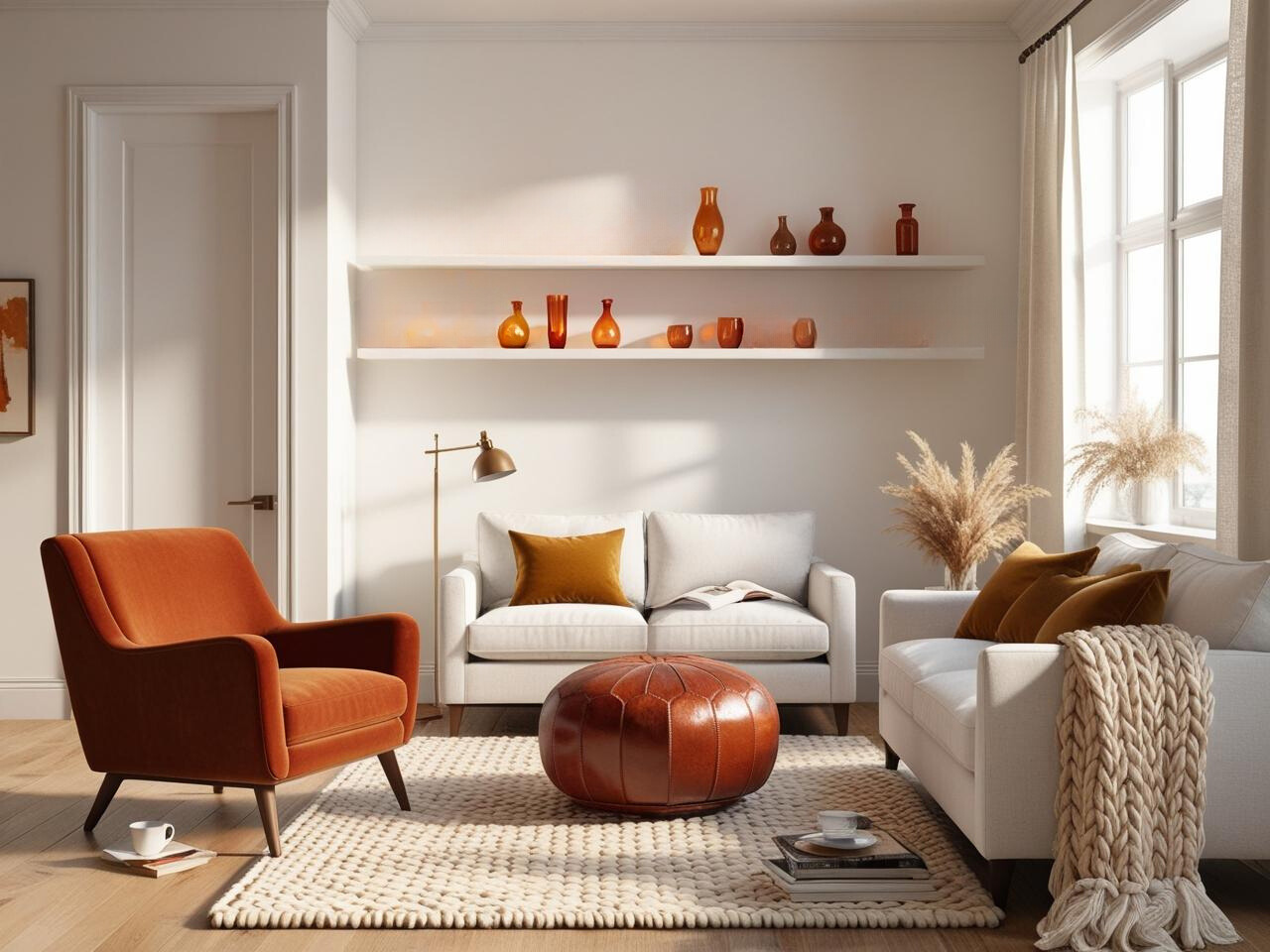
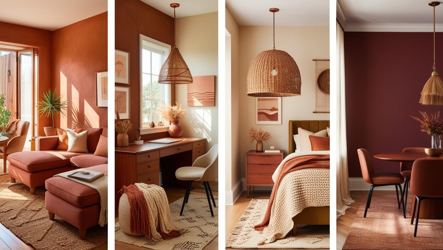
🛋️ Living Room: Let’s talk about this space for a minute. A recent project taught me that the sweet spot for living rooms is using warm colors that encourage lingering. Think golden hour sunlight captured in color form.
🛏️ Bedroom: Fun fact – one client reported sleeping better after we switched their cool gray walls to the softest warm peach. It’s all about those enveloping, restful tones here.
👩💻 Home Office: Had a client who couldn’t focus in their home office until we toned down the bold terracotta to a more subtle warm neutral. Now they swear their productivity has doubled!
🍽️ Dining Room: The magic formula? Rich, appetizing warm colors that make every meal feel a little more special.
Here’s a game-changing tip that came from a total accident: seasonal color layering! Picture this – a client wanted their space to feel cozy year-round without looking like a permanent autumn festival. The solution? A flexible warm color foundation that adapts with the seasons:
Spring/Summer Warm Color Layers:
- Coral accents that feel like sunrise
- Peachy tones that brighten corners
- Golden yellows that catch morning light
- Light terracottas that ground everything
Fall/Winter Warm Color Layers:
- Deep rusts that feel like falling leaves
- Burgundy touches that add drama
- Rich ambers that glow in lamplight
- Warm browns that anchor the space
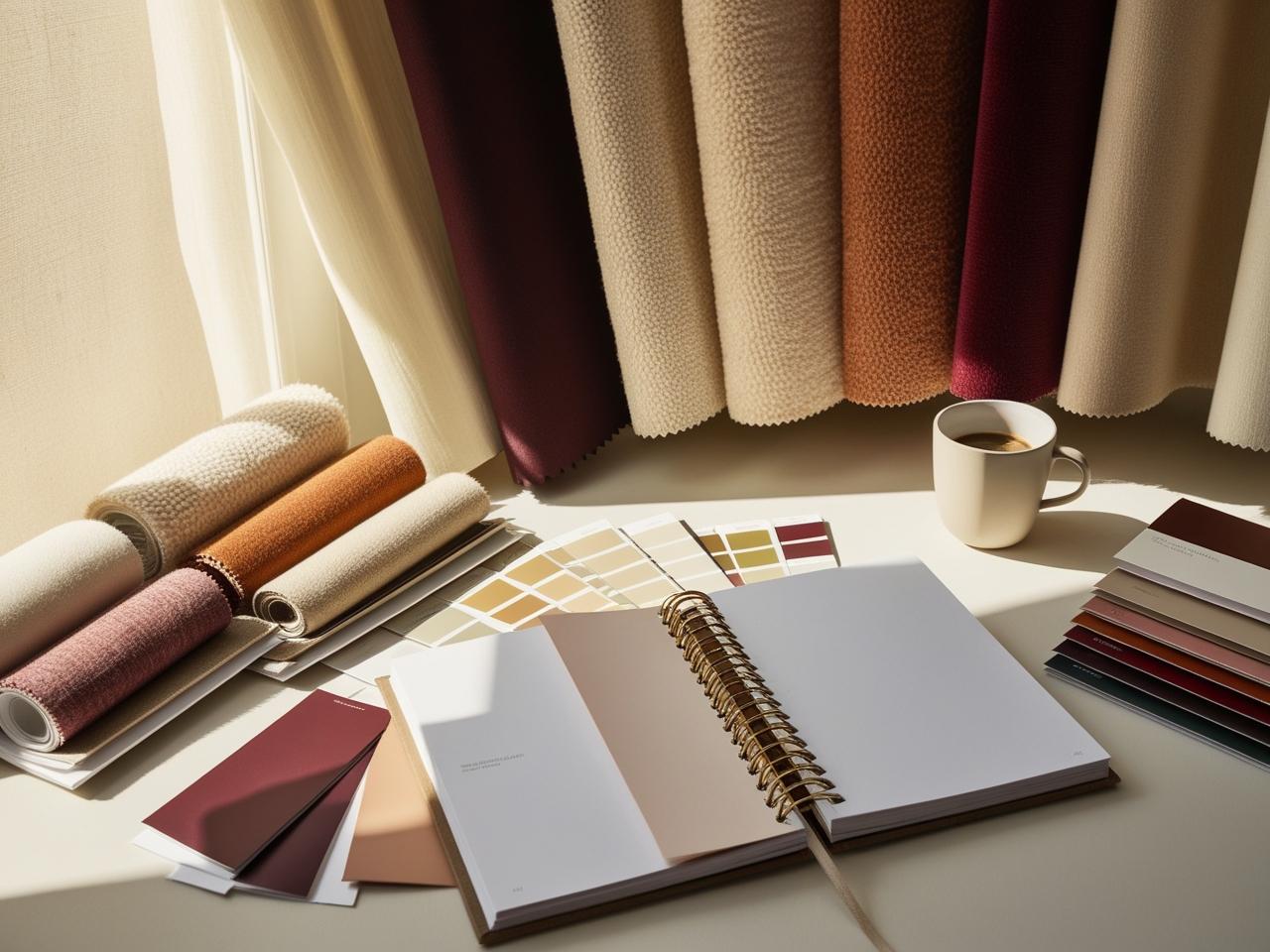
The Sunset Test (This One’s a Game-Changer!): You know that moment when the sun starts to set and suddenly your perfect warm color palette looks… different? That’s exactly why I always do what I call the “Golden Hour Check.” Set up your warm color samples, then watch how they transform throughout the day. Those terracotta curtains might look amazing at noon but turn into something completely different by sunset!
Pro Tips That Actually Work:
💡 Create a physical warm color board – phone screens lie!
💡 Test colors during different times of day (especially that tricky sunset hour)
💡 Use actual samples – paint chips are just the beginning
💡 Take photos of your samples in your space (they’ll tell you things your eyes miss)
💡 Never, ever finalize a color without seeing it in your actual lighting
Want to know the real secret to nailing warm colors? It’s about creating a space that feels like your favorite cozy sweater looks – comfortable, put-together, and totally you. Sometimes that means breaking all the “rules” we just talked about. Because at the end of the day, the best warm color strategy is the one that makes you want to stay in your space just a little bit longer.

Incorporating Warm Colors Without Overwhelming the Space
Let’s talk about the time a client walked into their freshly painted rust-colored room and immediately said “Oh… wow.” (And not the good kind of wow!) The space felt like walking into a sunset that got a little too excited about itself. But here’s the thing – that project led to discovering some game-changing tricks for using warm colors without letting them take over your whole life.
The Secret Sauce to Warm Color Balance:
- Start with the 80/20 rule: 80% neutral, 20% warm color drama
- Layer your warm colors like you’re building a cozy outfit
- Create breathing spaces between warm color moments
- Remember: sometimes less warmth = more impact
Strategic Placement 101 (Or: Where Warm Colors Love to Live):
✨ Eye-level moments that draw you in
✨ Below-eye-level grounding pieces
✨ Unexpected pops in overlooked spaces
✨ Natural light pathways that make colors glow
Here’s a fun plot twist: sometimes the boldest warm colors work best in the smallest doses. Take this recent project – instead of painting an entire wall terracotta (tempting, right?), we used it on the inside of a bookshelf. Every time the client opens a cabinet door, there’s this delicious little surprise of warmth. It’s like hiding little joy bombs around your space!
The Warm Color Balancing Act:
- Anchor pieces in warm neutrals
- Think oatmeal sofas
- Cream-colored curtains
- Warm white walls that glow
- Mid-tone warm accents
- Rust-colored pillows
- Amber glass accessories
- Cognac leather details
- Bold warm color moments
- That perfect burnt orange vase
- A rich burgundy throw
- Golden yellow art pieces
Temperature Mixing Magic:
💫 Pair warm colors with cool greys for sophistication
💫 Add natural elements to ground bright warm tones
💫 Use metallic accents as temperature mediators
💫 Incorporate white space as a visual palette cleanser
True Story Corner: A client once asked for a “warm and cozy” home office but spent their days squinting at their computer because the room felt like a warm color explosion. The fix? We kept the warm colors below eye level and at the edges of their vision. Now they get the cozy vibe without the visual overwhelm. Game changer!
Pro Tips for Warm Color Success:
- Test your warm colors in chunks, not all at once
- Create warm color “zones” with breathing space between
- Use texture to add warmth without more color
- Think about sight lines – what warm colors will you see from where?
The Light Factor (Because Lighting Changes Everything):
🌞 Morning: Warm colors are softer, more forgiving
☀️ Noon: They’re at their boldest – plan accordingly!
🌅 Sunset: The golden hour amp-up is real
💡 Night: Artificial light can make them feel totally different
Listen, here’s the real secret to using warm colors without overwhelming your space: treat them like that friend who has an amazing personality but needs to be balanced with quieter people at the dinner party. Give them their moment to shine, but make sure they’re not dominating every conversation in every room.
Want to see this in action? Look at your space through your phone camera – seriously! It helps you see where the warm colors are competing for attention and where they’re playing nice with others. Total game-changer for getting the balance just right.
Unlock Designer-Perfect Colors in Minutes
Browse my curated collection of interior color palettes—tailored for today’s most loved design styles.

Room-by-Room Warm Color Applications
True story: A client walked into her newly decorated living room and actually gasped – in a good way this time! The secret? We’d finally cracked the code for using warm colors in different rooms without making the whole house feel like a sunset festival. Let me share what really works, room by room, so you can skip the learning curve.
Living Room: Creating the Ultimate Gathering Space
Let’s talk about how to make your living room feel like that perfect coffee shop where everyone wants to linger. You know the one – warm, inviting, but not trying too hard. Working with a client last month, we discovered that the magic happens when you layer warm colors from the ground up:
The Living Room Recipe That Works:
- Start with a warm neutral base (walls and major furniture)
- Add rich warm accents at mid-level (pillows, art, curtains)
- Sprinkle in bold warm touches where people pause
- Create conversation zones with warm color anchors
Quick Tip: The most successful living rooms have what I call “warm color pauses” – neutral spaces between the warm elements that let your eye rest. Think of it like punctuation in a sentence.
Bedroom: Building Your Cozy Sanctuary
The bedroom is where warm colors can really shine, but there’s a catch – you need the right balance for restfulness. Here’s what transformed a recent client’s “meh” bedroom into their favorite space:
Bedroom Warm Color Strategy:
- Choose gentle, dusty warm tones for walls
- Layer in richer warm colors through bedding
- Add warm metallics for subtle gleam
- Keep bold warm colors away from the bed zone
Pro Tip: Want to know the secret to a perfect warm bedroom palette? Look at your favorite sunset photo and pick the softest colors you see. Those muted, gentle warm tones are your bedroom’s best friends.
Kitchen: The Heart of Warm Color Magic
Kitchens are tricky – you want them warm and welcoming but not so cozy that they feel heavy. A recent kitchen makeover taught me something fascinating: warm colors actually make people want to cook more! Here’s the formula we used:
Kitchen Warm Color Layout:
- Warm whites or creams for cabinets (they hide cooking splatters better anyway)
- Rich warm tones for backsplash or lower cabinets
- Subtle warm metallics in hardware and fixtures
- Bold warm color pops in easily changeable elements
Here’s a game-changing tip: Use your warm colors in the spots where people tend to gather. In kitchens, that usually means the island or eat-in area. It naturally draws people to the right spots!
Home Office: The Productivity-Meets-Cozy Sweet Spot
This might be my favorite warm color challenge – creating a space that energizes you for work while still feeling welcoming. A client recently switched from cool grays to warm tones in their home office, and their productivity actually increased. Here’s what worked:
The Perfect Office Balance:
- Warm neutral walls that glow in video calls
- Energizing warm accents at eye level
- Grounding earth tones in larger furniture
- Pops of bright warm colors in accessories
Want to know the real secret to nailing warm colors in any room? It’s all about what I call the “squint test.” Stand in the doorway, squint your eyes, and look at the room. The warm colors should create a pleasant rhythm, not a jumbled mess. If something jumps out too much, that’s your cue to dial it back.

Sustainability and Craftsmanship in Japandi vs Minimalism
Picture this: A client once ordered twelve rust-colored velvet pillows online, convinced they’d be the perfect warm accent for her space. When they arrived, it looked like a pumpkin patch had exploded in her living room! But that pillow predicament led to discovering some amazing tricks for styling with warm colors that I can’t wait to share.
The Textile Layer Cake 🧡
Here’s a styling secret that works every time: Think of warm textiles like you’re building the world’s coziest cake. Start with your base layer and work your way up:
- Foundation Layer: Large pieces in warm neutrals
- Middle Layer: Medium-sized textiles in richer warm tones
- Top Layer: Small accents in your boldest warm colors
- “Sprinkles”: Metallic or textured pieces that catch the light
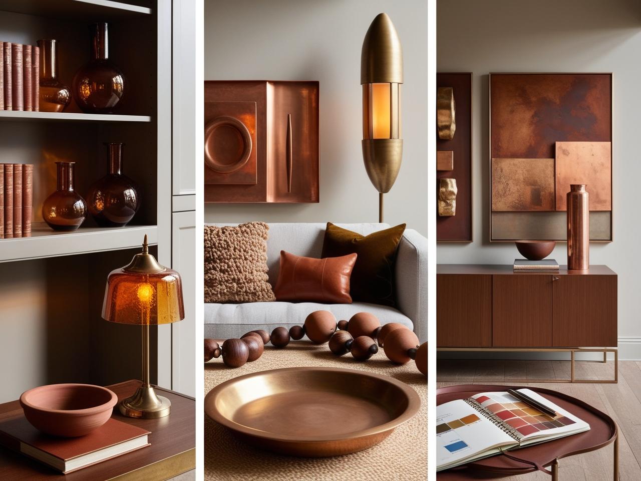
True story: A vintage amber glass vase completely transformed a client’s bookshelf situation. It caught the afternoon light just right and suddenly made all their cool-toned book spines make sense with their warm color scheme. Sometimes the smallest pieces make the biggest impact!
Art That Works Hard 🎨
The key to styling with warm-toned art? Location, location, location:
- Place your boldest pieces where people naturally pause
- Layer smaller warm-toned pieces in unexpected spots
- Create “color conversations” between art and accessories
- Use warm-toned frames to tie everything together
Wood & Metal Magic ✨
Let’s talk about the time three different gold finishes in one room taught a valuable lesson about mixing warm metals:
Foolproof Metal Mixing Formula:
- Choose one dominant metal finish
- Add a secondary finish for contrast
- Sprinkle in a third as “jewelry”
- Unite them with similar undertones
Working With Warm Woods:
- Dark woods = ground your space
- Medium woods = create flow
- Light woods = add brightness
- Mixed woods = instant character
Paint Like a Pro 🎨
The biggest game-changer for warm color implementation? Proper paint planning. Here’s what actually works:
The Perfect Paint Strategy:
- Test large swatches (no tiny paint chips!)
- View in different lights throughout the day
- Consider your room’s undertones
- Remember: warm colors advance visually
Pro Styling Tips That Save Lives:
- The Rule of Three: Group warm-colored items in threes
- The Height Game: Vary heights of warm elements
- The Texture Mix: Combine smooth and rough surfaces
- The Distance Test: Step back – things should flow, not fight
Here’s my favorite styling secret: Create what I call “warm color moments” – little vignettes where warm colors can really shine without overwhelming the whole space. Like that perfectly styled coffee table or a reading nook that just begs you to curl up with a book.
Remember: The goal isn’t perfection – it’s creating a space that feels like a warm hug every time you walk in. And sometimes that means breaking all the “rules” we just talked about. Because at the end of the day, the best styled spaces are the ones that make you want to stay a while
Curated Wall Art for Elegant Homes
Bring softness, texture, and intention into your home with digital wall art inspired by wabi-sabi, abstract forms, and muted watercolors. Every piece is crafted to create stillness and beauty—whether you’re styling a gallery wall or a minimalist nook.
Conclusion
You’ve made it through the complete warm color journey, and can I just say? I’m genuinely excited for the cozy transformations ahead of you! Remember that client I mentioned at the beginning, the one whose teenagers actually started hanging out in the living room? Well, last week they sent me a photo of their family game night, and let me tell you – those warm terracotta walls are doing exactly what they’re supposed to do: creating a space where life happens.
Here’s your warm color pep talk before you go:
- Start small if you’re feeling nervous (throw pillows are your friends!)
- Trust your instincts about what feels cozy to you
- Remember the squint test when you’re not sure about balance
- Take photos as you go – sometimes fresh eyes help!
The Real Talk Wrap-Up: Will you make some warm color mistakes along the way? Probably! (Hello, that time with the twelve rust pillows 😅) But here’s the beautiful thing about designing with warm colors – even the “mistakes” usually lead to something pretty amazing. Maybe that too-bold terracotta wall becomes the perfect backdrop for your art collection. Or perhaps those copper accessories that felt like too much actually create the perfect golden glow during your dinner parties.
Before You Go: Quick Temperature Check
- Feeling overwhelmed? Start with the warm color strategy section
- Ready to dive in? The styling techniques are your next stop
- Just want to dip your toe in? Try one cozy corner first
- Need more inspiration? Save this guide and come back when you’re ready
Remember, creating a warm and cozy space isn’t about perfection – it’s about creating rooms that make people want to kick off their shoes and stay awhile. Whether you’re starting with a tiny powder room or diving into a full living room transformation, you’ve got this! And hey, if you end up with your own “pumpkin patch explosion” moment along the way? Consider it a badge of honor in your warm color journey.
Now go forth and create spaces that feel like a perpetual golden hour hug. Your cozy warm color adventure awaits! ✨
Want more cozy design inspiration? Drop a comment below with your biggest warm color questions!