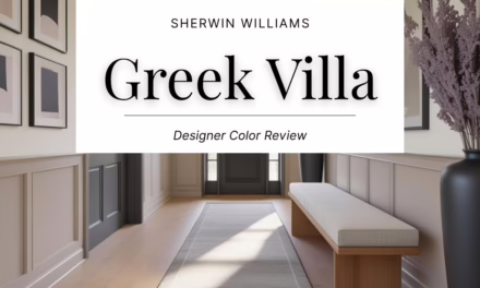
Sherwin Williams Accessible Beige (SW 7036) Color Review

Accessible Beige: A Warm, Expressive Sherwin-Williams Shade Worth Trying
Let’s talk about a paint color that has stood the test of time. Not because it’s bold, but because it works in almost any setting. Accessible Beige by Sherwin-Williams is one of those “just right” neutrals. It’s warm, soft, and quietly stylish. If you’re looking for something more current than a yellow-based beige but not as cold as gray, this could be your ideal middle ground.
Sherwin-Williams Accessible Beige (SW 7036) is a subdued, earthy neutral that brings depth and warmth without overpowering the space. It’s a favorite among designers because of how easy it is to work with across rooms, styles, and lighting conditions.
What Does Accessible Beige Look Like?
Accessible Beige is best described as a warm greige – a beige with just enough gray to keep it balanced and versatile. It feels soft and grounded, with a natural warmth that’s not too yellow, not too pink, and definitely not cold.
Depending on the space, it can read as cozy and traditional or modern and minimal. Its muted tone makes it a reliable backdrop for layered decor or clean-lined styling.
What Are the Undertones?
This color has subtle gray undertones that help neutralize the warmth. It doesn’t lean peachy or golden like many traditional beiges. Instead, the gray influence gives it a refined, quiet presence that shifts depending on the lighting and surrounding materials.
You might catch a faint taupe or mushroom undertone in some conditions, which adds to its adaptability. This is what makes Accessible Beige work so well with both cool and warm color palettes.

What Is the LRV of Accessible Beige?
The Light Reflectance Value (LRV) of Accessible Beige is 58, which means it reflects a moderate amount of light. It’s not super bright, but it won’t darken a room either.
This makes it a great option for spaces where you want a soft, cocoon-like feel without going full moody. In well-lit rooms, it looks warm and cozy. In darker spaces, it holds up beautifully without feeling too heavy.
Is Accessible Beige Warm or Cool?
Accessible Beige leans warm, but it’s tempered by its gray undertone. That keeps it from feeling too creamy or dated. It won’t skew yellow or gold, but it still brings that subtle warmth that makes a space feel settled and calm.
It’s this kind of balance that makes it so versatile. It can anchor a modern, organic palette just as easily as it can support more traditional decor.
What Lighting Directions Work Best?
Accessible Beige is fairly stable in different types of light, but it will shift slightly:
- North-facing rooms – Appears a bit cooler and more muted, leaning into its greige quality
- South-facing rooms – Feels warmer and richer, especially in full sun
- East-facing rooms – Crisp and clean in the morning, then softens by afternoon
- West-facing rooms – Starts neutral and picks up a gentle golden glow later in the day
Always sample the color on multiple walls and at different times of day. It is flexible, but testing ensures you’re seeing its best version in your space.

Best Rooms to Use Accessible Beige In
This is a true whole-home neutral. Some especially great uses include:
- Living Rooms – Creates a warm, easygoing atmosphere that doesn’t distract from art, furniture, or textiles
- Bedrooms – Calming and comfortable, especially when layered with natural fabrics
- Home Offices – Offers focus without feeling stark or cold
- Dining Rooms – Works beautifully with wood furniture and warm accents
- Entryways or Hallways – Provides cohesion and warmth throughout transitional spaces
It’s also a great choice for open-concept homes where you want one color to flow seamlessly across zones.
What Wood Tones Pair Beautifully?
Accessible Beige complements a wide variety of wood tones:
- Mid-tone woods like walnut or oak – Ground the space while maintaining warmth
- Weathered or gray-washed finishes – Highlight the gray undertone
- Natural or reclaimed woods – Emphasize the earthy, organic feel of the color
This flexibility is one reason the shade works so well in both new builds and older homes.
What Materials and Finishes Complement SW Accessible Beige?
Because Accessible Beige is so restrained, it allows textures and finishes to really shine. Try pairing it with:
- Natural fibers like linen, jute, seagrass, or cotton
- Textural upholstery such as bouclé, wool, or brushed canvas
- Warm stone like travertine, limestone, or soapstone
- Matte metals in brushed brass, aged bronze, or blackened iron
You can go modern or traditional with this color. It adapts to your styling.

What Colors Pair Well With Accessible Beige?
This color is endlessly versatile. Here are some palettes that work beautifully:
- Warm whites like SW Aesthetic White (SW 7035) for trim or ceiling
- Greiges and taupes to create a quiet, tonal scheme
- Earthy browns like SW Sanderling (SW 7513) for a soft, grounded contrast
- Slate blues and charcoal – SW Cadet (SW 9143) adds depth and interest
- Muted greens or olives for a natural, calming combination
It also holds its own next to bolder colors like terracotta, mustard, or dusty plum.
And if you’re building a color story and want expert coordination, explore my color guides on Etsy – each one is designed to make paint pairing easier and more beautiful.
What Styles Work Best with SW Accessible Beige?
Accessible Beige fits into so many design styles. It works especially well in:
- Transitional spaces as a bridge between modern and traditional
- Organic modern with soft finishes and raw textures
- Modern farmhouse for warmth without the yellowy undertone of older beiges
- California casual with a soft, natural, sun-washed look
- Traditional interiors with classic furnishings and layered drapery
It isn’t trendy, but it always looks intentional and styled.

Would I Use This for Trim or Doors?
Yes, though it works best in selective applications:
- Interior doors can look beautiful with light walls or in a warm, tonal scheme
- Built-ins or cabinets offer a tailored look while keeping things soft and approachable
- Trim works best with deeper wall colors or in rooms with a monochrome concept
It is not a replacement for crisp white trim, but used thoughtfully, it adds a cozy, designer feel.
Who Is Accessible Beige Best For?
This shade is perfect for:
- Homeowners updating warm finishes like honey oak or beige tile without repainting everything
- Designers and DIYers who want a sophisticated neutral that still feels approachable
- People tired of cold gray but not ready for bold color
- Anyone trying to create a home that feels layered, warm, and lived-in

Curated Wall Art for Elegant Homes
Bring softness, texture, and intention into your home with digital wall art inspired by wabi-sabi, abstract forms, and muted watercolors. Every piece is crafted to create stillness and beauty—whether you’re styling a gallery wall or a minimalist nook.
Final Thoughts
Accessible Beige continues to earn its place as a go-to neutral because it does exactly what you want a neutral to do. It grounds your space without dominating it. It’s warm, welcoming, and adaptable across design styles and decades.
Test it first with a peel-and-stick sample from Samplize, especially if your lighting is tricky. Seeing it on your own walls makes all the difference.
Need help building your palette?
Check out my curated color guides on Etsy – they take the guesswork out of pairing and help you decorate with confidence.
- SW Accessible Beige & Perfect Pairings
- SW Repose Gray & Perfect Pairings
- SW Quietude & Perfect Pairings
Until next time,
Franzi
