Sherwin Williams Alabaster (SW 7008) Color Review

Alabaster: A Soft, Balanced White That Feels Bright Without Being Cold
Today, let’s talk about a white that has real staying power – Alabaster by Sherwin-Williams. It’s a favorite for good reason. If you’ve ever tried to find a white that feels warm without turning creamy, and clean without going sterile, you know how tricky it can be. That’s exactly where Alabaster shines.
Sherwin-Williams Alabaster (SW 7008) is a warm, subtle white that creates calm, cohesive spaces. It brings light into a room without overwhelming it, and works equally well as a wall color, trim, or ceiling. Whether you’re refreshing a whole house or painting built-ins, this white stays soft, clean, and timeless.
What Does Alabaster Look Like?
Alabaster is best described as a creamy white with just enough warmth to keep it from feeling stark. It sits somewhere between a pure white and a very pale ivory. Its finish is soft and elegant – never chalky or yellow – and it gives walls a gentle glow that feels natural and inviting.
Depending on what you pair it with, Alabaster can lean fresh and airy or warm and grounded. It reflects a lot of light, but always holds a bit of warmth under the surface, which makes it feel more styled than default.
What Are the Undertones?
Alabaster has warm, creamy undertones with a hint of beige and soft yellow in the background. The warmth is subtle and controlled – it won’t skew peach or golden in most lighting, but it does prevent the color from reading too blue or icy.
Its undertones are especially helpful in rooms with cool northern light or stark finishes. Alabaster brings balance, keeping things feeling soft and inviting.

What Is the LRV of Alabaster?
The Light Reflectance Value (LRV) of Alabaster is 82, which means it reflects a high amount of light. This makes it a great candidate for brightening rooms that don’t get much natural sunlight, or for keeping large, open-concept spaces feeling clean and unified.
Despite its high reflectivity, it doesn’t wash out or feel overly sterile. It stays grounded and readable, even on full walls in direct light.
Is Alabaster Warm or Cool?
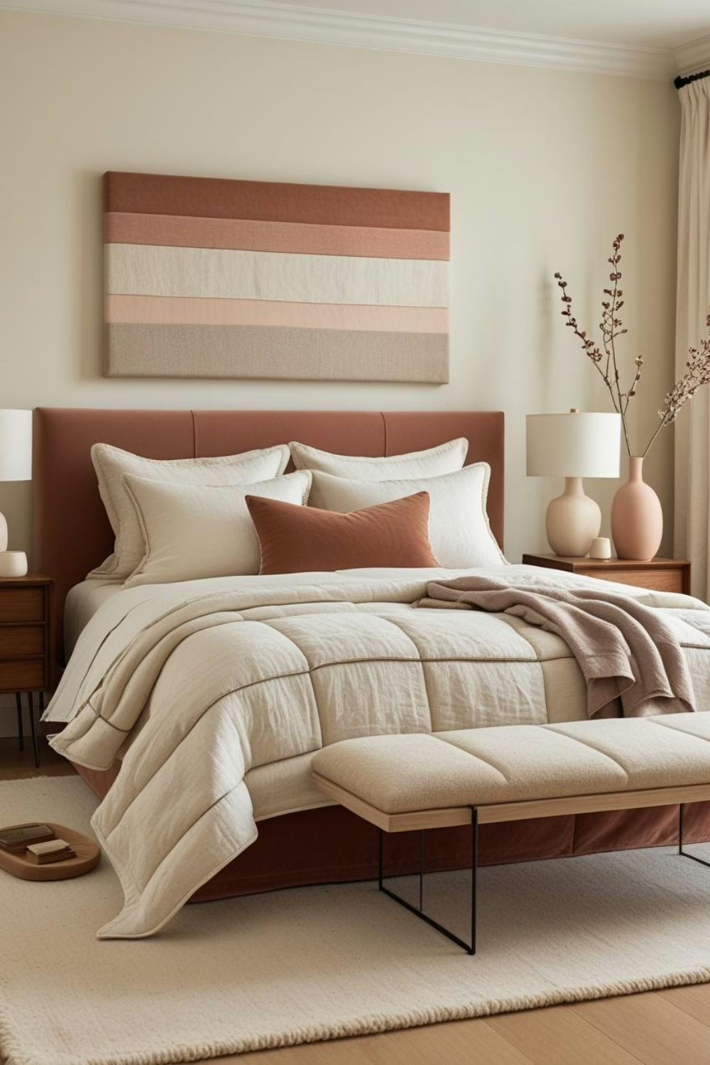
Alabaster is a warm white. Its creamy base gives it that soft, cozy glow that many designers look for in living spaces and bedrooms. It’s not crisp or blue-leaning like cool whites, which is why it pairs better with earth tones, warm wood, and soft fabrics.
Still, the warmth is restrained, so it rarely clashes with other colors in a palette. It’s a safe choice for whole-home use.
What Lighting Directions Work Best?
Here’s how Alabaster tends to behave in different natural light conditions:
- North-facing rooms – Appears slightly more muted, but the warmth still comes through
- South-facing rooms – Looks bright and warm, bringing out its creamy undertones
- East-facing rooms – Feels soft and golden in the morning light, with a clearer tone later in the day
- West-facing rooms – Takes on a slightly richer glow in the evening, especially paired with warm accents
No matter the exposure, Alabaster remains stable and comfortable. It rarely surprises you in a bad way.

Best Rooms to Use Alabaster In
Because of its warmth and softness, Alabaster works almost anywhere. Some especially good uses include:
- Living Rooms – A welcoming backdrop that keeps the space feeling calm and collected
- Bedrooms – Softens the room and reflects light without overpowering fabrics or artwork
- Kitchens – Clean and timeless on walls, cabinetry, or trim
- Bathrooms – Helps bounce light around and pairs beautifully with stone or brass
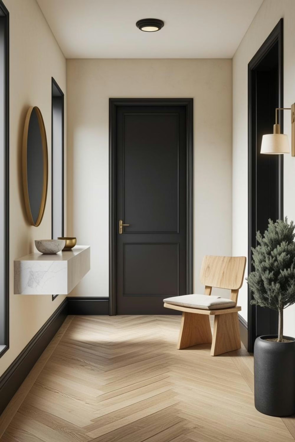
- Entryways and Hallways – Creates a smooth, seamless flow from room to room
It’s also excellent for open-concept homes where consistency is key.
What Wood Tones Pair Beautifully?
Alabaster is incredibly forgiving with wood tones. Some of the best pairings include:
- Light oak or maple – Keeps things airy and Scandinavian-inspired
- Mid-tone walnuts or cherry – Adds contrast while keeping the palette warm
- Rustic or weathered finishes – Highlights the softness of the white and adds texture
You can safely use Alabaster with cool or warm woods, though it looks best when paired with finishes that feel natural or matte.
What Materials and Finishes Complement SW Alabaster?
Alabaster plays well with a wide range of finishes. Some strong combinations include:
- Brushed brass or warm antique metals – Highlights the warmth in the color
- Marble and stone – Especially honed or veined white marble for a classic pairing
- Linen, wool, or boucle – Soft, nubby textures complement the gentle tone
- Terracotta or clay tile – Brings out the creamy undertone without overwhelming it
- Matte black or iron – Adds contrast and a modern edge in more minimal interiors
This color is all about restraint, so it’s at its best when layered with intentional materials.

What Colors Pair Well With Alabaster?
This color plays beautifully with both soft neutrals and deeper accent shades. Some favorite pairings:
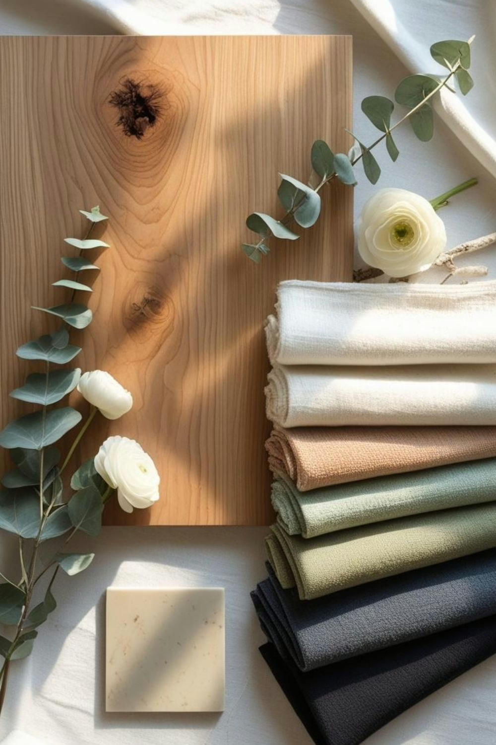
- Greige and warm taupe – For a tonal, earthy palette
- Warm terracotta and clay – Adds character and a cozy, handmade feel
- Sage, olive, or muted green – Introduces subtle color without disrupting the balance
- Dusty pink or mauve – Offers a gentle, styled contrast
- Deep navy or charcoal – Creates elegant drama in small doses
- Soft golden beige – Like Dakota Wheat or Townhall Tan for depth without heaviness
This is also a great base for seasonal changes. Alabaster works just as well with summer tones as it does with winter textures.
And if you’re building a color story and want expert coordination, explore my color guides on Etsy – each one is designed to make paint pairing easier and more beautiful.
What Styles Work Best with SW Alabaster?
Alabaster is versatile enough to support a range of styles. Top design fits include:
- Modern Farmhouse – Clean, warm, and effortless
- Scandi Minimalism – Balances light woods and natural materials beautifully
- Classic Traditional – A timeless base that doesn’t feel cold or trendy
- Boho or Earthy Organic – Feels cohesive with terracotta, greenery, and handmade textures
- Transitional – A perfect bridge between classic silhouettes and modern details
Because it adapts so well, Alabaster is often used throughout entire homes with varied room styles.

Would I Use This for Trim or Doors?
Yes – and it’s actually one of my favorite whites for trim.
- Trim and baseboards – Alabaster adds subtle warmth that softens any wall color
- Interior doors – Pairs nicely with mid-tone wall colors for contrast that still feels calm
- Ceilings – Reflects light without that stark ceiling-white effect
The only time I’d hesitate is when pairing with very cool grays or icy blues. Alabaster may feel too warm in those cases.
Who Is Alabaster Best For?
This white is perfect for:
- Homeowners who want a bright space but dislike clinical whites
- Designers building a layered, tonal palette with natural finishes
- People updating older homes who need a white that works with existing woodwork
- Anyone planning to use one white throughout a full home
- Clients who want something classic, comforting, and never trendy
Curated Wall Art for Elegant Homes
Bring softness, texture, and intention into your home with digital wall art inspired by wabi-sabi, abstract forms, and muted watercolors. Every piece is crafted to create stillness and beauty—whether you’re styling a gallery wall or a minimalist nook.
Final Thoughts
Alabaster is one of those rare whites that just works. It’s clean but never cold, soft but not creamy, and it creates instant cohesion in any space. Whether you’re painting cabinets, walls, or trim, Alabaster brings a refined, livable warmth that feels timeless.
If you’re curious how it behaves in your space, try a peel-and-stick sample first. And if you want help building an entire palette around Alabaster, I’ve created downloadable color guides with curated pairings – available now in the Ferrier Interior Etsy Shop.
- SW Alabaster & Perfect Pairings
- SW Quietude & Perfect Pairings
- SW Accessible Beige & Perfect Pairings
Happy decorating!
Franzi
Casa Ferrier