Sherwin Williams Naval (SW 6244) Color Review

Naval: A Sophisticated Deep Blue That Feels Bold and Grounded
Today, I want to highlight a color that’s both powerful and polished – Naval by Sherwin-Williams. If you’re looking for a color with serious presence that still feels timeless, Naval delivers. It’s a deep navy blue that can read classic or modern depending on how you style it, and it brings richness and refinement to any room.
Sherwin-Williams Naval (SW 6244) is a saturated, elegant navy with a cool gray undertone that adds depth without overwhelming a space. It’s ideal for creating drama, focus, and contrast – all without veering into overly trendy or harsh territory.
What Does Naval Look Like?
Naval is best described as a dark navy blue with a moody, luxurious feel. It’s not quite blackened navy, nor does it feel bright or cobalt. Instead, it sits in that perfect pocket of deep blue that feels substantial and steady.
In daylight, Naval shows off its cool blue tone clearly. In low light, it deepens and takes on a velvety softness. It brings structure and style to any space – the kind of color that elevates a room just by being on the walls.
What Are the Undertones?
Naval has cool undertones with hints of gray and green, which keeps it grounded and sophisticated. The green is extremely subtle, but it adds a sense of richness and balance that keeps the blue from feeling too cold or flat.
These undertones help Naval play well with warm woods, gold finishes, and a wide variety of neutral and bold accent colors.

What Is the LRV of Naval?
The Light Reflectance Value (LRV) of Naval is 4, which puts it in the very dark range. It reflects very little light, so expect it to read as a deep, inky tone on most walls.
Because of its low LRV, Naval creates a cozy, enveloping atmosphere. It’s best used in spaces where you want contrast, drama, or a bold design moment. It also pairs beautifully with high-contrast elements like bright white trim, brass hardware, or marble surfaces.
Is Naval Warm or Cool?
Naval leans cool, thanks to its gray-blue base and slight green edge. However, when styled with warm materials – like tan leather, walnut, or brass – it can feel incredibly balanced and comfortable.
This cool classification gives it a crisp, clean edge, but its richness means it never feels sterile.
What Lighting Directions Work Best?
Lighting makes a noticeable difference with a deep color like Naval:
- North-facing rooms – Will emphasize the coolness and can make the color feel extra dramatic
- South-facing rooms – Natural light helps Naval read more balanced and true-blue throughout the day
- East-facing rooms – Richer and cooler in the morning, then deepens as the light shifts
- West-facing rooms – Warm afternoon light softens the color slightly and adds a richer, more dimensional look
In any exposure, Naval reads as a bold color – so make sure to test it if your space is especially dark or lacks natural light.

Best Rooms to Use Naval In
Naval is a statement color that adds structure and drama. Some of the best spaces for it include:
- Dining Rooms – Creates a moody, elegant atmosphere that feels tailored and intentional
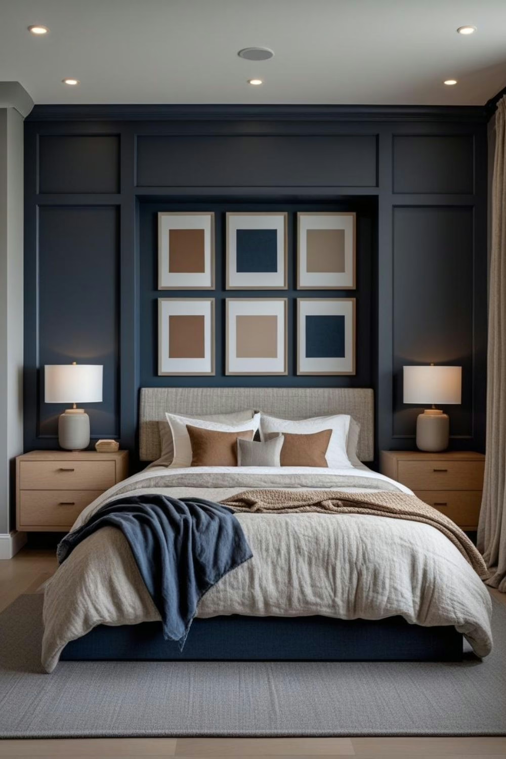
- Bedrooms – Makes the space feel cocooned and calm, especially with layered bedding and soft textures
- Home Offices – Adds focus and formality without feeling stark or cold
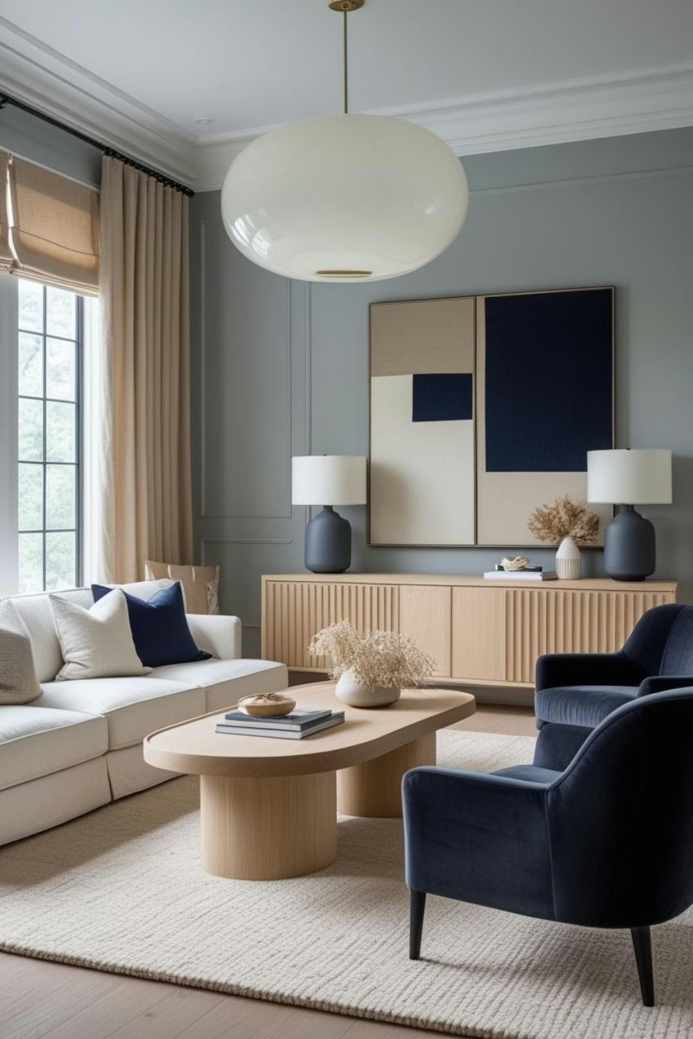
- Living Rooms – Use on a feature wall or in a library-style setup with built-ins
- Powder Rooms – Perfect for creating a jewel-box effect in a small space
What Wood Tones Pair Beautifully?
Naval works with a wide variety of woods, but these stand out:
- Light oak or whitewashed wood – Adds contrast and lightens the palette
- Mid-tone walnuts or cherry – Brings out the richness and elevates the mood
- Dark espresso finishes – Creates a luxurious, high-drama look when paired with light counters or soft textiles
It’s especially beautiful when layered with multiple wood tones in a single room.
What Materials and Finishes Complement SW Naval?
Because Naval is so saturated, it benefits from a mix of textures and finishes to give it dimension. Some of the best materials to pair with it include:
- Brushed or polished brass – Adds warmth and contrast
- Carrara marble or white quartz – Keeps the look sharp and classic
- Natural leather or suede – Balances the cool tone with earthy softness
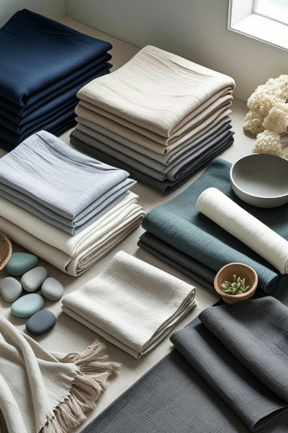
- Velvet or mohair – For a high-end, touchable finish
- Matte black or aged bronze – For an edgier, more modern style
This color pairs best with finishes that feel intentional and tactile.

What Colors Pair Well With Naval?
Naval works beautifully as both a lead and support color. Some great pairings include:
- Crisp whites – Like Pure White or Extra White, for clean contrast
- Warm taupes or camel tones – Brings balance and softens the boldness
- Muted greens – Olive, sage, or eucalyptus for an earthy, elegant palette
- Terracotta or rust – Adds warmth and creates a rich, layered effect
- Blush or dusty rose – Softens the palette and adds sophistication
- Gold or brass accents – Not a paint, but a must-have with this tone
You can also build a palette that includes grays, blacks, and soft creams for a more minimal, modern aesthetic.
And if you’re building a color story and want expert coordination, explore my color guides on Etsy – each one is designed to make paint pairing easier and more beautiful.
What Styles Work Best with SW Naval?
Naval is flexible but commands attention. It works best in styles where bold, intentional color has a role. Some top fits include:
- Modern Traditional – Clean-lined furniture, high-contrast trim, and polished finishes
- Moody Transitional – A mix of timeless pieces and saturated hues
- Coastal Modern – Paired with white oak, cane, and navy-striped accents
- Art Deco or Luxe Vintage – With brass, velvet, and geometric patterns
- Minimalist with Contrast – For bold accent walls or cabinetry in otherwise restrained spaces
Its adaptability means it can elevate both old-world and contemporary designs.

Would I Use This for Trim or Doors?
Yes – and it looks especially striking in the right places:
- Interior doors – Adds bold character in a hallway or against crisp white walls
- Kitchen or bathroom cabinets – Offers drama and richness with the right lighting
- Built-ins or fireplace surrounds – Gives depth and distinction in a focal area
Naval is too dark for full-house trim in most applications, but it works beautifully as a contrast element or in spaces designed for mood and depth.
Who Is Naval Best For?
This color is a great choice for:
- Designers and homeowners who love contrast and elegance
- People drawn to dramatic palettes but want something timeless
- Anyone creating a library, study, or formal space that needs presence
- Color lovers who still want refinement and control
- Clients craving a bold kitchen or cabinetry color that still feels classic
Curated Wall Art for Elegant Homes
Bring softness, texture, and intention into your home with digital wall art inspired by wabi-sabi, abstract forms, and muted watercolors. Every piece is crafted to create stillness and beauty—whether you’re styling a gallery wall or a minimalist nook.
Final Thoughts
Naval is one of Sherwin-Williams’ most beloved dark blues for a reason. It’s rich, balanced, and powerful – a color that instantly adds depth and distinction. Whether you’re using it in a traditional home or a modern build, it brings a bold but thoughtful tone to any room.
If you’re considering it, try a peel-and-stick sample first, especially in rooms with low light. Once you see it in your space, you’ll understand why it’s a staple in both residential and designer palettes.
Want a curated color guide built around Naval? I’ve put together palettes and pairing suggestions for every room – available now in the Casa Ferrier collection.
Happy decorating!
Franzi
Casa Ferrier