Sherwin Williams Repose Gray (SW 7015) Color Review
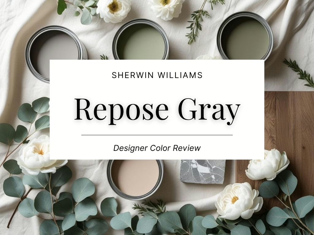
Repose Gray: A Soft, Balanced Greige That Works in Every Light
There’s a reason Repose Gray has become a go-to color for designers and homeowners alike. It walks that fine line between cool and warm, modern and classic. If you’ve been stuck between wanting a true gray and something that feels soft and inviting, this color might be your answer.
Sherwin-Williams Repose Gray (SW 7015) is a pale, muted greige that works across styles, lighting, and finishes. It’s neutral without being flat, and warm without going beige.
What Does Repose Gray Look Like?
Repose Gray is best described as a soft gray with warm undertones that give it approachability. It has a calm, balanced feel that sits comfortably between cool grays and warm taupes. The color is muted but not muddy, and it gives walls a clean but livable appearance.
Depending on your lighting, it can feel either sleek and minimal or warm and cozy. It has just enough pigment to feel styled without drawing too much attention to itself.
What Are the Undertones?
Repose Gray has subtle undertones of taupe and violet, with just a touch of warmth. In cooler light, it may show a bit of its violet side. In warmer light, it tends to read more like a warm greige.
This balance makes it a flexible choice that complements both cool and warm color palettes. It won’t turn too blue or too yellow, which is why it’s considered one of the most dependable “chameleon” neutrals.
What Is the LRV of Accessible Beige?
The Light Reflectance Value (LRV) of Repose Gray is 58, which means it reflects a moderate amount of light. It’s light enough to keep a room feeling open, but not so light that it washes out in bright spaces.
This makes it a great middle-ground neutral. It holds its color even in rooms with lots of natural light but won’t darken a space with minimal windows.
Is Repose Gray Warm or Cool?
Repose Gray leans slightly warm due to its taupe undertones, but it stays right on the edge. It’s not as warm as many beige-based greiges, and not as cool as most traditional grays.
It adapts well depending on what you pair it with. Use it with cooler tones to emphasize its grayness, or with warmer textures and finishes to bring out its subtle warmth.
What Lighting Directions Work Best?
Like most nuanced neutrals, Repose Gray will shift based on the direction of your natural light:
- North-facing rooms – May pull slightly cooler, with a more muted gray look
- South-facing rooms – Feels lighter and warmer, often reading as a soft greige
- East-facing rooms – Picks up cool clarity in the morning and warms slightly by afternoon
- West-facing rooms – Looks more beige in the evening as warmer light deepens the undertones
Always sample it in your own lighting to see how it behaves throughout the day.
Best Rooms to Use Repose Gray In
Repose Gray is one of those rare colors that can work in almost any room. Some of the best applications include:
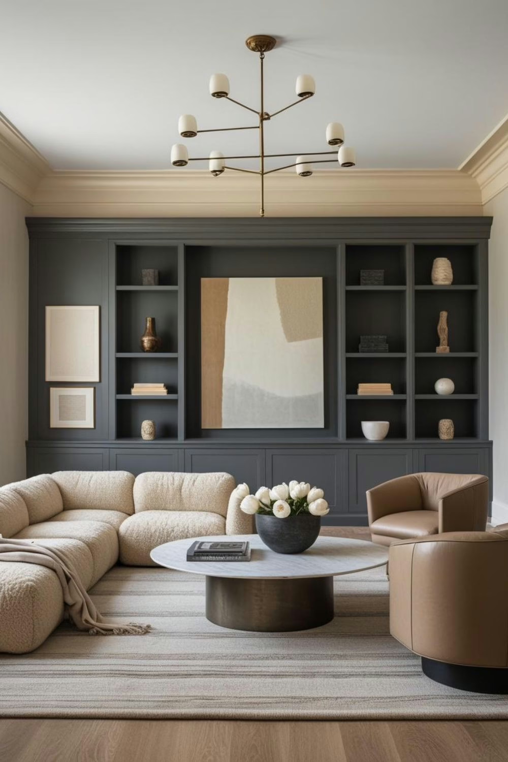
- Living Rooms – A calm, elegant backdrop that doesn’t overpower furnishings
- Bedrooms – Soft and tranquil, perfect for layering with textures
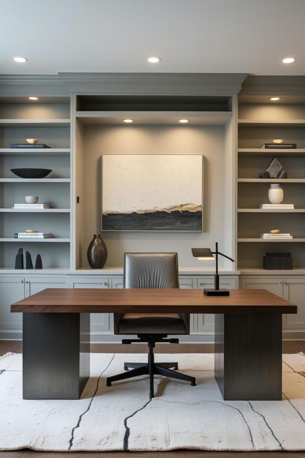
- Home Offices – Keeps things focused and polished without being cold
- Dining Rooms – Creates a tailored, finished look that works with both wood and metal
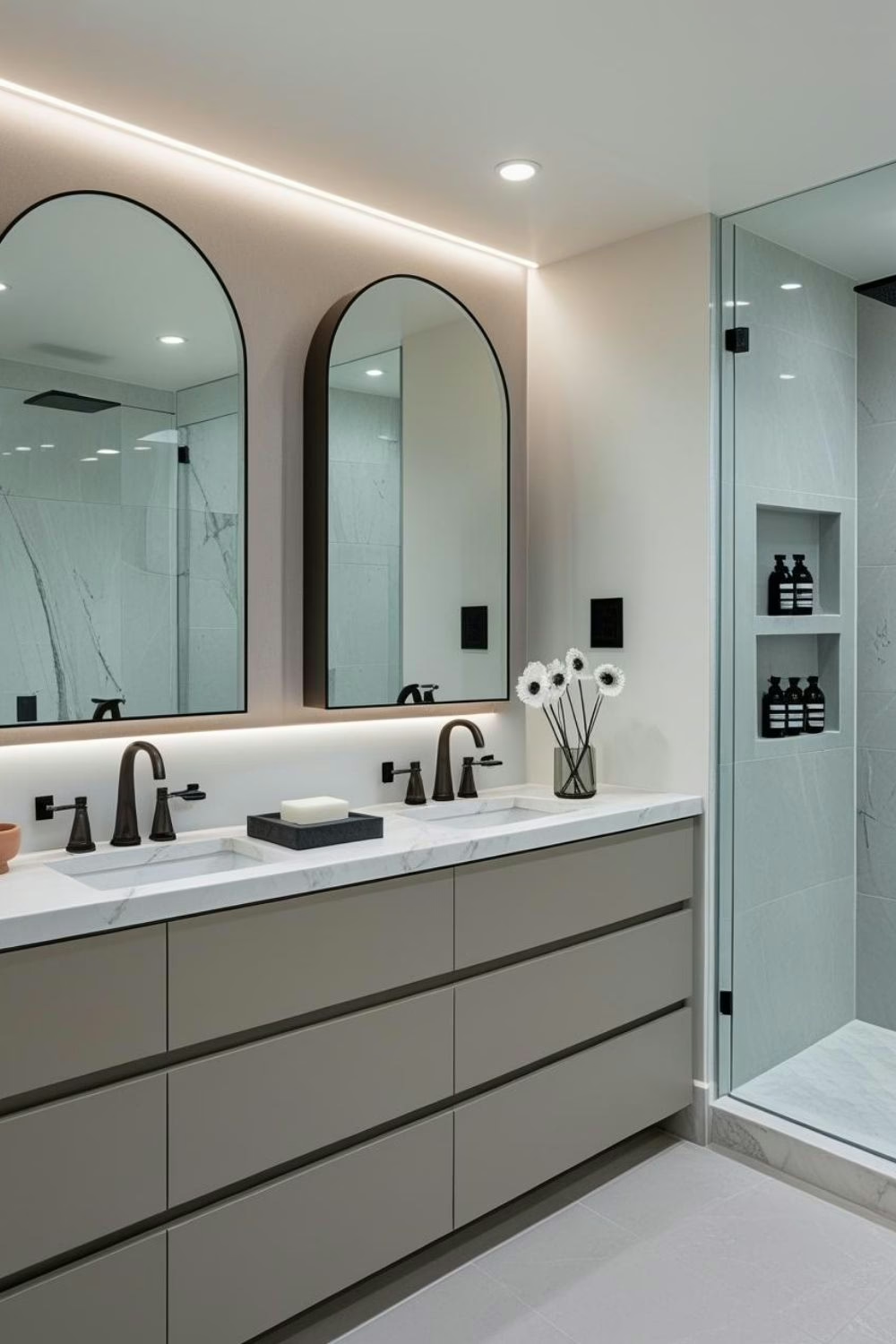
- Bathrooms – Crisp and clean against white tile or marble
It’s also a fantastic choice for open-concept spaces where consistency matters.
What Wood Tones Pair Beautifully?
Repose Gray is one of the most wood-friendly colors out there. It works especially well with:
- Mid-tone walnut or oak – Adds richness and contrast without clashing
- Pale, natural wood – Highlights the warmth and keeps things light
- Aged or reclaimed wood – Emphasizes its organic feel without overwhelming the space
Avoid red or orange-toned woods if you want to keep the look neutral and modern.
What Materials and Finishes Complement SW Repose Gray?
Because Repose Gray is so versatile, it lets your materials do the talking. Some pairings that always work:
- Linen, jute, or wool – Softens the tone and keeps things textural
- Matte black or antique brass – Adds depth and contrast
- Honed stone or ceramic tile – Keeps the look grounded and architectural
- Clean white trim or cabinetry – Offers crisp structure and a timeless feel
It’s also beautiful next to unlacquered metals and handmade finishes that add a bit of soul.
What Colors Pair Well With Accessible Beige?
This is a true team player in a palette. Some of the best pairings include:
- Crisp whites – Like Pure White or Alabaster for trim or ceilings
- Warm taupes and soft beige – Create a tonal, layered look
- Dusty blues or navy – Bring in contrast without overwhelming the space
- Muted greens or sage – Play up the earthy side of the undertone
- Charcoal or soft black – Grounds the color and adds drama
Repose Gray holds its own with both warm and cool colors, which makes it incredibly easy to work with.
And if you’re building a color story and want expert coordination, explore my color guides on Etsy – each one is designed to make paint pairing easier and more beautiful.
What Styles Work Best with SW Repose Gray?
Repose Gray fits beautifully into a wide range of interiors. Some of the most natural pairings include:
- Transitional – The perfect bridge between classic and contemporary elements
- Modern farmhouse – Warms up black-and-white palettes without going beige
- Scandinavian minimalism – Softens the starkness and adds a quiet elegance
- Coastal or organic modern – Evokes a driftwood-like calm that’s light but grounded
- Traditional with a twist – Updates older trim or finishes with a more modern lens
It’s neutral in the best possible way – adaptable, elevated, and never basic.
Would I Use This for Trim or Doors?
Yes, and it can look amazing when used intentionally:
- Interior doors – Offers a soft, unexpected alternative to white
- Built-ins or bookcases – Creates contrast against a lighter wall or ceiling
- Kitchen or bath cabinetry – Works well with white counters and brass or black hardware
If you’re considering using it for all trim, make sure the walls are a deeper shade to avoid everything feeling too flat.
Who Is Repose Gray Best For?
This color is a great fit for:
- People who want gray without the sterility
- Homeowners trying to bridge old finishes with newer design
- Anyone looking for one color to carry through multiple rooms
- DIYers who need a dependable neutral that plays well with others
Curated Wall Art for Elegant Homes
Bring softness, texture, and intention into your home with digital wall art inspired by wabi-sabi, abstract forms, and muted watercolors. Every piece is crafted to create stillness and beauty—whether you’re styling a gallery wall or a minimalist nook.
Final Thoughts
Repose Gray is one of those colors that works hard in the background. It brings just enough personality to give a room polish, but never overwhelms. Whether you’re using it for walls, cabinetry, or even built-ins, it delivers a clean, elevated look that holds up beautifully over time.
Try it in your home with a peel-and-stick sample first to see how it plays in your light.
Need help building your palette?
Check out my curated color guides on Etsy – they take the guesswork out of pairing and help you decorate with confidence.
- SW Accessible Beige & Perfect Pairings
- SW Repose Gray & Perfect Pairings
- SW Quietude & Perfect Pairings
Until next time,
Franzi