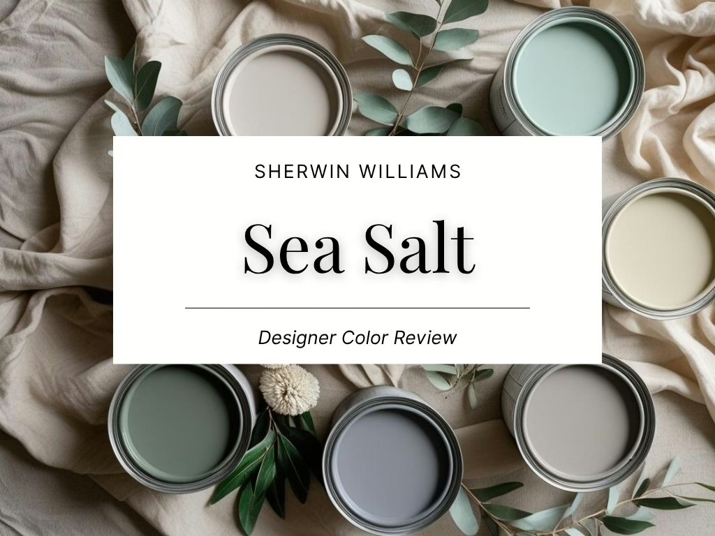
Sherwin Williams Sea Salt (SW 6204) Color Review

Quietude: A Calm Green-Blue That Feels Like a Breath of Fresh Air
Today, I want to share a color that continues to be a fan favorite – Sea Salt by Sherwin-Williams. It’s a soft, beachy hue that instantly evokes calm, comfort, and a sense of clarity. If you’re looking for a paint color that feels like a breath of fresh air but still reads as sophisticated and intentional, Sea Salt could be the perfect fit.
Sherwin-Williams’ Sea Salt (SW 6204) is a light, muted blue-green with a silvery softness that brings a peaceful energy into any room. I especially love it in spaces that need a light touch of color without becoming too bold or too cool. It’s a designer-approved go-to for good reason.
What Does Sea Salt Look Like?
Sea Salt is best described as a soft green-blue that leans airy and tranquil. It’s not quite mint, not quite aqua – more like a subtle coastal breeze in color form. It sits between green and blue, but always looks light and powdery, never saturated or loud.
It has a misty, foggy finish that reads fresh but never stark. Depending on what it’s paired with, it can feel slightly more green or more blue, but it always maintains a serene, spa-like mood. There’s a natural, organic quality to it that feels clean and restorative.
What Are the Undertones?
Sea Salt has a strong green base with clear blue undertones, both softened by a touch of gray. The gray keeps the color from becoming too pastel or tropical, and makes it more livable in adult spaces. In brighter light, the blue comes forward. In dimmer or north-facing light, the green dominates.
The undertones are what make this color so versatile – it walks the line between colorful and neutral, which is why it works in so many homes and room types.

What Is the LRV of Sea Salt?
The Light Reflectance Value (LRV) of Sea Salt is 63, which means it reflects a high amount of light. It’s definitely in the light category, but it carries enough color to stand apart from pure off-white or soft gray.
This LRV makes it perfect for rooms where you want to keep things airy and open. It bounces light around without being sterile and maintains a soft sense of color even in shaded corners or under artificial lighting.
Is Sea Salt Warm or Cool?
Sea Salt leans cool, due to its blue and gray undertones. But the green softens the temperature just enough to prevent it from feeling icy or clinical.
That balance is what makes it so appealing – it’s cool enough to feel fresh and crisp, but warm enough to remain inviting. It won’t overpower a room, and it won’t make a space feel stark or blue-gray.
What Lighting Directions Work Best?
Here’s how Sea Salt behaves in different lighting conditions:
- North-facing rooms – Appears more muted and leans toward soft green-gray. It feels cooler and more subtle.
- South-facing rooms – The natural light brings out the blue undertones, giving it a beachy brightness.
- East-facing rooms – Morning light enhances its freshness, while afternoon light mutes the color slightly.
- West-facing rooms – Starts out subtle but deepens slightly into a gentle green as the sun shifts in the evening.
Because Sea Salt is so reactive to light, it’s essential to test it at different times of day in your space.

Best Rooms to Use Sea Salt In
You can use this color in almost any room, but it shines especially well in:
- Bedrooms – Brings a gentle, calming effect that’s perfect for winding down.
- Bathrooms – Ideal for spa-like serenity, especially with white or marble finishes.
- Living Rooms – Adds a soft wash of color while keeping the space feeling open.
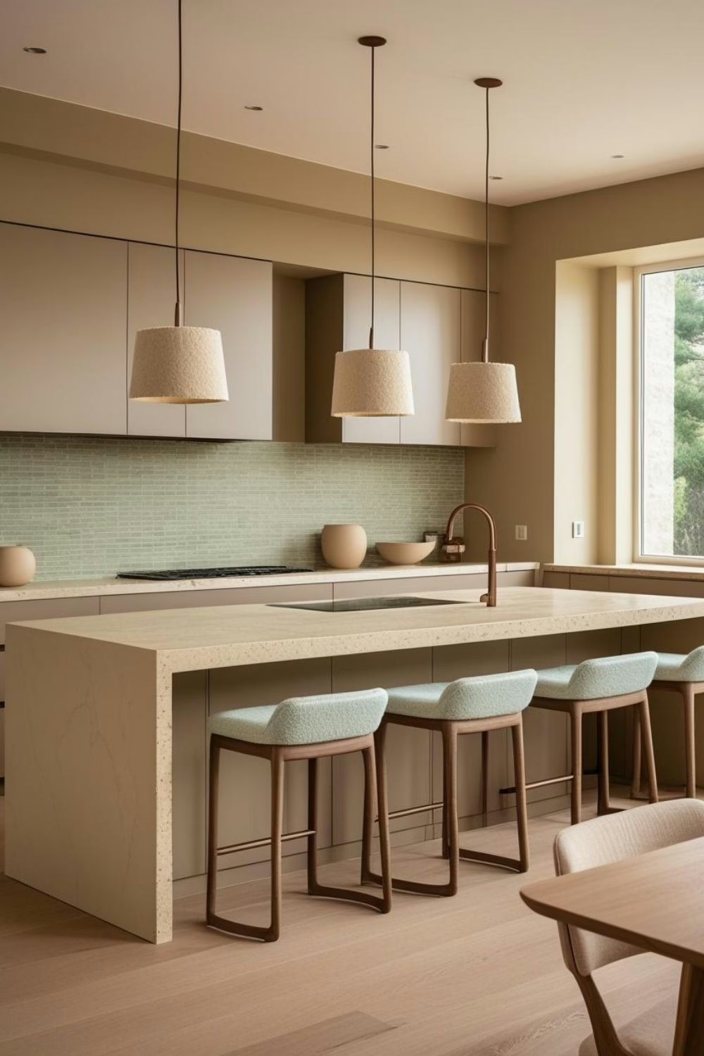
- Kitchens – Works beautifully on walls or cabinetry for a fresh, clean atmosphere.
- Laundry Rooms – Makes a functional space feel polished and relaxed.
- Entryways – Offers a soothing welcome to anyone stepping inside.
What Wood Tones Pair Beautifully?
Sea Salt looks exceptional next to:
- Light oak and ash woods – These enhance its coastal feel and brighten the palette.
- Mid-tone walnuts – Add richness and contrast while keeping the space warm.
- Whitewashed or driftwood finishes – Amplify its soft, beach-inspired vibe.
Avoid pairing it with overly red-toned woods, which can clash with the subtle green and blue hues.
What Materials and Finishes Complement SW Sea Salt?
This color is all about balance, softness, and natural texture. Pair Sea Salt with:
- Linen, gauze, or cotton – For an organic, relaxed atmosphere.
- Brushed brass or aged nickel – Adds a quiet elegance without overpowering the palette.
- Honed marble, quartz, or matte stone – Keeps the look clean and refined.
- Ceramic tile or white subway tile – For bathrooms or kitchens with a fresh but timeless vibe.
Layering textures ensures Sea Salt doesn’t feel flat, especially in minimal color schemes.

What Colors Pair Well With Sea Salt?
Sea Salt plays beautifully with a range of shades. Try it with:
- Soft whites – Like Extra White or Alabaster for trim and ceilings.
- Warm neutrals – Cream, oatmeal, or greige tones create a relaxed palette.
- Deeper blues – Navy or denim tones offer a striking contrast.
- Earthy greens – Sage or dusty olive bring an organic layering effect.
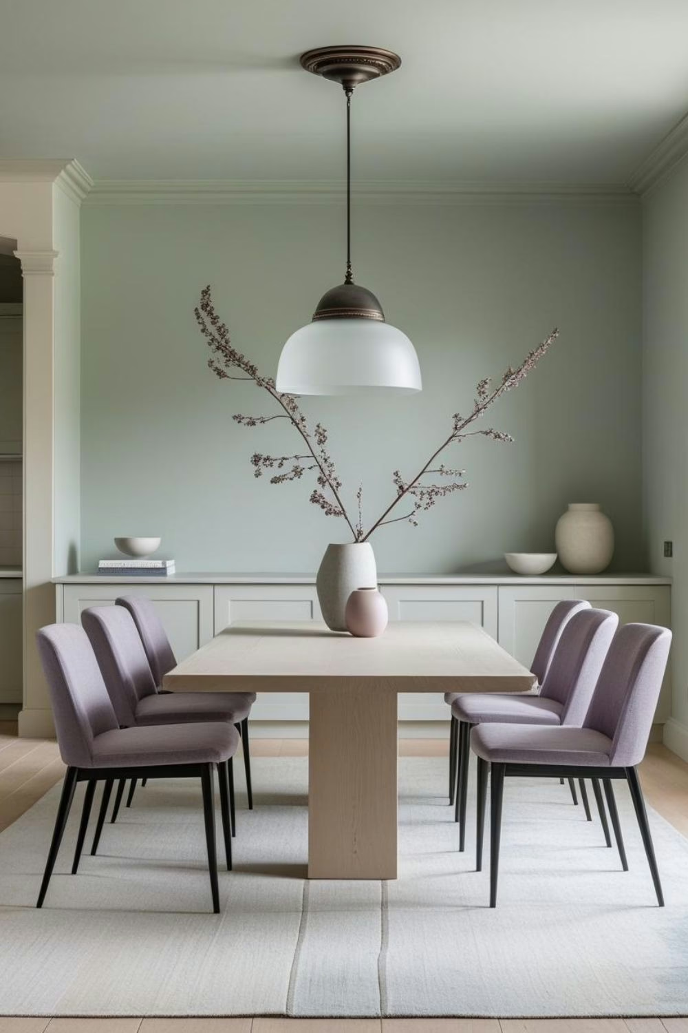
- Mauve or muted lavender – For a soft, feminine twist that still feels modern.
- Charcoal or warm black – Grounds the palette and adds a tailored edge.
It’s also an excellent choice for a whole-home palette that stays interesting while maintaining cohesion.
And if you’re building a color story and want expert coordination, explore my color guides on Etsy – each one is designed to make paint pairing easier and more beautiful.
What Styles Work Best with SW Sea Salt?
Sea Salt is flexible but pairs especially well with:
- Coastal – Natural textures, soft woods, and breezy fabrics come alive next to it.
- Modern Cottage – Sea Salt softens the edges of white walls and traditional trim.
- Scandi-inspired – Works beautifully with pale woods and minimal color palettes.
- Transitional – Balances traditional architecture with updated finishes.
- Spa or Wellness-Inspired – A top choice for yoga rooms, bathrooms, or bedrooms meant to relax the senses.
Its ability to blend into various aesthetics makes it a great anchor for layered, livable interiors.

Would I Use This for Trim or Doors?
Yes – but it depends on the design goal. Sea Salt looks beautiful when used on:
- Bathroom or laundry cabinets – Adds gentle color without overwhelming small spaces.
- Interior doors – Subtle and unexpected in an all-white hallway or soft neutral room.
- Built-ins – Perfect for soft color in an otherwise tone-on-tone palette.
For trim use, I recommend caution. It works best with white walls or a deep contrast shade. It’s not a great choice for full-house trim, but it’s ideal for accents and focal points.
Who Is Sea Salt Best For?
Sea Salt is perfect for:
- Homeowners who want color but still crave calm
- People transitioning from all-white interiors to more depth
- Anyone building a spa-like retreat or fresh coastal palette
- Designers seeking a soft, client-friendly alternative to gray or beige
- Those who love green and blue but want a more livable version
Curated Wall Art for Elegant Homes
Bring softness, texture, and intention into your home with digital wall art inspired by wabi-sabi, abstract forms, and muted watercolors. Every piece is crafted to create stillness and beauty—whether you’re styling a gallery wall or a minimalist nook.
Final Thoughts
Sea Salt is a color that delivers both personality and peace. It’s soft but never boring, colorful but still neutral enough to use in multiple rooms. Whether you’re going for a full refresh or a subtle update, this shade brings instant calm and quiet elegance.
If you’re thinking of using it, I always recommend testing with a peel-and-stick sample first. Light makes a big difference with this one, and it’s worth seeing how it behaves in your space.
Looking for more ways to style Sea Salt? I’ve created curated color guides and palettes with this shade as the centerpiece – available in the Ferrier Interior Shop on Etsy.
- SW Sea Salt & Perfect Pairings
- SW Repose Gray & Perfect Pairings
- SW Natural Choice & Perfect Pairings
Happy decorating!
Franzi
Casa Ferrier