7 Cozy Minimalist Home Decor Ideas on a Budget
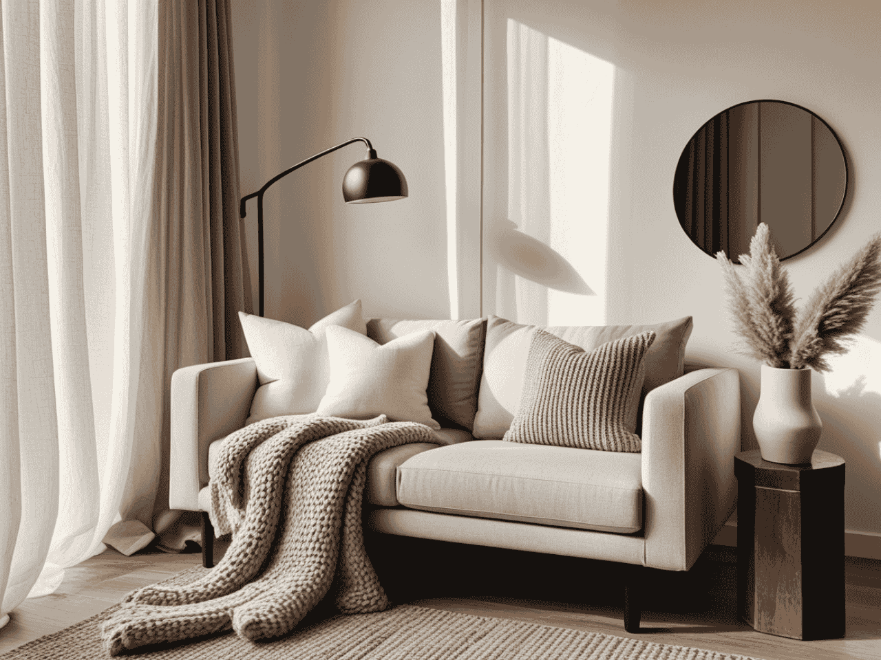
Want to know where I really learned about cozy minimalism? Not in design school, not from fancy magazines, but in a small camper van. True story! After years of designing spacious homes, I decided to challenge everything I thought I knew about design by living the van life for some years. Talk about a crash course in intentional living!
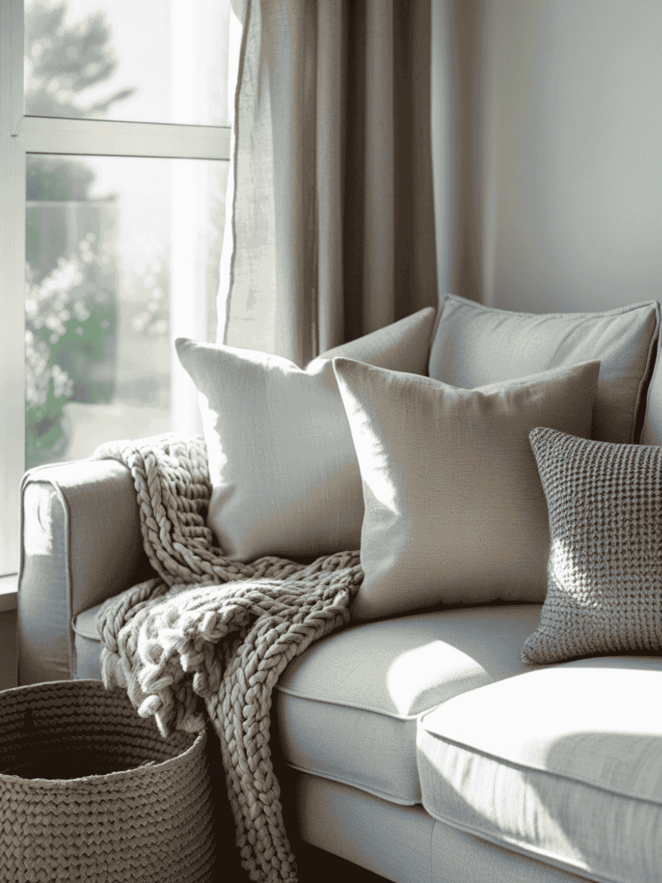
1. The Texture Layering Trick ($50-150): Where Cozy Meets Clean Lines
Let me share a design journey that can transform how you think about creating cozy minimalist spaces. Picture this: I’m working with a client who loves clean lines and modern design but wants her space to feel warm and inviting. As we sat in her pristine living room, sipping coffee and planning the design, we started talking about what makes a space feel like home.
That conversation sparked what I like to call the “touch test” method – a way of layering textures that brings warmth to even the most minimal spaces. It’s like composing a visual symphony where every piece plays its part perfectly.
We started with her sleek, modern sofa as our canvas. What happened next was pure design magic – watching the space transform as we thoughtfully added layers of texture, each one bringing its own character to the room while maintaining that clean, minimal aesthetic she loved.
The best part? This isn’t about spending a fortune on designer pieces. Some of our most impactful additions came from surprisingly accessible sources.
The IKEA Hack That Changed Everything
Okay, here’s my million-dollar secret (that actually costs $9): The IKEA VIGDIS cushion cover. But wait! Before you roll your eyes thinking “another IKEA hack,” let me share the game-changing twist. Here’s what you do:
- First, hand-wash it with fabric softener and a cup of white vinegar (trust me on this one)
- While it’s still damp, gently “rough up” the texture with a soft brush
- Let it air dry, then put it in the dryer on low heat with three tennis balls
- The result? A cushion cover that looks eerily similar to that $180 one from Restoration Hardware
I actually had a client’s mother-in-law (you know, the type who can spot a bargain from a mile away) ask where we got “that gorgeous designer pillow.” When I told her it was IKEA, she made me show her the tag!
The Bouclé Revolution on a Budget
Let’s talk about bouclé – that gorgeous, nubby texture that’s everywhere right now. Here’s what the design magazines won’t tell you: you don’t need to spend $800 on a bouclé accent chair. Instead:
- Hit up your local fabric store’s remnant bin (pro tip: go on Monday mornings when they’ve just put out new pieces)
- Look for anything labeled “textured weave” or “boucle-like” – they’re often the same thing for a quarter of the price
- My favorite find: Joann Fabrics often has a “luxury upholstery” section where you can find bouclé remnants for $15-20 per yard
I recently helped a client transform an old ottoman with $18 worth of bouclé remnant fabric, and it looks like it came straight from CB2’s latest catalog. Total cost including supplies? $43. The CB2 version? $299.
The Touch Test Method
Here’s the framework I work with after that “too cold” living room incident. I call it the “touch test,” and it’s foolproof for creating visual interest without chaos:
- Close your eyes and touch each texture in your room
- You should be able to identify at least 5 different feelings without looking:
- Smooth (like cotton canvas)
- Nubbly (like bouclé or wool)
- Soft (like chenille or velvet)
- Rough (like jute or sisal)
- Sleek (like leather or linen)
Budget-Friendly Texture Sources That Look Expensive
Let me share my secret source list:
- H&M Home’s textured cushion covers ($12.99) – They look like West Elm but cost a fraction
- HomeGoods basket section (go for the ones that look handwoven)
- Amazon’s handmade section for jute runners (search “Indian handwoven jute” specifically)
- Facebook Marketplace for vintage textured throws (search term hack: use “woven blanket” instead of “throw” – trust me, the prices are better)
The Layering Formula That Never Fails
Here’s my foolproof recipe for layering textures in a minimal space:
Base Layer:
- One large textural piece (like a sisal rug) in a neutral tone
- Cost-saving tip: Buy the largest size you can afford – it’s the foundation of everything else
Middle Layer:
- 2-3 medium-sized textural elements (think cushions and throws)
- Designer secret: Mix high and low pieces here. One really good textured throw can elevate everything around it
Top Layer:
- Small textural accents (like a ceramic vase or textured basket)
- Budget hack: This is where those IKEA VIGDIS covers really shine
True story: I recently used this exact formula in a client’s reading nook. Total budget? $127. The result? Her friend asked if she’d used a professional stager. Sometimes the best compliments come from fooling others!
Your Shortcut to Effortless Cozy Minimalism Style
12 refined color palettes & implementation strategies designed to bring warmth, texture, and harmony into your home.
2. Strategic Lighting Magic ($75-200): The Secret Sauce of Cozy Minimalism
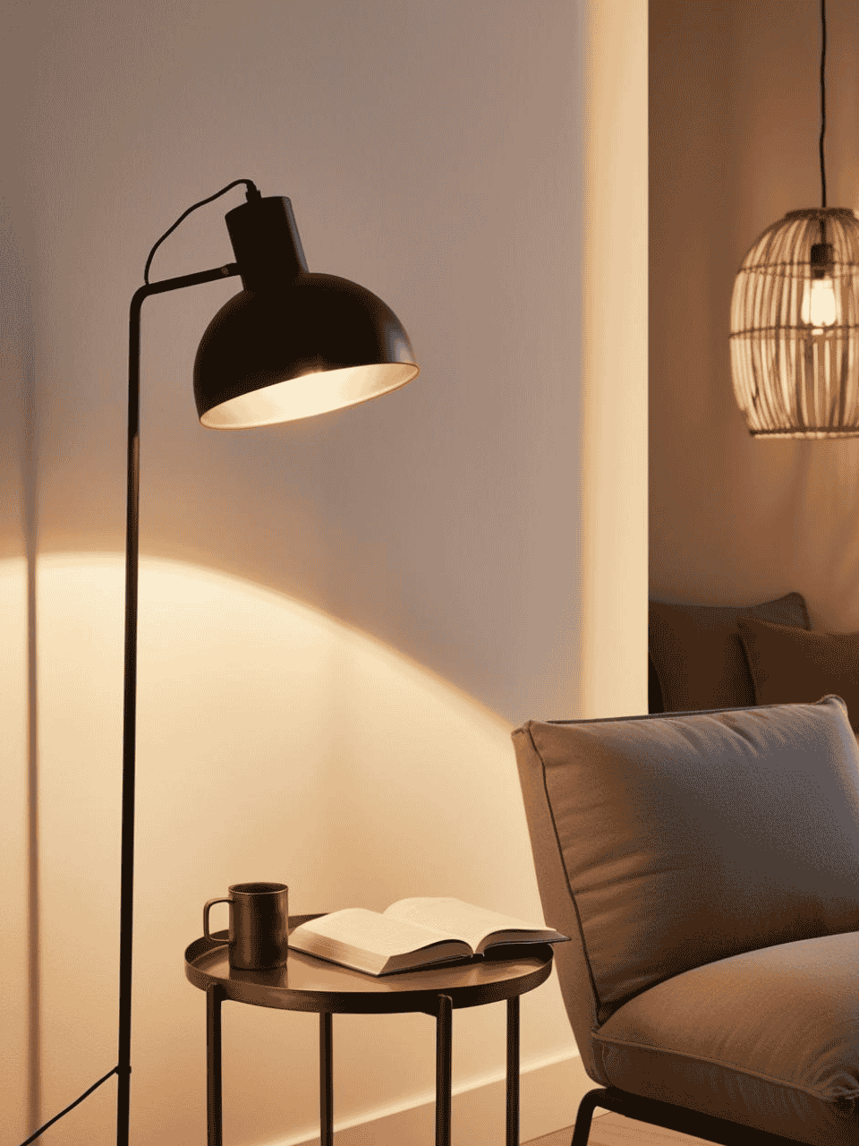
Okay, can we talk about the time I spent $400 on a designer lamp that ended up making my living room look like an interrogation room? 😅 Plot twist: the $98 Target lamp that replaced it actually created the cozy vibe I was after. That expensive mistake taught me something crucial: when it comes to lighting, it’s not about how much you spend – it’s about strategic placement and knowing which pieces are worth the splurge (and which totally aren’t).
The Target Hack That Had My Designer Friends Fooled
Let me spill the tea about Target’s Surplus Collection – specifically their Project 62 line. Here’s why it’s my secret weapon:
- Their brass floor lamps use the same manufacturer as some high-end brands (I literally gasped when I found this out)
- The finishes are nearly identical to the expensive versions
- The weighted bases actually feel more stable than some $300+ options
My favorite find? Their dome floor lamp that looks suspiciously similar to that infamous CB2 bestseller. But here’s the game-changing styling trick:
- Replace the standard bulb with a sunset-hued smart bulb
- Add a small piece of gold leaf to the inside of the dome
- Suddenly you have a $400-looking lamp for under $100
The Rattan Pendant Magic
I still remember when I found a $350 a rattan pendant, and almost fell off my chair. I thought “Challenge accepted!” and got creative. That led to my favorite lighting hack ever:
What You’ll Need:
- Basic white pendant light ($20-30 from IKEA)
- Rattan ribbon from Amazon ($12)
- Hot glue gun
- Clear fishing line
- About 45 minutes of your time (and maybe a glass of wine)
The Step-by-Step That Works:
- Start from the top of the pendant (learned this the hard way after doing it backward the first time)
- Wrap the rattan in a spiral pattern, securing with tiny dots of hot glue
- Use fishing line to reinforce high-stress points
- Add a second layer in the opposite direction for that expensive hand-woven look
Cost breakdown: Under $50 total vs. $300+ for the “real” thing. And honestly? The DIY version often looks better because you can control the pattern exactly how you want it. Bonus: You will feel a sense of pride every time you look at it.
The Cozy Minimalist Lighting Formula
Here’s my never-fail lighting recipe for any room (developed after numerous “this room feels like a hospital” moments):
The Rule of Four:
- Overhead Light (The Scene Setter)
- Keep it simple but impactful
- Budget hack: Spray paint your existing fixture in matte black or brass
- Pro tip: Always, always on a dimmer (even in rentals!)
- Eye-Level Light (The Mood Maker)
- Usually a table lamp or sconce
- This is where that Target magic happens
- Position it about 5 feet off the ground for perfect facial illumination
- Floor Light (The Space Definer)
- Helps create zones in open spaces
- Look for adjustable options for versatility
- My go-to: The Project 62 cantilever floor lamp ($79!)
- Accent Light (The Secret Weapon)
- Small, unexpected sources of glow
- Think: fairy lights in a clear vase
- Hidden LED strips (but used strategically – not like a gaming setup!)
The Smart Bulb Game-Changer
Let’s talk about the most overlooked budget lighting hack: smart bulbs. But not just any smart bulbs – here’s my tried-and-true setup:
Best Budget Options:
- Wyze bulbs for basic fixtures ($15 each)
- TP-Link Kasa for color-changing needs ($25 for two)
- LIFX for premium spots (worth the splurge for main lighting)
The Temperature Trick:
- Morning: Cool white (around 4000K)
- Afternoon: Neutral (3500K)
- Evening: Warm (2700K)
- After 8 PM: Ultra warm (2400K)
True story: I had a client who was ready to repaint her entire living room because it felt “cold.” Turns out, switching her bulbs to warm white solved the entire problem. Cost? $45. Saved? About $800 in painting costs!
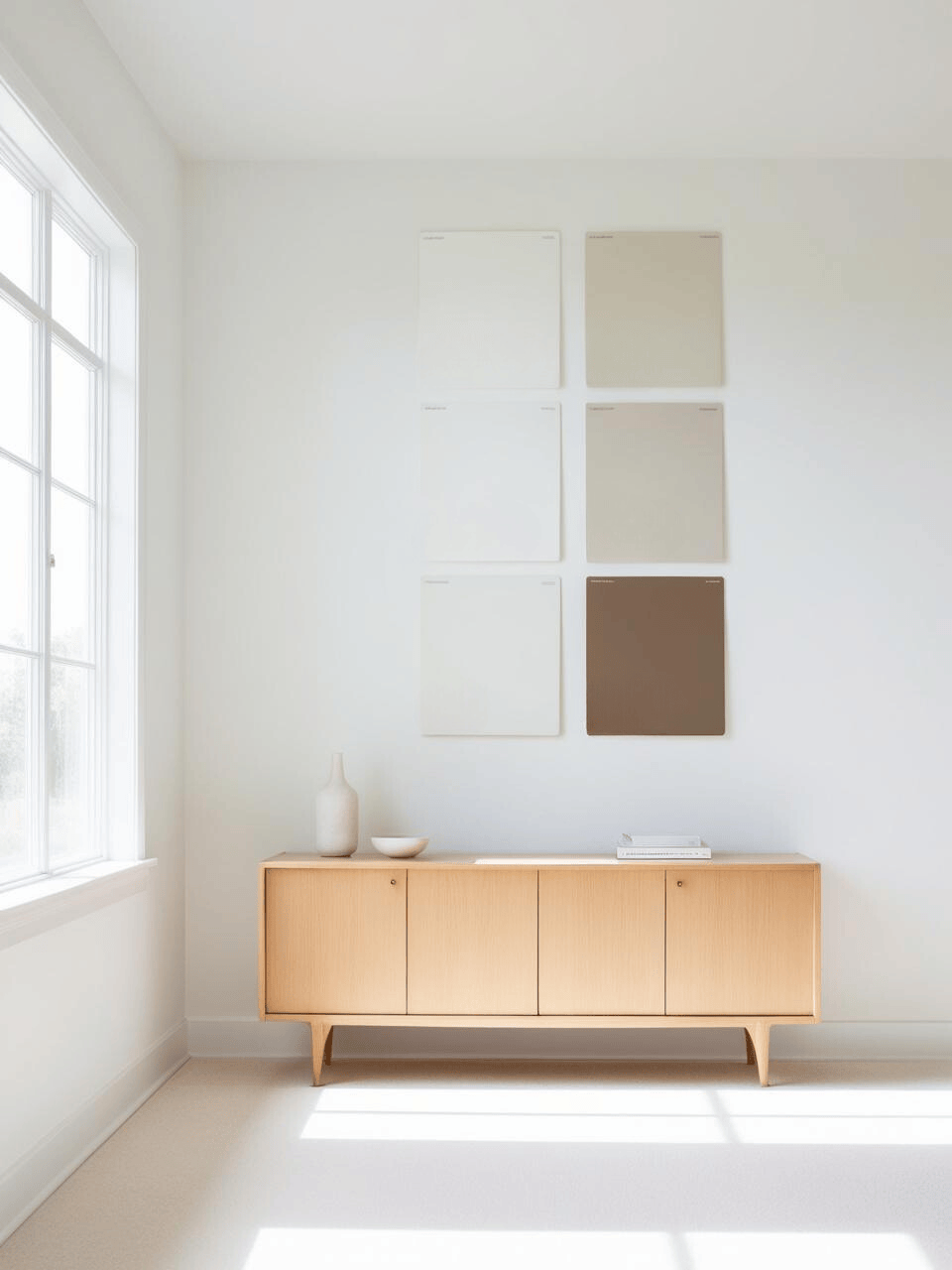
3. The Right White Paint Strategy ($30-60): The Foundation of Cozy Minimalism
Let me tell you about my “Fifty Shades of White” phase – and no, it wasn’t nearly as exciting as it sounds. Picture me, surrounded by 23 white paint samples, trying to convince myself they all looked different. (Spoiler alert: they did, and that’s exactly what led to my biggest paint disaster yet!)
I still remember the day when I confidently painted an entire apartment in Pure White without testing it first. My boyfriend back then walked in and said, “Oh… it feels like we’re living in a yogurt commercial.” That’s when I learned the most valuable lesson about white paint: the right white can make your space feel like a warm hug, while the wrong one can make it feel like a medical waiting room.
The White Paint Truth Bomb
Here’s what design magazines won’t tell you about white paint:
- Pure white is almost never the answer (unless you’re running a gallery or really love that “fresh snowfall” vibe)
- Undertones are everything (and they’re probably not what you think they are)
- The same white paint can look completely different in your space than it did in that gorgeous Architectural Digest spread
My Never-Fail White Paint Testing Method
After the Great White Disaster of my early designer days I developed what I call the “White Paint Success System”:
- The Sample Board Strategy
- Grab a piece of white poster board (NOT paint store sample cards!)
- Paint 2’x2′ squares of each sample
- Move these bad boys around your space throughout the day
- Pro tip: Label the backs with painter’s tape – trust me, you think you’ll remember which is which, but after sample #4, they all start looking the same
- The Three-Day Rule
- Day 1: Morning light check
- Day 2: Evening light assessment
- Day 3: Cloudy day evaluation
True story: A client almost picked the wrong white because she only looked at samples during golden hour. Everything looks good during golden hour!
My Top 3 Budget-Friendly Warm Whites (That Never Fail)
- Sherwin-Williams Alabaster (My Ride-or-Die)
- Why it works: The perfect balance of warm and clean
- Where to use it: Literally anywhere – it’s the Switzerland of white paints
- Money-saving tip: Get it color-matched at a budget-friendly paint store
- Real client quote: “It feels like my walls are giving me a hug”
- Benjamin Moore Swiss Coffee (The Chameleon)
- Perfect for spaces with tricky lighting
- Looks expensive even when it isn’t
- Pro tip: Get the color matched at Behr for half the price
- Warning: The sample looks scary yellow – trust the process!
- Valspar Warm Wool (The Sleeper Hit)
- My go-to for budget renovations
- Already available at a lower price point
- Looks incredibly high-end when paired with textural elements
The $8 Sample Pot Trick
Here’s how to test whites without breaking the bank:
- Buy ONE sample pot of your chosen white
- Paint it on THREE different walls
- Mark each test area with:
- North-facing spot
- South-facing spot
- A typically shadowed area
- Check each spot during:
- Morning coffee time
- Lunch break
- Wine o’clock (aka sunset)
- After dark with your actual lights
The Undertone Cheat Sheet
Stop me if this sounds familiar: “I picked a white paint and somehow ended up with baby pink walls?” Here’s my foolproof undertone test:
Hold your sample against:
- A pure white sheet of paper
- A cream towel
- A gray paint chip If it suddenly looks pink, yellow, or blue – that’s your undertone calling!
Unlock Designer-Perfect Colors in Minutes
Browse my curated collection of interior color palettes—tailored for today’s most loved design styles.
4. Thrifted Natural Elements ($0-50): The Soul of Cozy Minimalism
Okay, we need to talk about the time I spent $175 on a “perfectly imperfect” wooden bowl from that fancy home store we all pretend we don’t stalk on Instagram. Two weeks later, I found its actual twin at Goodwill for $4. That moment changed everything I thought I knew about sourcing natural elements for a cozy minimalist space. (And yes, I still have both bowls – one’s just my secret “I can’t believe it’s thrifted” conversation starter!)
The Facebook Marketplace Secret Menu
Let me spill my most sacred thrifting secrets. Forget searching for “wooden bowl” – that’s amateur hour, and it’s why you’re seeing overpriced Instagram-worthy pieces. Here’s my secret search term list that consistently scores the good stuff:
The Magic Search Terms:
- “Vintage wooden” (instead of just “wood”)
- “Teak bowl” (even if you’re not sure it’s teak)
- “MCM accessories” (hello, hidden gems!)
- “Scandinavian decor” (trust me on this one)
True story: One of my clients found a set of three perfectly aged wooden bowls for $15 using these search terms. The seller thought they were “just old bowls.” We did a quick transformation, and now they’re the star of her dining room – the ones guests always ask about!
The 15-Minute Bowl Transformation That Changes Everything
That $80 for a “restored” wooden bowl you were eyeballing? Yeah, about that… Here’s how to get the same look for pennies:
The Never-Fail Process:
- Light sanding (220 grit is your friend)
- Just enough to smooth, not strip
- Focus on the rim and any rough spots
- Pro tip: Sand in the direction of the wood grain
- The Secret Sauce
- Mix equal parts:
- Mineral oil ($4 at any drugstore)
- Pure beeswax ($6 at craft stores)
- Heat gently in a double boiler
- Apply with a lint-free cloth
- Let sit overnight
- The Final Touch
- Buff with a clean cotton cloth
- Add a second coat if the wood still looks thirsty
- Stand back and admire your $5 thrift store find that now looks like it came from that fancy store in Soho
The Natural Element Treasure Map
I’ve mapped out all the secret spots where you can find amazing natural elements without breaking the bank. Here’s my tried-and-true circuit:
- Estate Sales (The Gold Mine)
- Go on the last day
- Look in the kitchen (seriously!)
- Check the basement
- Pro tip: Most estate sale companies post photos online – search for “wood” or “natural” in their descriptions
- Flea Markets (The Hidden Gem Factory)
- Go early (like, breakfast-early)
- Bring cash (and small bills)
- Look for the vendors with the messiest booths
- True story: Found a $300-looking olive wood bowl under a pile of Christmas ornaments for $8
- Antique Mall Back Corners
- Skip the front displays
- Head straight to the back corners
- Look on bottom shelves
- Check the “clearance” booths
The “Is It Worth It?” Checklist
After one too many “what was I thinking?” purchases, I developed this checklist for evaluating natural pieces:
✓ Weight Test
- Should feel substantial for its size
- No hollow sounds when tapped
- Stable when set down
✓ Construction Check
- Look for solid pieces over glued ones
- Check for cracks versus natural grain
- Examine joints and seams
✓ Transformation Potential
- Can minor flaws be sanded out?
- Is the overall shape good?
- Would mineral oil bring out natural beauty?
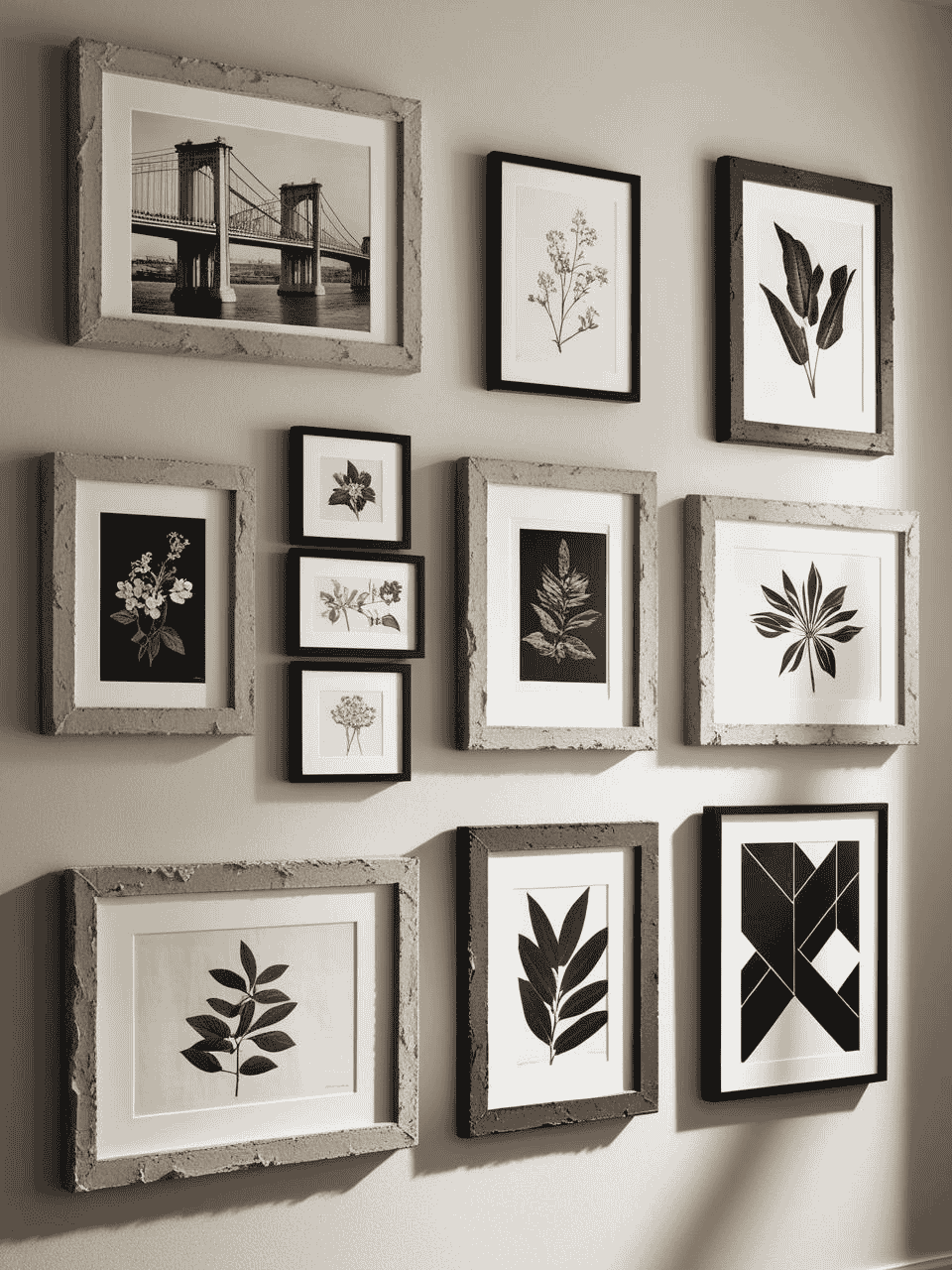
5. The Minimalist Gallery Wall ($100-200): Your Personality on Display (Without the Price Tag)
Let me share a story that still makes me cringe: I once spent $400 on a single oversized print for a gallery wall. The day after we hung it, I found practically the same image as a free download on Unsplash. 🤦♀️ That moment of pure designer mortification led me to develop what I now call the “High-End, Low-Spend Gallery Wall System” – and honestly? The results look even better than those budget-busting pieces.
The Engineering Print Secret That Changed Everything
Picture this: I’m standing in my local copy shop, trying to explain why I want to print art on engineering paper without actually saying it’s for art (because technically, it’s not what these prints are for). The guy behind the counter gives me thatlook, but lets me do it anyway. The result? A stunning 36×48 print for – wait for it – $7.86.
Here’s my tried-and-true engineering print process:
- Find high-res black and white images (architectural shots work beautifully)
- Convert to grayscale in a free photo editor
- Bump up the contrast slightly
- Save as PDF
- Take to your local copy shop and ask for “engineering prints”
Pro tip: When they ask what it’s for, just smile and say “project documentation.” Trust me on this one! 😉
The Frame Hack That Had My Designer Friend Googling
Here’s where it gets really good. I call this my “aged plaster frame” technique:
What You’ll Need:
- Basic black frames from Target ($15-20 each)
- Pre-mixed joint compound ($8)
- Putty knife
- Old paintbrush
- White chalk paint
The Magic Process:
- Remove the glass (keep it clean!)
- Apply a thin layer of joint compound to the frame
- Before it dries completely, take your brush and create subtle texture
- Let it dry overnight
- Add a whisper of chalk paint
- Reassemble with your engineering print
Cost per frame? About $25. The look? Like it came from that fancy art gallery downtown that none of us can afford.
Free Art Sources That Look Expensive
Let me tell you about my secret art sources that have saved clients thousands:
- The New York Public Library Digital Collection
- Vintage botanical prints that look incredible large-scale
- Historical maps that make amazing statement pieces
- Pro tip: Search for “hand-colored” items for the best finds
- Biodiversity Heritage Library
- The most gorgeous nature illustrations you’ve ever seen
- Perfect for those moody, dramatic gallery walls
- Fun fact: These are what those expensive art retailers are reselling for $200+
- NASA’s Public Domain Gallery
- Abstract satellite images that look like modern art
- Cosmic photos that create instant drama
- True story: A client’s guest thought their NASA print was a $900 abstract painting!
The Spacing Secret No One Talks About
Here’s my “make it look curated” formula that never fails:
- 2-3 inches between smaller pieces
- 4-6 inches between larger pieces
- One statement piece that’s at least 30% larger than the others
The real trick? Lay it all out on your floor first and snap a photo. Then look at the photo through your phone’s black and white filter. If it looks balanced in B&W, it’ll look amazing in color!
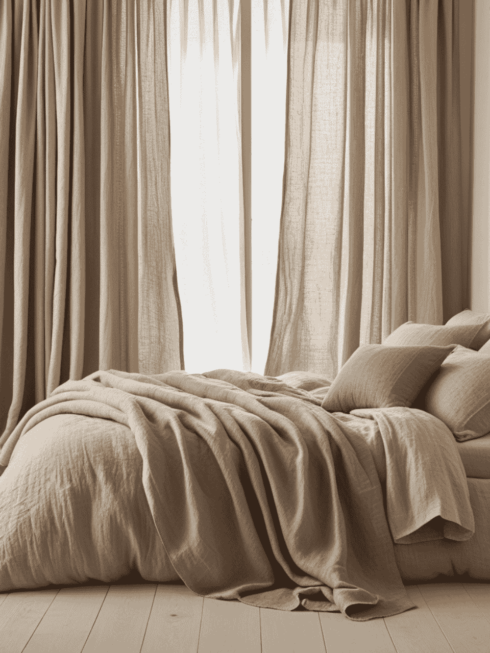
6. Strategic Soft Furnishings ($150-300): The Cozy Layer That Makes Everything Work
You guys, we need to talk about a $250 throw pillow incident. Picture me, convinced that this one designer pillow would transform my entire sofa situation. Cut to: me, discovering that my “investment piece” looked exactly like the $34.99 H&M Home version my friend had just bought. I’ve never swiped my credit card return so fast! But you know what? That humbling moment led to cracking the code on how to make budget-friendly soft furnishings look like they cost a small fortune.
The H&M Home Magic No One’s Talking About
Let me spill some tea about H&M Home’s linen-blend curtains. You know those dreamy, expensive-looking European curtains all over Pinterest? Yeah, we can get that look for about a quarter of the price. Here’s my never-fail curtain hack:
The Perfect Curtain Formula:
- Buy them 2 sizes too long (trust the process!)
- Wash them with a cup of white vinegar
- While slightly damp, do my signature fold-under hem:
- Fold up from the bottom
- Press with steam
- Use hem tape (no sewing!)
- Let them “rest” overnight
- Hang them high and wide (like, higher than you think)
The Pillow Insert Secret That is a Real Gamechanger
Okay, here’s the truth about throw pillows that took me way too long to learn: A cheap cover with an expensive insert looks way better than an expensive cover with a cheap insert. Mind. Blown. Right?
My Pillow Formula:
- Down-alternative inserts (allergies are real, friends!)
- Always size up (20″ insert for an 18″ cover)
- Mix high and low (splurge on back pillows, save on decorative ones)
The Game-Changing Insert Brands:
- Crate & Barrel inserts (wait for sales!)
- HomeGoods down-alternative finds (dig through the bins)
- Amazon Basics (but only the ones with 4.5+ stars)
The Texture Mixing Blueprint
Here’s my foolproof recipe for mixing textures without looking like a fabric store exploded:
Base Layer:
- Linen-look curtains (H&M Home, always)
- One solid-colored, textured throw (the IKEA INGABRITTA is my ride-or-die)
- Basic cotton pillow covers in your main neutral
Middle Layer:
- Two different textured pillows (think: bouclé + woven)
- One patterned throw (small scale, tone-on-tone)
- A chunky knit accent (HomeGoods clearance section is your friend)
Top Layer:
- One “fancy” pillow as your star player
- A delicate mohair or cashmere-blend throw
- Something unexpected (like that vintage silk scarf turned pillow)
Want to know my biggest soft furnishings secret? It’s all about the high-low mix. I recently styled a sofa with:
- Two $12.99 H&M pillow covers
- One splurge throw pillow from West Elm
- IKEA throw blanket
- One vintage silk scarf turned lumbar pillow ($6 at Goodwill!)
Total cost? $147. The look? Easily $500+. The secret? Everything had amazing texture and the colors were spot-on.

7. Mindful Color Layering ($50-100): The Secret to Sophisticated Coziness
Let me tell you about what I now affectionately call “The Great Greige Disaster of 2023.” Picture this: I’m standing in my client’s living room, surrounded by fifty shades of what I THOUGHT were fool-proof neutral paint samples, when she walks in and says, “Why does my room look like an old oatmeal bowl?” 😅 That moment – while slightly traumatic – taught me everything I know about layering colors the smart way.
The Tonal Triangle Method That Changed Everything
You guys, this is the color-choosing hack that literally saved my design career (okay, maybe I’m being a bit dramatic, but it’s GOOD). I call it the Tonal Triangle, and it’s basically foolproof:
Choose three shades of the same color:
- Light version (think: your perfect warm white)
- Medium version (your cozy greige)
- Deep version (that yummy taupe)
Here’s the magic part – distribute them in your space like this:
- 60% lightest shade (walls, large furniture)
- 30% medium shade (accent furniture, textiles)
- 10% deepest shade (accessories, art)
True story: I used this method in a client’s “impossible to decorate” north-facing room, and her husband (who previously couldn’t tell beige from bark brown) actually noticed how much warmer the space felt. Design victory! 🎉
The Paint Sample Art Hack That Looks Expensive
Remember all those paint samples you’ve been hoarding? (Don’t worry, we all do it!) Here’s how to turn them into actually gorgeous art:
What You’ll Need:
- Those million paint samples you’ve collected
- Sharp scissors
- Plain white frames from Target
- Archival-quality glue stick
- A good playlist (this takes time, but it’s so worth it!)
The Process:
- Cut geometric shapes (triangles are your friend)
- Arrange by temperature (warm with warm, you know the drill)
- Create an abstract pattern
- Frame that baby up!
Cost breakdown: About $35 total for something that looks like it came from that fancy gallery downtown. I recently did this for a client’s powder room, and their real estate agent thought it was commissioned art. I’ll never tell if you don’t! 😉
My Favorite Neutral-But-Not-Boring Combinations
Let’s talk about the combinations that never fail:
The Coffee Shop Cozy:
- Warm white (walls)
- Oat milk beige (larger pieces)
- Rich espresso (accents)
The Scandi Chic:
- Bright warm white (base)
- Pale birch (middle)
- Warm gray (accents)
The Desert Modern:
- Sand white (main color)
- Warm terracotta (secondary)
- Deep clay (punches)
Pro tip: Want to test if your colors work together? Grab some coffee filters (yes, really!), paint small swatches on them, and let them dry. The thin paper shows undertones like nobody’s business. This little trick has saved me from so many “why is this reading pink?!” moments!
The Two-Tone Wall Technique
Here’s my favorite budget-friendly way to add depth without going full accent wall (because honestly, we’re all a little tired of those, right?):
- Choose two shades in the same color family
- Paint the bottom 1/3 of your wall in the darker shade
- Use the lighter shade above
- Skip the chair rail (trust me – clean lines are your friend)
Cost? About $60 in paint. Impact? Looks like you hired a designer. I did this in my own bedroom and now all my designer friends are copying it. Should I be flattered or annoyed? (Definitely flattered – imitation is the sincerest form of flattery in design!)
Remember, friends: The best color schemes aren’t about following rigid rules – they’re about creating spaces that make you want to kick off your shoes and stay awhile. And if you accidentally paint a wall the wrong shade of greige? Welcome to the club – we meet every time the paint store has a sale! 😉
Curated Wall Art for Elegant Homes
Bring softness, texture, and intention into your home with digital wall art inspired by wabi-sabi, abstract forms, and muted watercolors. Every piece is crafted to create stillness and beauty—whether you’re styling a gallery wall or a minimalist nook.
In Conclusion: Happy Decorating!
You guys, can we just take a moment to appreciate how far we’ve come? From expensive designer lamp fiascos to that time I thought pure white walls were the answer to everything (narrator: they were not), we’ve covered a lot of ground. And you know what? Creating a cozy minimalist space that doesn’t require a trust fund is totally possible – we’ve got the receipts to prove it!
Let’s do a quick reality check on what we’ve learned (and the money we’ve saved):
- That IKEA VIGDIS cushion cover that looks like it cost a month’s rent? $9!
- The rattan pendant that had my friends fooled? Under $50!
- Those “vintage” wooden bowls that keep stealing the show? Thrifted for pocket change!
- And don’t even get me started on those engineering prints that look like gallery art – I’m still not over that $7.86 price tag!
Here’s what I really want you to take away from all this: Creating a space that feels both zen AND cozy isn’t about having the biggest budget or following some rigid minimalist rulebook. It’s about being clever with your choices, intentional with your spending, and not afraid to laugh at yourself when that “perfect” white paint turns out to be more “medical office” than “modern farmhouse.”
Listen, if I can recover from painting an entire apartment Pure White without testing it first (still cringing), you can absolutely create the cozy minimalist space of your dreams without eating ramen for the next six months. Start with one thing – maybe that IKEA cushion hack or the Facebook Marketplace treasure hunt. Test out the tonal triangle method in your smallest room. Play with lighting until you find your perfect golden hour glow.
And if something doesn’t work out exactly as planned? Congratulations! You’re officially part of the “design is a journey, not a destination” club. We meet every time someone asks us if we’re sure about mixing those metals. (Spoiler alert: we’re totally sure, even if we weren’t the first three times! 😉)
Remember: The most beautiful spaces aren’t the ones that look perfectly curated – they’re the ones that make you want to kick off your shoes, curl up with a good book, and stay awhile. Now go forth and create something beautifully, perfectly, imperfectly yours!
P.S. Still not sure where to start? Pick your favorite tip and just dive in. The worst thing that could happen is you end up with a funny story for your next dinner party. And trust me, those “what was I thinking?” design moments make the best stories! Just ask me about the time I thought three different gold finishes “basically matched.” (Friends, they did not.)
Now it’s your turn to create some magic! And remember, if anyone asks where you got your amazing [insert thrifted find here], you can just smile mysteriously and say, “Oh, this old thing? It’s vintage.” Because technically, everything at Goodwill is vintage, right? 😉