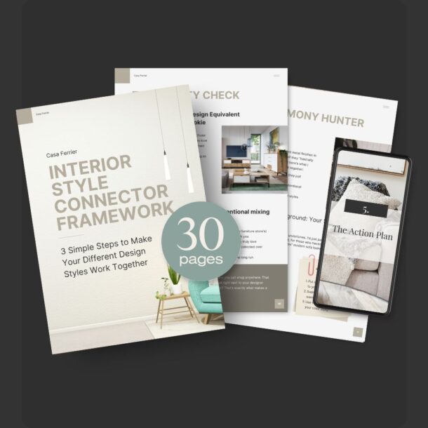
Pattern Clashing 101: How to Boldly Combine Prints in Your Home

Let me tell you about my first real dive into pattern mixing. Picture this: I’m standing in my living room, surrounded by what felt like a hundred fabric samples, trying to convince myself that leopard print, florals, and geometrics could totally work together. (Spoiler alert: they can, but maybe not in the way I first attempted!)
Here’s the thing about pattern mixing – it’s a bit like cooking without a recipe. Sure, you could play it safe and stick to the basics, but where’s the fun in that? I’ve spent years experimenting with patterns, making plenty of what I like to call “learning opportunities” along the way, and now I’m here to share everything I’ve discovered about making different prints play nicely together.
Whether you’re staring at that bold floral armchair you inherited from your aunt (wondering how it could possibly work with your modern geometric rug), or you’re ready to dive headfirst into the world of pattern mixing but aren’t quite sure where to start – I’ve got you. We’re going to explore everything from why pattern clashing actually works (trust me, there’s a method to the madness) to how to pull it off in every room of your home.
Think of this as your pattern-mixing permission slip. You know that wallpaper sample you’ve been holding onto for months, afraid to commit? Or those striped pillows you love but aren’t sure about? We’re about to break down exactly how to make them work in your space.
And don’t worry – I’ll share all my “what was I thinking?” moments so you can skip straight to the good stuff. Ready to create some pattern magic? Let’s dive in!

Why Pattern Clashing Works: Understanding the Basics
You know what always makes me smile? Walking into a room where patterns that technically shouldn’t work together somehow create pure magic. It’s like that moment when you realize your polka dot cushions actually look amazing next to that striped chair you inherited from your aunt – and suddenly your whole space feels alive with personality.
The Magic of Mixing Patterns
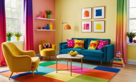
Let’s talk about why pattern mixing works so beautifully in home design. Think of your room as a conversation – when everything matches perfectly, it’s a bit like everyone agreeing with each other. Nice, but not exactly memorable. Now, throw in some contrasting patterns, and suddenly you’ve got a lively discussion happening in your space.
I’ve been there – staring at a floral armchair and geometric rug, wondering if I’ve completely lost my design marbles. But here’s what I’ve learned: those “wait, could this actually work?” moments often lead to the most interesting spaces. Just last week, I was helping a friend style her living room, and we discovered that her traditional ikat pillows looked absolutely stunning against a modern abstract-print sofa. Sometimes the best combinations happen when you’re brave enough to ignore the “rules.”
Finding Your Balance
The secret to pattern clashing isn’t about matching everything perfectly – it’s about finding that sweet spot where different patterns complement each other. Think of it like putting together an outfit. You wouldn’t wear head-to-toe stripes (trust me, I tried that once at a design conference, and let’s just say it wasn’t my finest moment), but mix those stripes with some florals and solid pieces? Now we’re talking.
In your home, this might look like:
- Using larger patterns as your anchor pieces (like that amazing botanical print wallpaper you’ve been eyeing)
- Adding medium-scale patterns through upholstery or curtains
- Sprinkling in smaller patterns through accessories like throw pillows or vases
Creating Dynamic Energy
Remember when everyone thought patterns had to match perfectly? (Hello, 1990s coordinated bedroom sets!) Well, I’m here to tell you that pattern clashing brings energy to your space in a way that matching sets never could. I recently experimented with pairing a traditional damask wallpaper with modern geometric curtains. On paper, it shouldn’t have worked – but in reality, the contrast created this incredible tension that made the whole room feel more dynamic and intentional.
When you’re playing with patterns, contrast becomes your best friend. It’s like adding percussion to a melody – it creates rhythm and movement that makes your space feel alive. And the best part? There’s no single “right” way to do it. Your unique combination of patterns tells your story, making your space distinctively yours.
Ready to start mixing things up in your space? Let’s dive deeper into choosing the right patterns for your home…
Your Shortcut to Effortless Desert Modern Style
12 refined color palettes & implementation strategies designed to bring sophistication, texture, and harmony into your home.

Choosing the Right Patterns for Your Space
Let me tell you about the time I stood in my living room surrounded by what felt like a hundred fabric samples. There I was, trying to decide if the oversized floral print I loved would play nicely with my existing geometric rug, when I had this lightbulb moment: choosing patterns isn’t about following rules – it’s about understanding the different personalities in your pattern party.
Getting to Know Your Pattern Players
Think of patterns like guests at a dinner party. You’ve got your florals (the charming storytellers), stripes (the reliable friends), geometrics (the structured conversationalists), and abstracts (the free spirits). I once combined all four in a client’s space, and you know what? It worked beautifully – but only after we figured out who should sit where, if you catch my drift.
Let’s break down these pattern personalities:
- Florals can range from bold botanicals to delicate vintage prints
- Stripes work like a neutral (trust me on this one – I use them everywhere)
- Geometrics add that modern edge we’re all craving right now
- Abstract patterns are your wild cards – they can tie everything together in surprising ways
The Scale Game
Here’s something I wish someone had told me years ago: scale is your secret weapon in pattern mixing. I learned this the hard way after putting three small-scale patterns together and wondering why my room looked busy but boring (yes, that’s possible!).
Think about it this way:
- Large-scale patterns need room to breathe – they’re like that friend who tells great stories and needs the space to gesture
- Medium patterns are your connectors – they bridge the gap between bold and subtle
- Small-scale patterns work best as accents – sprinkle them in like confetti
Creating Your Pattern Story
The most interesting rooms I’ve seen (and created) always tell a story through their pattern mix. Recently, I worked on a space where we started with a dramatic abstract wallpaper and gradually built around it with striped curtains and a subtle geometric rug. Each pattern added a new chapter to the room’s story.
Pro tip: Start with a pattern you absolutely love and build from there. Remember that time I tried to work backward from “safe” patterns to add interest later? Let’s just say it ended up about as exciting as vanilla ice cream without any toppings.
What makes a space truly sing is when you:
- Mix different scales (think big, medium, small)
- Vary your pattern types (don’t be afraid to put that animal print with those florals)
- Keep some elements solid to give your eye a place to rest
You know that feeling when you walk into a room and everything just feels right? That’s what we’re aiming for. It’s not about perfection – it’s about creating a space that feels thoughtfully curated and uniquely yours. Ready to start experimenting with your pattern mix? Let’s talk about how to make those colors work together…

Color Coordination: The Secret to Harmonious Clashing
You know that moment when you’re staring at your favorite patterned pieces, and they’re all individually gorgeous but together they’re giving you a headache? Been there! Let me share something I discovered while trying to make sense of my own pattern-happy living room: color is like the mutual friend that can make any two patterns get along.
Finding Your Color Compass
Picture this: I once walked into a room with the most amazing mix of patterns I’d ever seen – leopard print chairs, botanical curtains, and geometric pillows. What made it work? They all shared this wonderful deep emerald green. That’s when it clicked – you don’t need patterns to match, you just need them to speak the same color language.
Here’s what I’ve learned works best:
- Pick a main color that appears in most of your patterns (even if it’s just a tiny detail)
- Choose 2-3 supporting colors that complement your star player
- Add 1-2 unexpected pops that make everything feel intentional rather than matchy-matchy
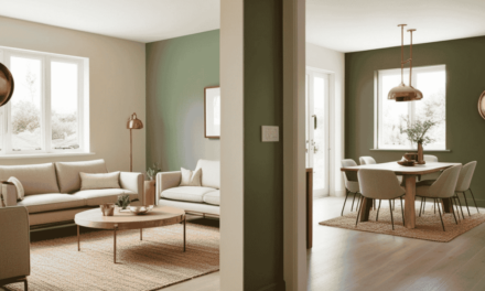
The Neutral Game-Changer
Can we talk about neutrals for a second? I used to think they were boring (sorry, beige!), but now I know better. They’re like the perfect host at a party – they make all the bold personalities play nice together.
Last month, I was working with a client who had this amazing collection of colorful patterns but couldn’t figure out why her room felt chaotic. We added a cream-colored sofa and suddenly – magic! The neutral base gave all those beautiful patterns room to shine without competing for attention.
Playing with Accents
Here’s a little secret that took me way too long to figure out: accent colors are your pattern-mixing superheroes. I once rescued a room from pattern chaos just by adding mustard yellow throw pillows to connect a blue floral chair with a geometric rug. Who knew?
Try this approach:
- Find a color that appears in small doses across your patterns
- Amplify it through solid-colored accessories
- Use it to create intentional connections between different areas of your room
Pro tip: Don’t be afraid to use black or white as accents. I once spent weeks trying to find the perfect colorful accent for a room until I realized a few black-and-white striped pillows were exactly what we needed to make everything click.
The 60-30-10 Rule (Sort Of)
I say “sort of” because rules are made to be bent, right? But here’s a helpful starting point: think about using:
- 60% of your dominant color family
- 30% of your secondary color choice
- 10% for those gorgeous accent colors that make everything pop
Remember that green room I mentioned earlier? The patterns were wild, but because the color balance was right, it felt intentional rather than overwhelming. Sometimes the boldest choices are the ones that work best – as long as you’ve got your color story straight.
Ready to start playing with color in your pattern mix? Just remember: if you love all the pieces individually, there’s usually a way to make them work together. It’s all about finding that color connection that makes everything click…

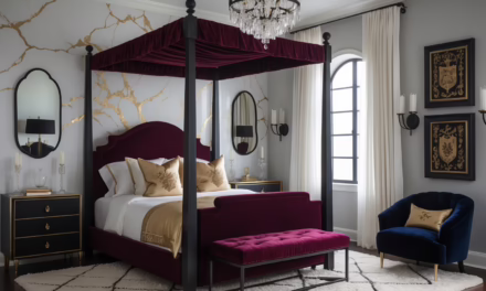
Textures and Materials: Layering Prints with Touch and Feel
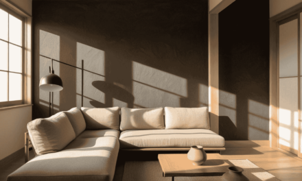
Remember when I first discovered velvet? I went a bit overboard and turned my living room into what my friend kindly called a “Victorian disco.” But you know what? That velvet obsession taught me something crucial about mixing patterns – texture changes everything.
The Touch Factor
Let me share a little design epiphany I had while helping a client who had the most gorgeous collection of patterned pillows, but something felt flat. We swapped out her silk floral pillows for the same pattern in linen, and suddenly the whole room felt more inviting. It was like changing from formal wear to your favorite well-worn jeans – same style, totally different vibe.
Think about these texture personalities:
- Linen brings that casual, lived-in warmth (and forgives pizza nights)
- Velvet adds drama and depth (plus it’s having a major moment right now)
- Silk creates luminosity but can be a bit precious (learned that one the hard way with my cat)
- Cotton is your reliable friend that plays well with others
Softening Bold Statements
Here’s a trick I stumbled upon during my “help, these patterns are fighting” phase: changing the texture can dial a pattern up or down without losing its punch. Last month, I had this client with a bold geometric rug that was overwhelming her space. Instead of replacing it, we added a chunky knit throw and some nubby fabric pillows. The contrast in textures made the bold pattern feel intentional rather than shouty.
Pro tip: When you’re mixing multiple patterns, try varying the textures to create natural breaks for your eye. It’s like adding punctuation to a really long sentence – suddenly everything makes more sense.
The Comfort Layer
Let’s talk about something that took me embarrassingly long to figure out: a room can be beautiful and still feel uncomfortable. (Flashback to my “everything must be silk” phase – sorry, houseguests!) The secret is mixing textures that invite touch:
- Layer a sleek patterned chair with a fuzzy throw
- Add quilted elements to smooth surfaces
- Mix matte and glossy finishes in your patterns
- Include natural textures like woven baskets or wooden elements
I recently worked on a space where we paired a smooth, patterned wallpaper with a heavily textured grasscloth on the opposite wall. Everyone who walks in wants to touch both surfaces – that’s exactly the kind of engagement you want in a room.
Creating Depth Through Texture
Here’s something fun to try: Pick a single color but play with it in different textures and patterns. I did this with navy blue in my bedroom – velvet curtains, matte walls, and a subtle geometric pattern in a waffle-weave blanket. The room feels rich and interesting without being busy. It’s like wearing all black but mixing leather, cotton, and knits – same color, totally different energy.
Remember, texture is your friend when you’re pattern mixing. It can take your space from “interesting concept” to “I never want to leave this room.” And isn’t that exactly what we’re all aiming for?

Practical Tips for Decorating with Bold Prints in Every Room
Let me share something that still makes me laugh: I once got so excited about a leopard print ottoman that I forgot to consider how it would play with my already-busy living room. It was like introducing a cat to a room full of dogs – chaos ensued! But you know what? That’s how we learn. Let’s talk about making bold prints work in every room without creating a pattern party gone wild.
Living Room Love: The Pattern Playground
Your living room is like the host of the party – it sets the tone for your whole home. I learned this firsthand when I helped a friend transform her “safe” beige living room into a pattern paradise. We started small with pillows (always a good idea), then got braver:
- Start with your largest pattern on the biggest piece (like those curtains you’ve been eyeing)
- Layer in medium patterns on accent chairs or ottomans
- Add small-scale patterns through accessories
Pro tip: Remember that time I put six different patterned pillows on one sofa? Don’t do that. Instead, try this formula that’s never let me down: two bold patterns, one small-scale print, and one solid. Trust me, your sofa will thank you.
Bedroom Magic: Your Pattern Sanctuary
The bedroom is where people tend to get nervous about patterns – I get it! No one wants to feel like their sleeping space is giving them a headache. But here’s what I discovered after years of experimenting:
Start with your bed as your canvas:
- Layer patterned sheets with a contrasting duvet
- Add a statement headboard in a bold print
- Use solid pillows to give your eyes a rest
You know what’s funny? I once had a client who was terrified of patterns in her bedroom until we found this gorgeous botanical print duvet. Now she’s mixing patterns like a pro and sleeping better than ever!
Small Space Solutions: Big Impact, Tiny Footprint
Here’s the thing about small spaces – they’re actually perfect for pattern play! I learned this in my tiny first apartment’s kitchen. The key? Strategic placement and scale control.
For kitchens:
- Try a bold patterned Roman shade
- Add personality with patterned tea towels
- Use small-scale patterns on backsplash tiles
In bathrooms:
- Go bold with wallpaper (yes, really!)
- Mix patterned towels with solid tiles
- Add a fun shower curtain as your statement piece
I once transformed a powder room with this crazy-bold bird pattern wallpaper, and you know what? That tiny space became everyone’s favorite room in the house. Sometimes the smallest spaces can handle the biggest personality!
Remember my leopard ottoman story? Well, it actually found its perfect home in my home office, where it plays nicely with a striped rug and floral curtains. The lesson? Sometimes it’s not about toning down your bold pieces – it’s about finding their rightful place in your pattern story.
The best part about decorating with patterns? There’s always room to play, adjust, and have fun with it. And if something doesn’t work? Well, that’s just another story to share over coffee…

Common Mistakes to Avoid When Clashing Patterns
Oh, friends, let me tell you about my first attempt at pattern mixing. Picture this: floral wallpaper, zebra print chairs, AND a geometric rug – all in one room. I was going for ‘eclectic chic’ but ended up somewhere between ‘design fever dream’ and ‘pattern explosion.’ Let’s talk about how to avoid some of these classic pattern-mixing mishaps that I’ve either made myself or witnessed (and helped fix!) over the years.
The “More is More” Trap
You know that saying “too much of a good thing”? Well, I learned its meaning the hard way in a client’s living room where we initially had patterns on Every. Single. Surface. It was like walking into a kaleidoscope – interesting for about 30 seconds, then completely overwhelming.
Here’s what I’ve learned works better:
- Pick 2-3 statement patterns that you absolutely love
- Let them be the stars of the show
- Give your eye somewhere to rest (this was a game-changer when I figured it out!)
The Breathing Room Blues
True story: I once decorated a room and couldn’t figure out why it felt so chaotic despite loving each individual piece. The problem? I’d completely forgotten about negative space – you know, those lovely blank areas that give your patterns room to shine.
Think of it like this: your patterns are having a conversation. If everyone’s talking at once (aka patterns everywhere), nobody can hear what’s being said. But add some quiet moments? Now we’re talking! Some ways to create that breathing room:
- Keep larger furniture pieces in solid colors
- Leave some walls pattern-free
- Use solid-colored throws or pillows to break up pattern-heavy areas
The Vibe Mismatch
Here’s a mistake I still cringe about: putting super sleek, modern geometric patterns in a client’s cozy cottage-style home. Each pattern was gorgeous on its own, but together? It was like wearing a cocktail dress to a backyard barbecue – beautiful but completely wrong for the vibe.
When choosing patterns, always consider:
- The overall feeling you want in the room (cozy? sophisticated? playful?)
- The architecture of your space
- How you actually live in the room (because those white silk patterns I once loved? Not so practical with two dogs!)
The Scale Scramble
Let me confess something: I used to think that if patterns were in the same color family, they’d automatically work together. Cue me putting three different small-scale patterns next to each other and wondering why the room felt busy but boring at the same time. The missing ingredient? Pattern scale variation!
Now I know to:
- Mix up the sizes of my patterns
- Use at least one large-scale pattern as an anchor
- Vary the density of patterns (some busy, some more open)
Remember, we’ve all made these mistakes – they’re like design rites of passage! The key is learning from them and moving forward with a better understanding of what works in your space. And hey, if you’re ever in doubt, just step back and ask yourself: “Would I want to spend time in this room?” Sometimes that’s all the guidance you need!
Unlock Designer-Perfect Colors in Minutes
Browse my curated collection of interior color palettes—tailored for today’s most loved design styles.
Expert Tips: How to Make Bold Prints Work for Your Style
You know what’s funny? I spent years trying to replicate Kelly Wearstler’s bold pattern mixing exactly, only to realize that the magic happens when you take those expert techniques and make them uniquely yours. Let me share some wisdom I’ve gathered from both the greats and, honestly, my own pattern-mixing adventures (including that time I tried to mix four different animal prints – spoiler alert: it wasn’t exactly a roaring success).
Learning from the Masters
I love how Miles Redd once said pattern mixing is like cooking – you need to taste as you go. This clicked for me when I was helping a client who kept asking “but what are the rules?” Instead of rules, we started playing with patterns like we were creating a recipe, adding and adjusting until it felt just right.
Some timeless lessons from design icons:
- Dorothy Draper taught us that bold patterns need equally bold personalities to balance them
- Kelly Wearstler shows how geometric patterns can work in any style
- Iris Apfel reminds us that sometimes more really is more (but only if you do it with intention!)
Making Patterns Work in Your Style Story
Here’s something I wish someone had told me earlier: your style isn’t a box to fit into – it’s a story to tell. Let me break down how patterns can work in different design themes:
Modern:
- Keep patterns geometric and clean-lined
- Try monochromatic pattern mixing (trust me, it’s like a chic whisper)
- Use negative space intentionally
Boho:
- Layer patterns like you’re creating a visual feast
- Mix cultural influences with confidence
- Don’t be afraid of color (I once created a boho space with 12 different patterns – it worked!)
Eclectic:
- Start with one “crazy” pattern you love
- Build around it with complementary prints
- Remember: eclectic doesn’t mean chaotic (learned that one the hard way)
Trusting Your Pattern Instincts
Can I share something personal? I used to second-guess every pattern decision until a mentor told me: “If it makes you smile when you walk in the room, it works.” Game changer! Now when I’m helping clients, I ask them to ignore the “rules” for a moment and just notice what makes them happy.
Try this approach:
- Start with a pattern that gives you that “I have to have it” feeling
- Take photos of your combinations (trust me, it gives you a fresh perspective)
- Live with samples before committing (that leopard print wallpaper might look different after 48 hours)
I recently worked with a client who was terrified of mixing patterns but fell in love with this wild botanical print. Instead of playing it safe, we used it as inspiration to create a whole pattern story in her space. Now she texts me pictures of new patterns she’s trying – that’s what I call a pattern mixing success!
Remember, the most successful pattern-mixed rooms aren’t the ones that follow all the rules – they’re the ones that feel authentically you. So go ahead, try that combination that’s calling to you. The worst that can happen? You learn something new about your style. And the best? You create a space that makes you smile every time you walk in.
Curated Wall Art for Elegant Homes
Bring softness, texture, and intention into your home with digital wall art inspired by wabi-sabi, abstract forms, and muted watercolors. Every piece is crafted to create stillness and beauty—whether you’re styling a gallery wall or a minimalist nook.
Conclusion: Your Pattern-Mixing Journey Starts Here
You know what makes me smile? Thinking back to when I was absolutely terrified of mixing patterns – convinced I’d create a design disaster. Now here I am, encouraging you to be bold, take risks, and trust your instincts. Because here’s the thing: pattern mixing isn’t about following a strict rulebook. It’s about creating spaces that make you feel excited to come home.
Remember when we talked about that first wild pattern combination that made your heart skip a beat? That’s your starting point. Whether it’s a bold floral that reminds you of your grandmother’s garden or a modern geometric that speaks to your city-loving soul, let that be your jumping-off point for something amazing.
I’ve shared all my pattern-mixing secrets with you – from the importance of scale and color to the power of texture and negative space. But the most important tip? Make it yours. Your home should tell your story, not someone else’s. Those “mistakes” I mentioned? They’re really just stepping stones to finding your unique style voice.
So here’s my challenge to you: Start small if you need to (maybe those polka dot pillows you’ve been eyeing?), but start somewhere. Mix those patterns. Play with scale. Have fun with it! And remember, some of the most beautiful rooms I’ve ever seen started with someone saying, “I wonder what would happen if…”
Your perfect pattern mix is out there, waiting to be discovered. And trust me – when you find it, you’ll know. It’ll be the combination that makes you smile every single time you walk into the room.
Now, who’s ready to start their pattern-mixing adventure? Because I can’t wait to see what you create!
P.S. And if you’re ever in doubt? Just remember: some of the best design decisions I’ve ever made started with “This might be crazy, but…”
