Cherry Red: The 2025 Color Trend in Interior Design

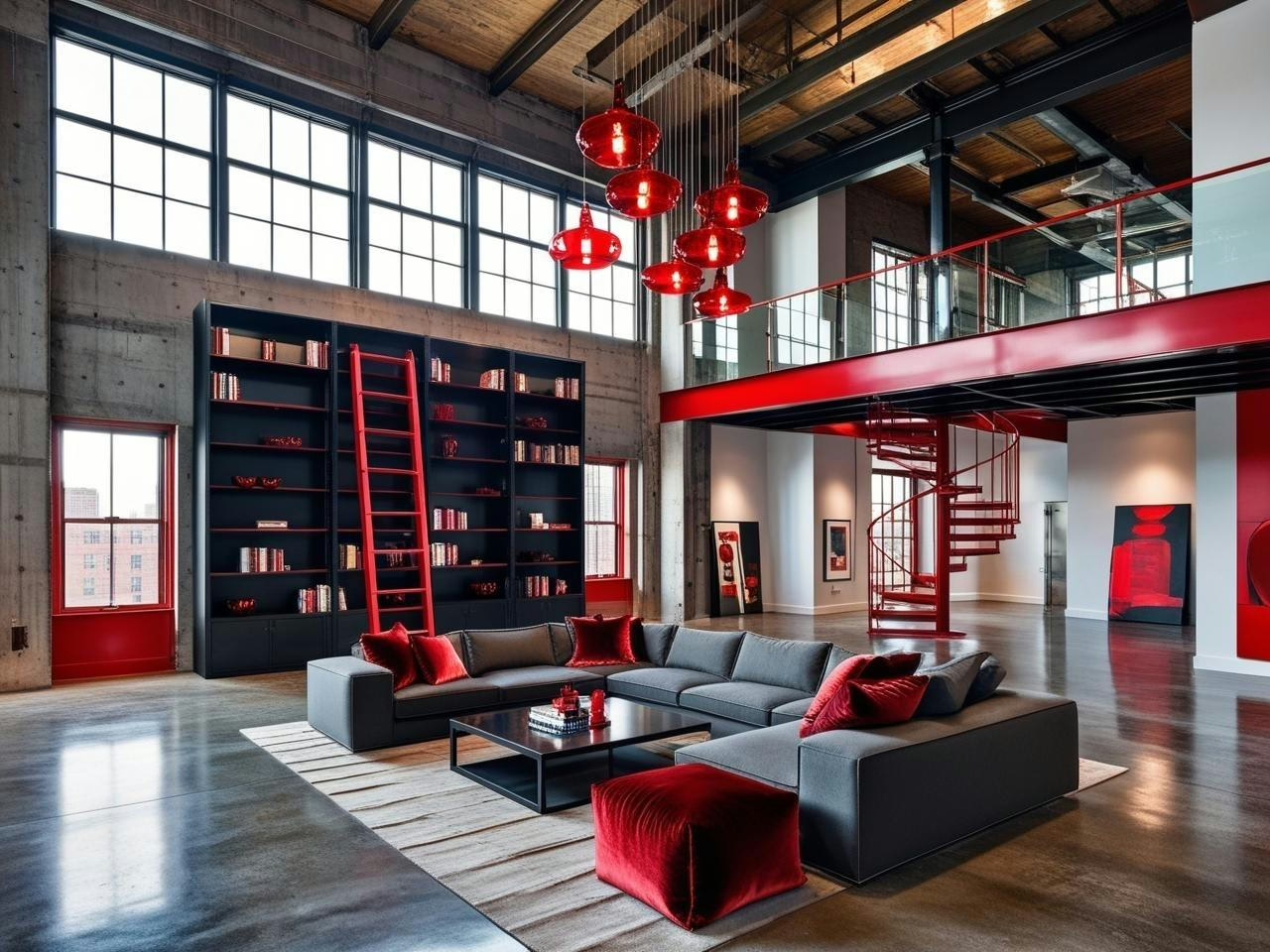
Cherry red is having a moment in 2025, and it’s not just another passing color trend. Walking through the studio last week, surrounded by material samples and mood boards, I caught myself getting genuinely excited about how this shade keeps popping up in unexpected places – and more importantly, how it’s making different design styles work together in ways I hadn’t imagined.
What’s fascinating about this particular cherry red moment is how it’s breaking all those old rules about bold colors. You know the ones – “keep it as an accent,” “use it sparingly,” “stick to neutral pairings.” Instead, we’re seeing cherry red step into this amazing role as a bridge between different styles, patterns, and design eras.
I’ve spent the last few weeks exploring all the ways this color can transform a space, from subtle touches to more substantial statements. And here’s what’s really exciting: whether you’re working with vintage pieces, modern designs, or that delightful mix of both that makes a space feel truly personal, cherry red might just be the secret ingredient you’ve been looking for.
Let’s dive into how this sophisticated shade is rewriting the rules and making every style it touches look a little bit better. Trust me – by the end of this post, you’ll never look at cherry red the same way again.
Unlock Designer-Perfect Colors in Minutes
Browse my curated collection of interior color palettes—tailored for today’s most loved design styles.
What Makes 2025’s Cherry Red Different
Browsing through the latest design trends, something caught my eye that I wasn’t expecting – cherry red was everywhere, but not in the way you might remember it. This isn’t your 90s accent wall red or that overpowering crimson from grandma’s formal dining room. The new cherry red has this incredible ability to make every piece in a room look like it was chosen with intention.
I realized this while sourcing fabrics for a living room project. Sitting in the showroom, surrounded by swatches, I noticed how this particular shade of red seemed to make both the vintage brass lamp and the sleek modern coffee table look better. It wasn’t screaming for attention like traditional reds often do – instead, it was quietly elevating everything around it.
The secret lies in its undertones. While experimenting with different lighting conditions (yes, I’ve been that person moving pillows around the room at different times of day), I noticed this new cherry red has a warmth that previous iterations missed. It’s got just enough brown undertones to feel grounded, but still maintains that energetic pop that makes red so appealing in the first place.
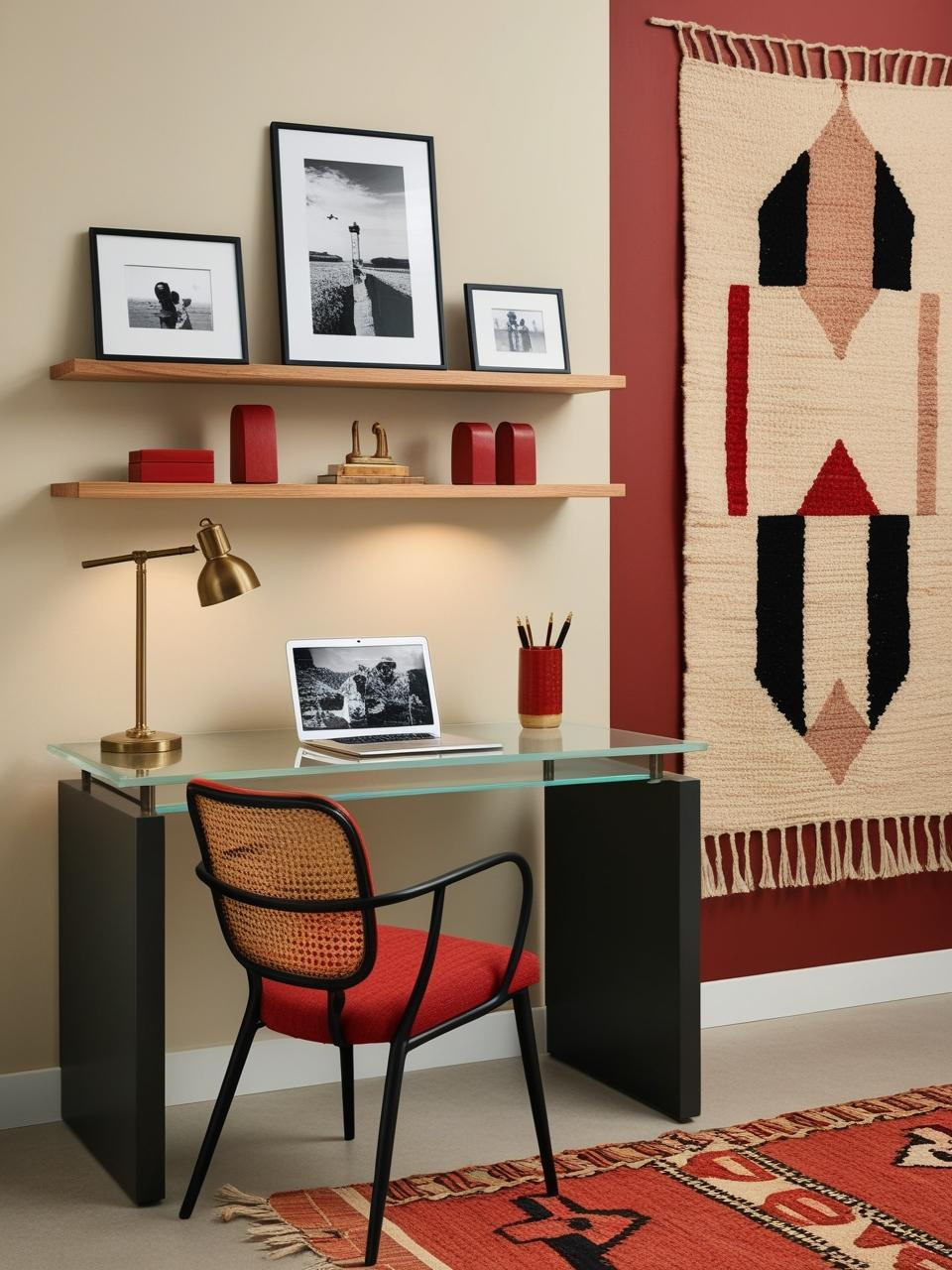
What’s really fascinating is how it’s showing up in current designs. I spotted it on everything from hand-thrown ceramics to textural wallcoverings at the winter design shows. But here’s what makes it different – designers are using it more like a sophisticated neutral than a statement color. It’s weaving its way through spaces in subtle ways: a book spine here, a throw pillow there, maybe a vintage rug that ties everything together. The effect is more collected-over-time than matching-set-from-a-catalog.
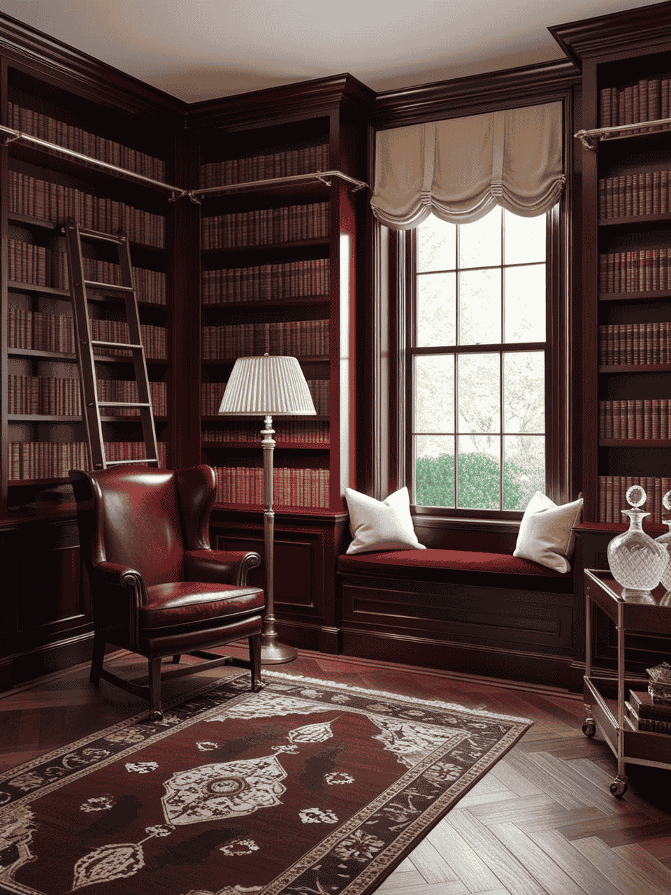
In the studio, we’ve been playing with unexpected pairings, and let me tell you – this cherry red plays well with others. It makes warm woods look richer, helps modern pieces feel more approachable, and somehow manages to make vintage finds look even more special. It’s like finding that perfect red lipstick that somehow works for both coffee runs and cocktail parties – versatile in a way that feels almost magical.

Starting Small: Your Cherry Red Training Wheels
You know that moment when you’re staring at a color sample, and your brain is simultaneously screaming “I love this!” and “But what if I mess this up?” Been there. After weeks of experimenting with cherry red in various spaces, I’ve discovered some foolproof ways to dip your toes in without diving into the deep end.
Here’s a little story from the design studio: I was working with a pile of cherry red samples, moving them around different corners of the space throughout the day. What started as a careful experiment turned into this delightful game of “spot the perfect placement.” A small ceramic vase on a bookshelf caught the morning light just right. By afternoon, it had migrated to the coffee table, and by evening, it found its home on a side table where it made both the vintage lamp and modern art look even better.
The beauty of starting small is that you can play around without commitment. Think portable pieces that can move around your space: a stack of vintage art books, a textural throw pillow, or even fresh flowers in a cherry red vase. These are like the training wheels of decorating – they give you the confidence to experiment while you find your balance.
I’ve found that cherry red has this magical quality in different lighting conditions. That’s why I always suggest trying your chosen piece in at least three different spots before deciding on its final home. That gorgeous cherry red bowl might look a bit intense on your coffee table but absolutely perfect on that console by the window. It’s all about finding that sweet spot where the color enhances rather than overwhelms.
One of my favorite discoveries? Cherry red looks amazing in small doses against neutral backgrounds. It’s like adding the perfect piece of jewelry to a classic outfit – it elevates everything without trying too hard. Start with something as simple as a small art print or a vintage book spine, and watch how it makes your existing pieces look more intentional and pulled together.

The Mix-Master’s Guide to Cherry Red
I remember one exercise in design school when our color theory professor made us create 50 different color combinations with the same red paint chip. I thought she was torturing us. Turns out, she was onto something. After years of experimenting with color (and some memorable “learning opportunities” along the way), I’ve discovered that cherry red might just be one of the most misunderstood color in our design toolbox. It’s not just about making a statement – it’s about creating connections.
Unexpected Color Pairings That Feel Like Magic
True story: Last month I had this cherry red vase sitting on my desk, and I kept moving it around while I was on calls (bad fidgeting habit, I know). By complete accident, I placed it next to my olive green notebook, and I literally stopped mid-sentence on my call. The combination was so good, it distracted me from my phone call! Looking at it just sparked so much joy. Since then, I’ve been that person who can’t stop experimenting with cherry red pairings, much to my friend’s amusement.
That olive green moment led me down a rabbit hole of color experiments. You know how sometimes you match your shoes to your bag? I started matching everything to cherry red – like a design version of “If You Give a Mouse a Cookie.” And here’s what I discovered: cherry red has this amazing superpower of making unexpected color combinations just work.
Take caramel tones, for example. I used to think brown and red together would look like a 1970s basement (no offense to retro design lovers). But then I was rearranging my bookshelf – you know, one of those “I’ll just move one book” situations that turns into a two-hour styling session – and I propped a cherry red art book against my vintage caramel leather bookends. Mind. Blown. The warmth of the caramel brought out this gorgeous depth in the red that I’d never noticed before.
But my favorite discovery? It happened during a photoshoot when we were all running on too much coffee and not enough sleep. I put a cherry red vase against this dusty lilac fabric we’d been avoiding using. It was like discovering that pineapple belongs on pizza (controversial, I know, but stay with me here). That combination of cherry red and muted lilac created this sophisticated, unexpected palette that now lives rent-free in my head.
Quick tip from someone who learned the hard way: before you commit to any of these combinations in a big way (like, say, ordering a cherry red sofa without testing it with your existing decor), grab some small decor pieces and play around. Trust me, your wallet will thank you for starting small!

Bridging Different Design Styles
I love those design moments that make you see everything differently. The other day in the studio, we were pulling together a mood board featuring a mid-century sideboard (you know the type – warm wood tones, classic lines). Next to it, we had photos of these gorgeous contemporary pieces. They weren’t quite clicking until we added a cherry red ceramic vessel to the mix. Suddenly, everything made sense together.
That’s when it hit me – cherry red isn’t just a color, it’s more like a design mediator. It has this incredible ability to speak multiple style languages at once. In the studio, we’ve started calling it our “universal translator” (yes, we’re design nerds who make Star Trek references).
What’s really fascinating is how it works in real spaces. Take gallery walls, for instance. I’m always excited to see how a touch of cherry red can make different art styles feel like they belong together. A client recently mixed her modern abstracts with vintage botanical prints – the cherry red details running through both made them look like they were always meant to be together.
And here’s something I didn’t expect: cherry red actually makes minimalist and maximalist pieces play nice. Picture a sleek, modern lamp in cherry red sitting next to an ornate vintage frame. Instead of fighting for attention, they complement each other. The color creates this visual handshake between different styles, making your space feel thoughtfully curated rather than randomly assembled.
The Art of Pattern Play
Pattern mixing with cherry red is like hosting a really good dinner party – it’s all about bringing together different personalities that spark interesting conversations. I’ve been playing with patterns in the studio lately, and cherry red has become my favorite guest at these pattern parties.
The other day, I was putting together a reading nook concept when I noticed something interesting. A small-scale geometric print in cherry red made this amazing connection with a vintage floral pattern I love using. It reminded me of introducing two friends and watching them hit it off immediately. The cherry red created this perfect bridge between the modern geometry and the traditional floral motifs.
What’s really fun about using cherry red in pattern mixing is how it can make bold patterns feel more approachable. In the studio, we’ve been experimenting with different combinations – a subtle cherry red pinstripe paired with a larger abstract print, or a classic cherry red buffalo check playing off a more organic pattern. The color acts like a thread that weaves through different patterns, making them feel connected rather than competitive.
And you know what’s particularly exciting? Cherry red patterns have this wonderful way of making neutral spaces feel more dynamic. Even something as simple as adding a cherry red striped pillow to a solid-colored sofa can transform the whole vibe of a room. It’s like adding just the right amount of spice to a dish – it enhances everything without overwhelming.
Speaking of transformations, I love seeing how cherry red patterns interact with different scales. Big, bold patterns become more grounded when paired with smaller-scale cherry red prints. It’s fascinating to watch how the eye naturally moves between them, creating this beautiful visual rhythm in the space.
The real joy of pattern mixing with cherry red isn’t about following strict rules – it’s about finding those unexpected combinations that make your space feel uniquely yours. Sometimes the most interesting pattern stories come from simply being curious and asking “what if?” What if we paired this traditional cherry red toile with a modern geometric? What if we mixed in some animal print with our cherry red stripes?
Curated Wall Art for Elegant Homes
Bring softness, texture, and intention into your home with digital wall art inspired by wabi-sabi, abstract forms, and muted watercolors. Every piece is crafted to create stillness and beauty—whether you’re styling a gallery wall or a minimalist nook.
Bringing It All Together
You know what I love most about design trends? How they sometimes surprise you by becoming something more than just a trend. That’s exactly what’s happening with cherry red right now. What started as a bold color choice has evolved into this amazing design tool that helps us tell our unique style stories.
Whether you’re just dipping your toe in with a small ceramic piece or ready to commit to that gorgeous cherry red accent chair you’ve been eyeing (I see you, fellow design enthusiast!), remember that there’s no rule book here. The joy is in the experimenting, in finding those combinations that make you smile every time you walk into the room.
I’d love to hear how you’re planning to welcome cherry red into your space. Are you starting small with accessories? Or are you feeling bold and going for that statement piece? Drop a comment below and share your cherry red adventures – and don’t forget to tag us in your photos! Your creative solutions might be exactly what another reader needs to see.
In the meantime, I’ll be over here, probably rearranging my shelf styling for the hundredth time (because that’s just what we do, right?), and discovering new ways this versatile color can bridge different styles together. Here’s to making 2025’s favorite color uniquely yours!
Until next time, Franzi
P.S. Curious about how to style cherry red in a particular room? Let me know in the comments – I love a good design challenge!