Cherry Red in Modern Kitchens: Trendy and Timeless

You know that moment when you walk into a kitchen and just… stop? That happened to me recently when I visited a client’s newly finished space. The show-stopper wasn’t some exotic marble or ultra-modern appliance – it was this absolutely gorgeous cherry red island that somehow made everything else in the room look better. Which, if I’m being honest, was not at all what I expected when she first suggested it!
Here’s the thing about cherry red in kitchens: it’s having this amazing renaissance moment right now, but not in the way you might think. Forget those retro diners or that questionable red accent wall from your first apartment (guilty as charged – we all have design skeletons in our closets!). Today’s cherry red is sophisticated, versatile, and – dare I say it? – surprisingly practical.
I’ll never forget the look on my colleague’s face when I suggested cherry red cabinets for a minimalist kitchen remodel. “Are you sure?” she asked, probably remembering the same ’50s kitchen nightmares I was trying to avoid. But by the time we finished that project, she was already planning to use cherry red in her own kitchen renovation. That’s the power of this color when it’s done right – it converts skeptics into believers.
In this article, we’re diving deep into how cherry red is making its mark in modern kitchens. Whether you’re thinking about a bold statement piece or just curious about dipping your toe into more colorful waters, I’m sharing everything I’ve learned (sometimes the hard way!) about making this vibrant hue work in real life. From cabinet choices to small accents, we’ll explore how to use cherry red in ways that feel fresh, intentional, and totally you.
Ready to see how this classic color is getting a modern makeover? Let’s dive in – and I promise, no diner-style checkered floors in sight!

The Rising Popularity of Cherry Red in Kitchen Design
You know what’s funny? A few years back, if you mentioned putting cherry red in a kitchen, people would immediately think of those 1950s diners. But here we are, watching this bold, beautiful color make its way into some of the most sophisticated kitchen designs I’ve seen. And let me tell you, it’s not your grandmother’s cherry red anymore!
Why Cherry Red is Having a Moment
I first noticed this trend taking shape when more and more clients started pointing to inspiration photos with pops of red in otherwise neutral kitchens. It wasn’t the whole retro throwback look they were after – it was something entirely fresh. These spaces felt modern, confident, and somehow both energetic and sophisticated at the same time.
The psychology behind it makes perfect sense when you think about it. Red is known to stimulate appetite and conversation (hello, perfect kitchen color!), but it’s the specific depth of cherry red that makes it so special. Unlike brighter reds that can feel a bit overwhelming, cherry red has this rich, almost velvety quality that adds warmth without screaming for attention.
Finding the Sweet Spot
What’s really interesting about cherry red’s revival is how it’s being used. The key difference I’m seeing in today’s designs is all about balance. Instead of going all-in with red everything (trust me, I’ve seen those Pinterest fails), designers are treating it more like a fine spice – using just enough to enhance the space without overpowering it.
Here’s what’s making it work:
- It’s showing up in unexpected places, like a single statement wall or a stunning range hood
- Designers are pairing it with sophisticated neutrals rather than the classic black and white
- The finish matters as much as the color – think matte surfaces that feel contemporary rather than glossy finishes that lean retro
I recently worked on a kitchen where we added just a touch of cherry red through the cabinet hardware. The client was nervous at first (totally get it – red can feel like a big commitment!), but those little pops of color ended up being exactly what the space needed to feel finished. Sometimes the smallest touches make the biggest impact.
Through working with different spaces and styles, I’ve learned that cherry red has this amazing ability to bridge different design aesthetics. Whether you’re going for modern minimalist or warm contemporary, it’s all about how you use it. And isn’t that what great design is all about? Finding those unexpected elements that just… work.
Let me know if you’d like me to write the next section about cherry red in kitchen cabinetry. I’ve got some great insights about mixing bold cabinet colors with different countertop materials!

Your Shortcut to Effortless Quiet Luxury Style
12 refined color palettes designed to bring luxury, sophistication and harmony into your home.
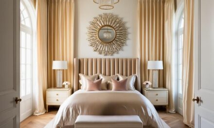
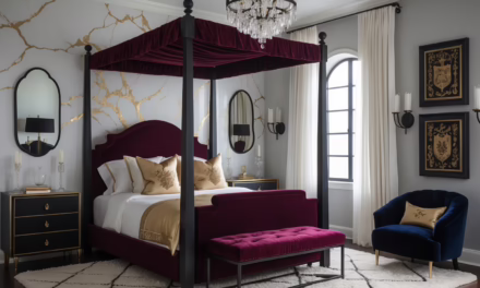
Cherry Red in Kitchen Cabinetry
Let’s talk about cherry red cabinets – and before you start having flashbacks to that questionable rental kitchen from your college days, hear me out! I’ll never forget walking into a client consultation where she was practically apologizing for wanting red cabinets. By the end of the project? Those gorgeous cherry red cabinets became the envy of her entire social circle.
Making the Bold Choice
Here’s the thing about cherry red cabinets: they’re like that friend who knows exactly how to command attention without being obnoxious about it. When done right, they bring this incredible warmth to your space that somehow makes everything feel more inviting. I’ve noticed that kitchens with cherry red cabinets tend to become the natural gathering spot during parties – there’s just something about that rich color that draws people in.
Finding Your Perfect Shade
Can we talk about the time I learned the hard way that not all cherry reds are created equal? Picture this: sample boards spread across a client’s floor, each one catching the light differently. What looked perfect in the showroom suddenly felt more like “emergency exit sign” than “sophisticated statement piece.” The breakthrough moment? Realizing that cherry red needs to have just a touch of burgundy undertone to feel grounded in a kitchen space.
Playing Nice with Others
When it comes to balancing cherry red cabinets with other colors, think of it like hosting a dinner party – you want everyone to get along, but you also need a clear star of the show. Here’s what I’ve found works beautifully:
- Warm whites (think créme fraîche rather than stark white) make red cabinets feel intentional rather than overwhelming
- Cool grays can play up the sophisticated side of cherry red
- Natural wood tones, especially in flooring, help anchor the whole look
The Finish Line
Let’s get real about finishes for a second. I once had a client insist on high-gloss cherry red cabinets because “that’s what the Pinterest photo had.” After showing her how a matte finish could give her that same wow factor while hiding fingerprints (hello, real life!), she was sold. The finishing secret I’ve discovered? A subtle sheen that sits right between matte and satin gives you that perfect balance of sophisticated and practical.
Smart Ways to Start
Not quite ready to go full cherry red with all your cabinets? I get it! Some of my favorite projects have started with just a red kitchen island or a few strategic red cabinets. One client dubbed this the “toe-in-the-water” approach, and honestly? It’s brilliant. You get to live with the color, see how it plays with your lighting throughout the day, and decide if you want to expand the rouge revolution.
Here’s a pro tip I wish I’d known years ago: if you’re testing out cherry red cabinets, look at them at different times of day. Natural daylight, evening shadows, and your kitchen lighting can all make the color read differently. There was this one project where we almost scrapped the whole red cabinet idea until we realized it was the client’s old fluorescent lighting making everything look off. Switched to warm LEDs, and suddenly everything clicked.
Want to know how to take this bold cabinet choice to the next level? The appliance game is where things get really interesting – but that’s a whole other conversation we’re about to dive into in the next section!

Appliances in Cherry Red: A Bold Statement
Okay, can we talk about the first time I saw a cherry red refrigerator in person? I literally stopped mid-conversation during a client meeting. There it was, this gorgeous piece of functional art, completely transforming what could have been just another white kitchen into something spectacular. And here’s the best part – my client had picked it up at a scratch-and-dent sale for a steal because someone else had gotten cold feet about the color. (Their loss, am I right?)
Making the Leap to Red Appliances
Let’s be real for a second – choosing a cherry red appliance is kind of like getting bangs. It’s a commitment that can feel a little scary at first, but when it works, it works. I’ve learned that the key is starting with one statement piece rather than going full Valentine’s Day with every appliance. Though I did once work with a client who insisted on matching everything in red, and you know what? She loves her kitchen more than anyone I know!
Which Appliances Work Best in Red?
Through some serious trial and error (and maybe a few “what was I thinking?” moments), I’ve discovered that certain appliances really shine in cherry red:
- Ranges and range hoods (absolute showstoppers – they’re like the runway models of the kitchen)
- Refrigerators (but stick with me here – the matte finishes are game-changers)
- Stand mixers (the gateway appliance to bigger red commitments, let’s be honest)
- Coffee makers (because shouldn’t your morning coffee maker spark joy?)
Fun story: I once talked a client out of a red dishwasher because it would have competed with her gorgeous red range. She thanked me later – sometimes less really is more, even with a color this fabulous.
Mixing Modern Elements
Here’s something I wish someone had told me years ago: cherry red appliances actually play incredibly well with other modern elements. Think of them as the extrovert at the party who somehow makes everyone else more interesting too. I’ve seen magic happen when pairing them with:
- Sleek concrete countertops (the industrial-meets-playful vibe is chef’s kiss)
- Minimalist hardware (letting the red be the star)
- Smart home features (because who says technology can’t be beautiful?)
The Practical Side
Let me share a little secret I learned from a kitchen showroom disaster (picture me, frantically wiping fingerprints off a glossy red fridge before a client walkthrough): texture matters almost as much as color. Today’s matte finishes are basically kitchen armor – they hide smudges like a pro and look sophisticated doing it.
And here’s another tip that took me way too long to figure out: lighting can make or break your red appliance game. I once had a client whose red range looked absolutely perfect during the day but turned slightly orange under their old track lighting. A quick switch to daylight-temperature LEDs, and boom – gorgeous 24/7.
Want to know the absolute best way to test if you’re ready for a cherry red appliance? Start with something small and portable. I tell my clients to live with a red coffee maker or stand mixer for a few months. If you find yourself smiling every time you look at it, you’re probably ready for that showstopping red range you’ve been eyeing!
Speaking of making statements, wait until you see how these bold appliances can work with some equally bold decor choices – but that’s coming up next!

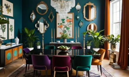
Cherry Red in Kitchen Decor: Accent Pieces and More
You know that moment when you’re playing with paint swatches and suddenly everything clicks? That’s exactly what happened in a recent project when we added a cherry red pendant light above the island. The client had been so careful with her choices – white cabinets, marble countertops, the works – but something was missing. That single red pendant? Total game-changer. And the best part? If she ever changes her mind, it’s just a light fixture, not a complete kitchen overhaul!
Starting Small: The Power of Red Accents
Let me tell you about my favorite design experiment gone right. Picture this: a completely neutral kitchen, beautiful but playing it safe. We started with just one cherry red vase on the counter. Then a matching tea towel. Before we knew it, this kitchen had personality for days, and not a single permanent change was made! It’s like adding spices to a dish – you can always adjust until it’s just right.
The Art of Balance
True story: I once got so excited about cherry red accents that I may have gone a tiny bit overboard. Red canisters, red clock, red bar stools… my client very kindly suggested we might be veering into “diner territory.” Lesson learned! Now I live by what I call the “three-spot rule”:
- Choose three locations for your red accents
- Vary the sizes (think: one large piece, one medium, one small)
- Keep them at different heights to draw the eye around the room
Practical Pieces with Personality
Here’s where it gets fun! Some of my favorite ways to incorporate cherry red that actually serve a purpose:
- Bar stools (bonus: they’re easy to repaint if you change your mind)
- Kitchen runners (the best way to add color without commitment)
- Mixing bowls and stand mixers (functional and fabulous)
- Tea kettles (because why should boiling water be boring?)
The Unexpected Places
Want to know my secret weapon for cherry red accents? The insides of cabinets! I had this client who was nervous about going too bold, so we painted the interior of her glass-front cabinets cherry red. Every time she opens them, it’s like a little surprise party for her dishes. And when they’re closed? Just a subtle hint of color peeks through.
When Things Go Wrong (And How to Fix Them)
Remember when I mentioned my “too much red” moment? Here’s what I’ve learned about pulling back without starting over:
- Swap out some red pieces for metallic or glass ones
- Break up red groupings with neutral items
- Add texture through different materials to make the color feel more intentional
I once salvaged a too-red situation by simply rearranging the accents so they created a natural flow through the space instead of competing for attention. Sometimes it’s not about the pieces themselves but how they play together!
The Secret Sauce
Here’s something I wish someone had told me years ago: cherry red accents work best when they have a job to do. That gorgeous red dutch oven that lives on the stove? It’s not just pretty – it’s practical. The red knife block? Both storage and style. When your accent pieces pull double duty, they feel more intentional and less like they’re just there for show.
Ready to take your cherry red kitchen to the next level? Coming up next, we’ll talk about how to make sure all these bold choices stay feeling fresh and timeless rather than trending toward trendy!

Practical Tips for Incorporating Cherry Red into Your Kitchen
Let me share something that still makes me laugh: my first attempt at using cherry red in a kitchen involved painting an entire wall this gorgeous, rich shade I’d fallen in love with. Two days later, my client called in a mild panic. Turns out, their morning coffee routine felt like walking into a sunset! These days, I have a much better handle on making cherry red work in real life, and I promise you won’t need sunglasses with your morning brew.
Finding Your Sweet Spot
Remember when mixing metals was considered a design sin? Well, I’ve discovered that cherry red is kind of like that – there’s no one “right way” to use it, but there’s definitely a sweet spot for every kitchen. Here’s what I’ve learned about keeping things functional:
- Start with your lighting situation (trust me on this one – I once picked the perfect shade of red for a kitchen, only to realize it looked completely different under the client’s vintage pendant lights)
- Consider your kitchen’s workflow (that stunning red backsplash might look amazing on Pinterest, but if it reflects onto your food prep area, you might not love it so much)
- Think about your cleaning style (confession: I once specified a high-gloss red finish for a busy family’s kitchen island. Let’s just say we quickly learned about the magic of matte finishes!)
Playing Well with Others
You know that friend who somehow gets along with everyone at a party? That’s what we want your cherry red elements to be! After years of trial and error (and maybe a few “what was I thinking?” moments), here’s what I know works:
- Warm whites make cherry red feel sophisticated rather than shouty
- Natural wood tones create this amazing grounded feel
- Stainless steel is basically cherry red’s best friend
- Black can work, but use it sparingly (learned that one the hard way!)
Choosing Your Shade
Here’s a little behind-the-scenes story: I once had three different clients choose what they thought was the same shade of cherry red from different paint brands. When we put the samples next to each other? Totally different colors! Since then, I’ve developed what I call the “personality test” for choosing the right shade:
For Modern Kitchens:
- Look for cherry reds with a slight blue undertone
- Aim for a matte or soft-touch finish
- Consider how it looks under different types of lighting
For Traditional Spaces:
- Warmer undertones work beautifully
- A hint of burgundy can make it feel more timeless
- Test it against your existing wood tones (I once had to repaint an entire set of cabinets because we skipped this step!)
The Reality Check
Let’s be honest – sometimes our eyes are bigger than our design stomachs! Before you commit to any cherry red elements, I always suggest this little exercise I developed after my own kitchen color adventure:
- Live with a few red accessories for a week
- Notice how you feel about them at different times of day
- Pay attention to how they work with your existing elements
- Consider how they affect your mood while cooking
The truth is, the perfect amount of cherry red is like the perfect amount of seasoning – it’s different for everyone, and that’s exactly how it should be! Next up, we’ll explore why this bold choice has staying power beyond just being a trend.
Unlock Designer-Perfect Colors in Minutes
Browse my curated collection of interior color palettes—tailored for today’s most loved design styles.
The Timeless Appeal of Cherry Red in Modern Kitchens
You know what’s fascinating about cherry red in kitchens? Every time someone declares it “over,” it pops up in another stunning space that makes us all rethink everything we thought we knew about kitchen design. I remember sitting in a design meeting about five years ago, listening to someone confidently declare that “red in kitchens is so last decade.” Fast forward to last week, when that same person called me to ask about incorporating cherry red into their own kitchen renovation!
Why Cherry Red Sticks Around
Let me share something I’ve noticed after years of watching kitchen trends come and go: there’s a big difference between trendy and timeless, and cherry red somehow manages to be both. It’s like that friend who’s both totally reliable and full of surprises. I recently walked into a kitchen I designed eight years ago with cherry red lower cabinets, and you know what? It looked just as fresh as the day we installed them.
Here’s what makes it work:
- It’s a color with actual personality (unlike some trends we’ve seen come and go – remember when everything had to be greige?)
- It plays well with both vintage and modern elements (I once used the same shade of cherry red in a super modern condo and a restored Victorian – worked beautifully in both!)
- It has this amazing ability to feel both bold and classic at the same time
Size Doesn’t Matter (But Scale Does!)
Can we talk about the tiny galley kitchen that made me completely rethink everything I thought I knew about using bold colors in small spaces? The owner insisted on cherry red upper cabinets, against pretty much everyone’s advice. The result? The kitchen actually felt bigger because the color drew your eye up and created depth. Mind. Blown.
I’ve since learned that cherry red works in any size kitchen if you nail these three things:
- Scale (think about the size of your red elements relative to the space)
- Distribution (spread the color around instead of concentrating it in one spot)
- Balance (pair it with enough neutral space to let it breathe)
The Evolution Factor
Here’s something cool I’ve noticed: cherry red actually gets better with time. Unlike some trending colors that scream their installation date (hello, 1970s avocado green!), cherry red has this chameleon-like ability to evolve with your style. I had a client who started with just a red kettle and slowly added more red elements over five years – each addition felt intentional and fresh, never dated.
Making It Last
Want to know my secret for keeping cherry red feeling current? It’s all about what you pair it with. I learned this the hard way after going all-in on a very specific trend combination that… well, let’s just say it didn’t age as gracefully as we’d hoped. Now I stick to this formula:
- Keep the foundational elements classic (you can always update the supporting players)
- Use red in ways that can be easily updated if needed
- Mix in timeless materials like marble, wood, or stainless steel
- Let the red be the star without making everything about it
The real magic of cherry red in kitchens isn’t just its staying power – it’s how it makes people feel. I’ll never forget what one client told me after living with her cherry red kitchen island for a year: “It’s like having a piece of joy in my kitchen every single day.” And isn’t that exactly what great design should do?
You know what makes me smile? Thinking about all the cherry red kitchens out there that started as “maybe this is too bold” and ended up as “I can’t imagine my kitchen any other way.” Because at the end of the day, that’s what timeless design is all about – creating spaces that just keep getting better with time.
Curated Wall Art for Elegant Homes
Bring softness, texture, and intention into your home with digital wall art inspired by wabi-sabi, abstract forms, and muted watercolors. Every piece is crafted to create stillness and beauty—whether you’re styling a gallery wall or a minimalist nook.
Bringing It All Together: Your Cherry Red Kitchen Journey
You know what makes me smile? Thinking back to all those initial client conversations where “cherry red” was whispered like some kind of design confession. “I know it sounds crazy, but…” they’d start, and now here we are, watching this gorgeous color take center stage in some of the most stunning kitchens I’ve seen.
Remember how we started this journey? Wondering if cherry red could really work in a modern kitchen without feeling like a throwback? Well, after diving deep into everything from bold appliances to subtle accents, I hope you’re feeling as excited about the possibilities as I am. Whether you’re dreaming of that showstopping red range or just thinking about adding a few strategic pops of color, here’s what I want you to take away:
Cherry red isn’t just another trend that’ll fade faster than last season’s paint chips. It’s more like that perfect red lipstick that somehow works for every occasion – classic, confident, and completely adaptable to your style. And the best part? There’s no single “right way” to use it. I’ve seen it steal the show in tiny galley kitchens and play a supporting role in sprawling open-concept spaces. It all comes down to finding your perfect balance.
Here’s a little secret I’ve learned after years of working with this bold beauty: the kitchens that end up loving their cherry red elements the most are the ones that let the color tell their story. Maybe it’s a collection of vintage red enamelware that reminds you of cooking with your grandmother. Or perhaps it’s that ultra-modern red backsplash that makes you feel like a culinary rockstar every time you cook. Whatever your cherry red story is, embrace it!
And if you’re still feeling a bit nervous about taking the plunge? Start small. Remember that client I told you about who began with just a red tea kettle? Her kitchen is now this gorgeous symphony of red and neutral tones that she absolutely adores. But she got there at her own pace, letting her confidence grow with each new addition.
Because that’s really what great kitchen design is all about – creating a space that makes you happy every single time you walk into it. And if a touch (or a splash, or even a whole wall!) of cherry red is what makes your heart sing? Well, now you know exactly how to make it work.
Now, if you’ll excuse me, I need to go talk to a client who’s convinced they can’t pull off red cabinets in their galley kitchen. (Spoiler alert: they absolutely can, and I can’t wait to show them how!)
Want to share your own cherry red kitchen journey? Drop a comment below – you know I love a good design story! And who knows? Maybe your bold choice will be the inspiration someone else needs to take that colorful leap!


